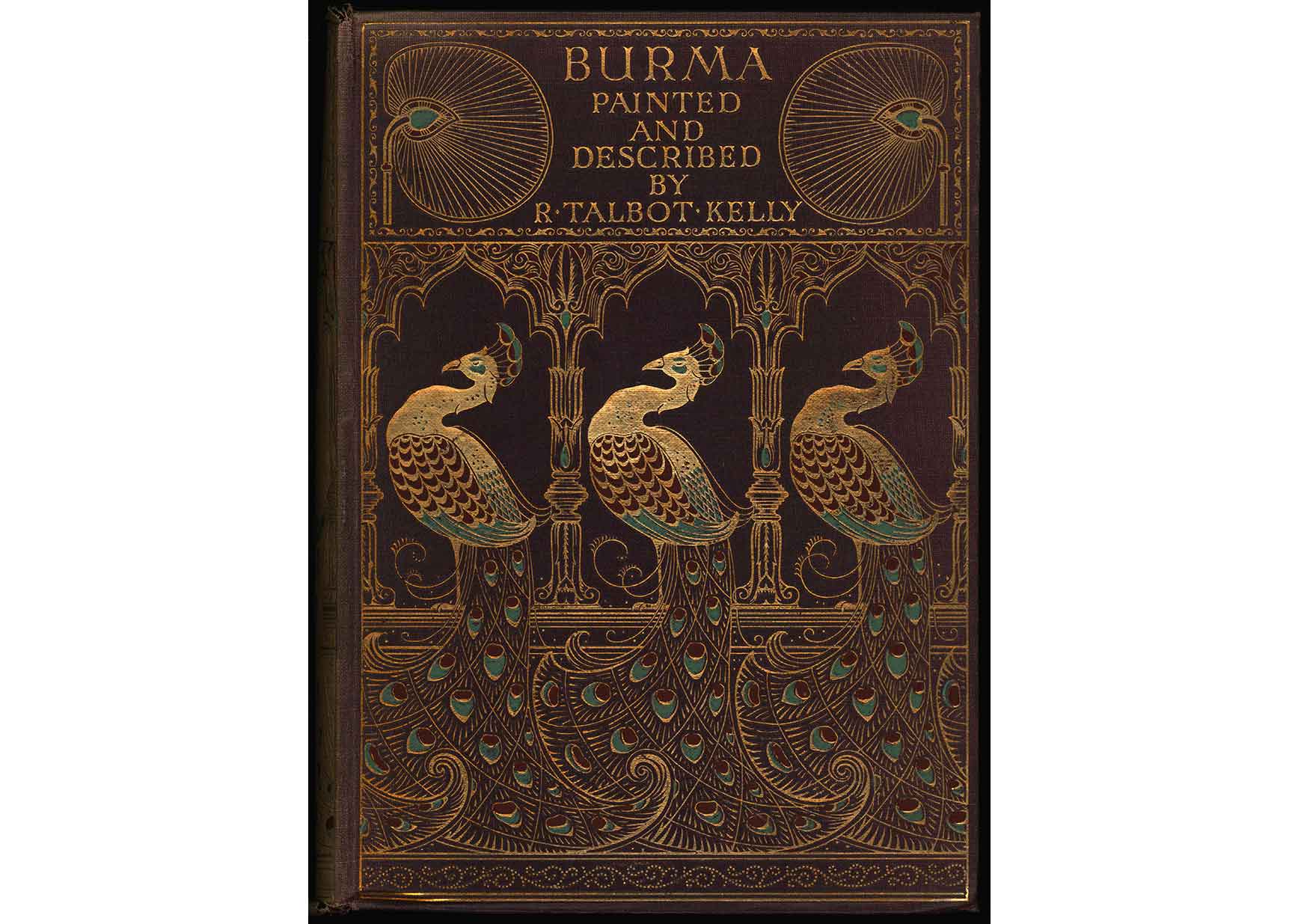
Every so often I stumble across a book in our library collection that is so beautiful it inspires me to try to find every other book by that designer that I can get my hands on. Burma, by Robert Talbot Kelly (1905), is one such book. The regal Art Nouveau peacocks with their swirling tail feathers had me entranced, and I immediately searched the cover for any sign of the binding designer’s signature. After carefully scanning every inch of the cover I finally found it: there, at the bottom of the spine and nearly impossible to see, was the distinctive scarab-like signature of artist Albert Angus Turbayne. Once I spotted it, I was hooked.

Turbayne’s distinctive scarab monogram.
It turns out we already had a few other books in the collection designed by Turbayne, I just didn’t know it. He didn’t always sign his designs, which makes identifying them difficult and, despite being one of the most distinguished binding designers of the late-nineteenth century (an art director asserted that “the designs of A. A. Turbayne come nearest to perfection”), little is known about him today. Born in Boston in 1866, he moved to Canada in 1881, then to England in 1890, where he would spend the rest of his life. In 1898 he was appointed as a teacher of graphic design at the London County Council School of Photoengraving and Lithography, a position he held until 1920. During this time he also helped set up the Carlton Studio, which became one of the largest commercial art studios of its time in London, where he specialized in decorative lettering, initials, and motifs.
Turbayne began his career as a book designer in the late-1880s, a time when trained, professional artists were just beginning to turn their talents towards book design. The previous decades had witnessed sweeping changes in the publishing industry, inspired by technological advances and a significant growth in literacy. As the century progressed and the middle class grew, more people were reading for pleasure and were able to spend their income on books. Beautiful books became a status symbol for the middle class, and publishers were eager to capitalize on the increasing demand for affordable, attractive books.
In the 1890s Turbayne designed several covers for the “Peacock” edition of illustrated novels published by Macmillan, including those for the novels by Thomas Love Peacock. Here again Turbayne used an elaborate Art Nouveau peacock (a play on the author’s name) that was carried through to the series’ endpapers. With their artistic design, heavy use of gold stamping, and affordable price of 5 shillings (roughly equivalent to £20 today) these books were meant to be seen as well as read.
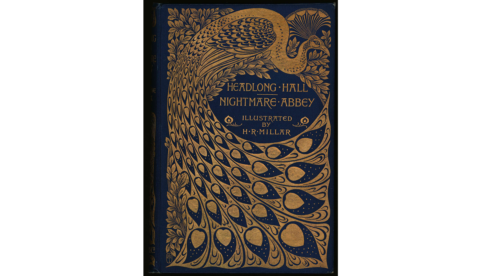
Headlong Hall and Nightmare Abbey, by Thomas Love Peacock (London: Macmillan and Company, 1896). Helen Farr Sloan Library & Archives, Delaware Art Museum.
In 1901 British publishing firm A. & C. Black became the first to use the three-color printing process for color illustrations in its 20 shillings (£1) series of “Colour Books.” Black used watercolor artists to create the illustrations, and most of the volumes featured 70 or more color plates. Turbayne and his colleagues at the Carlton Studio were responsible for the majority of the covers as well as the overall design of the entire series. These books sold very well, boosted by their relatively affordable price (roughly equivalent to £78 today), colorful illustrations, and handsome bindings.
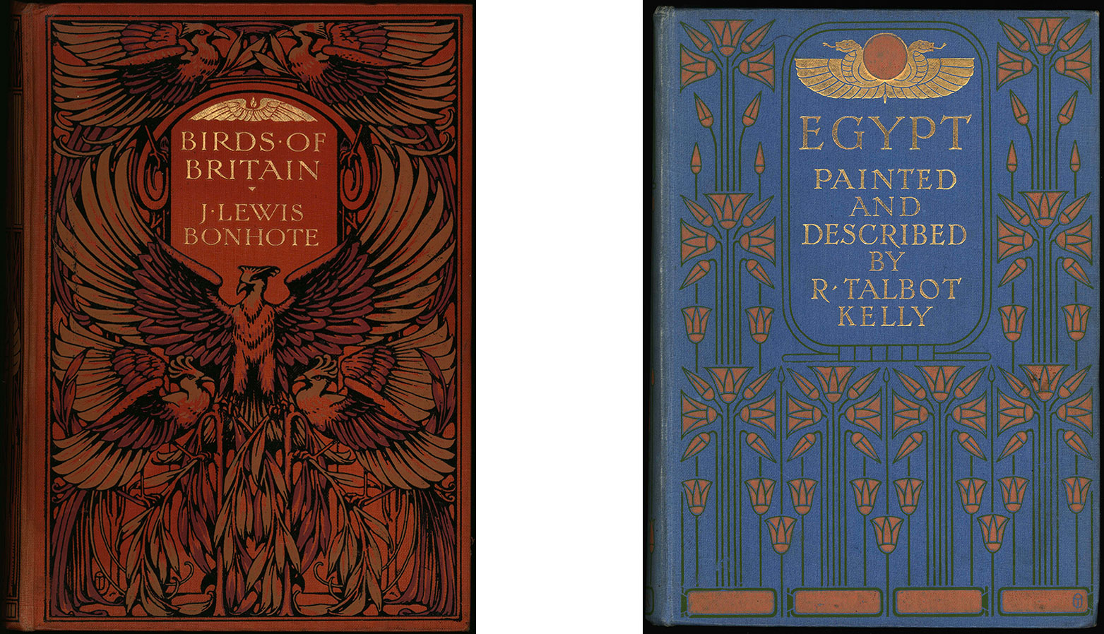
Birds of Britain, by J. Lewis Bonhote (London: A. & C. Black, 1907) and Egypt, painted and described by R. Talbot Kelly (London: A. & C. Black, 1907). Helen Farr Sloan Library & Archives, Delaware Art Museum.
In all, the Helen Farr Sloan Library & Archives holds 27 books with bindings designed by Albert Angus Turbayne, though I am still adding more to the collection as I find them. A virtual exhibition, “Nearest to Perfection”: The Binding Designs of Albert Angus Turbayne, may be found on the DelArt website: https://delartlibrary.omeka.net/exhibits/show/turbayne/introduction, and several of his books are on view in the cases outside the Library on the lower level of the Museum. And if you’d like to own a Turbayne design of your very own, the DelArt Store is selling journals featuring the covers of Headlong Hall and Birds of Britain.
Rachael DiEleuterio
Librarian/Archivist
Top image: Burma, painted and described by Robert Talbot Kelly (London: A. & C. Black, 1912). Helen Farr Sloan Library & Archives, Delaware Art Museum.