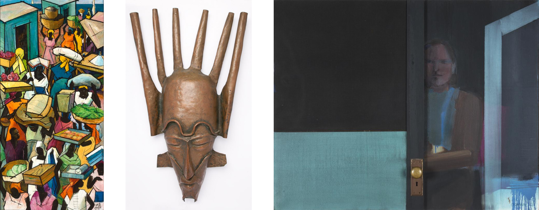
Excerpted from Afro-American Images 1971: The Vision of Percy Ricks (Wilmington, DE: Delaware Art Museum, 2021).
Though Percy Eugene Ricks, Jr. began what would be a long career in arts and education in Wilmington in 1947, the roots of what would become Aesthetic Dynamics, Inc. took hold in the mid-1960s. It was in 1964 that Ricks began teaching at P. S. DuPont High School as the art and humanities instructor. Four years later, he was still there during the uprising that followed the assassination of Dr. Martin Luther King Jr. and National Guard occupation of Wilmington. By creating Aesthetics Dynamics and curating Afro-American Images 1971, Ricks nurtured a group of Wilmington’s dedicated arts and culture professionals. In doing so, he created an innovative model that addressed the needs of the African American and artistic community in the city circa 1970.
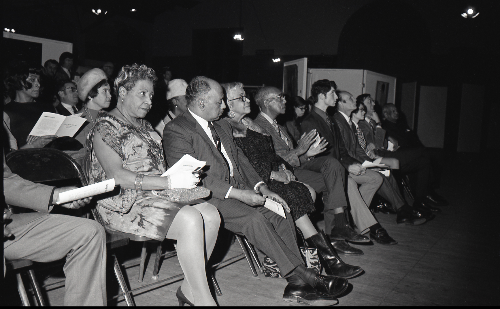
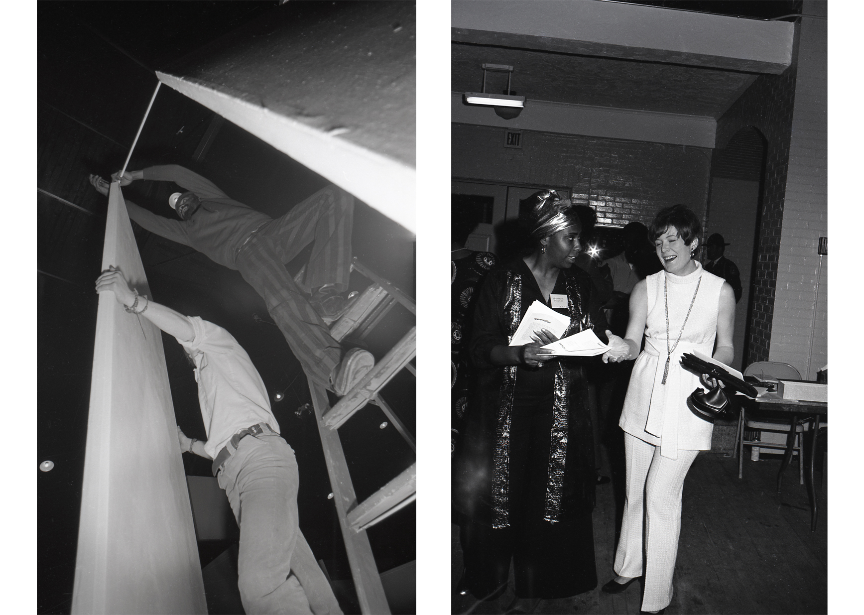 Left to right: Photograph of Simmie Knox (center) during Afro-American Images 1971 installation, Wilmington Armory, Delaware, 1971. Photograph by Photographers Collaborative (Woldemar Shock and Richard Carter). | Photograph of Gertrude Redden Jenkins (left) and others during Afro-American Images 1971 opening, Wilmington Armory, Delaware, 1971. Photograph by Photographers Collaborative (Woldemar Shock and Richard Carter).
Ricks’ first position in Wilmington was as an art teacher at the Absalom Jones School in 1947, and in October 1948 he was employed as the first full-time African American art instructor in the city’s school district. Ricks quickly immersed himself in the cultural fabric of the city and began to establish the networks that would later support Aesthetic Dynamics’s membership. He exhibited his work with Edward Loper Sr. and served on the planning committee for the development of F. D. Stubbs Elementary School, where he would later teach. Ricks also became active in the Delaware Fine Arts Council, serving as chairman in 1959. Education was at the core of his work. He chaired the planning committee for Stubbs Day (established in 1960 to celebrate the life of Dr. Frederick Douglass Stubbs, the elementary school’s namesake). In 1961, he was a member of Studio Ten. Other members included Robert C. Moore, Theodore Wells I, Gertrude Jenkins, Marilyn Rittenhouse, Muriel Cooper, Marie Goss, and C. Charles Carmichael. Such were Ricks’s networks when he started at P. S. DuPont High School in 1964.
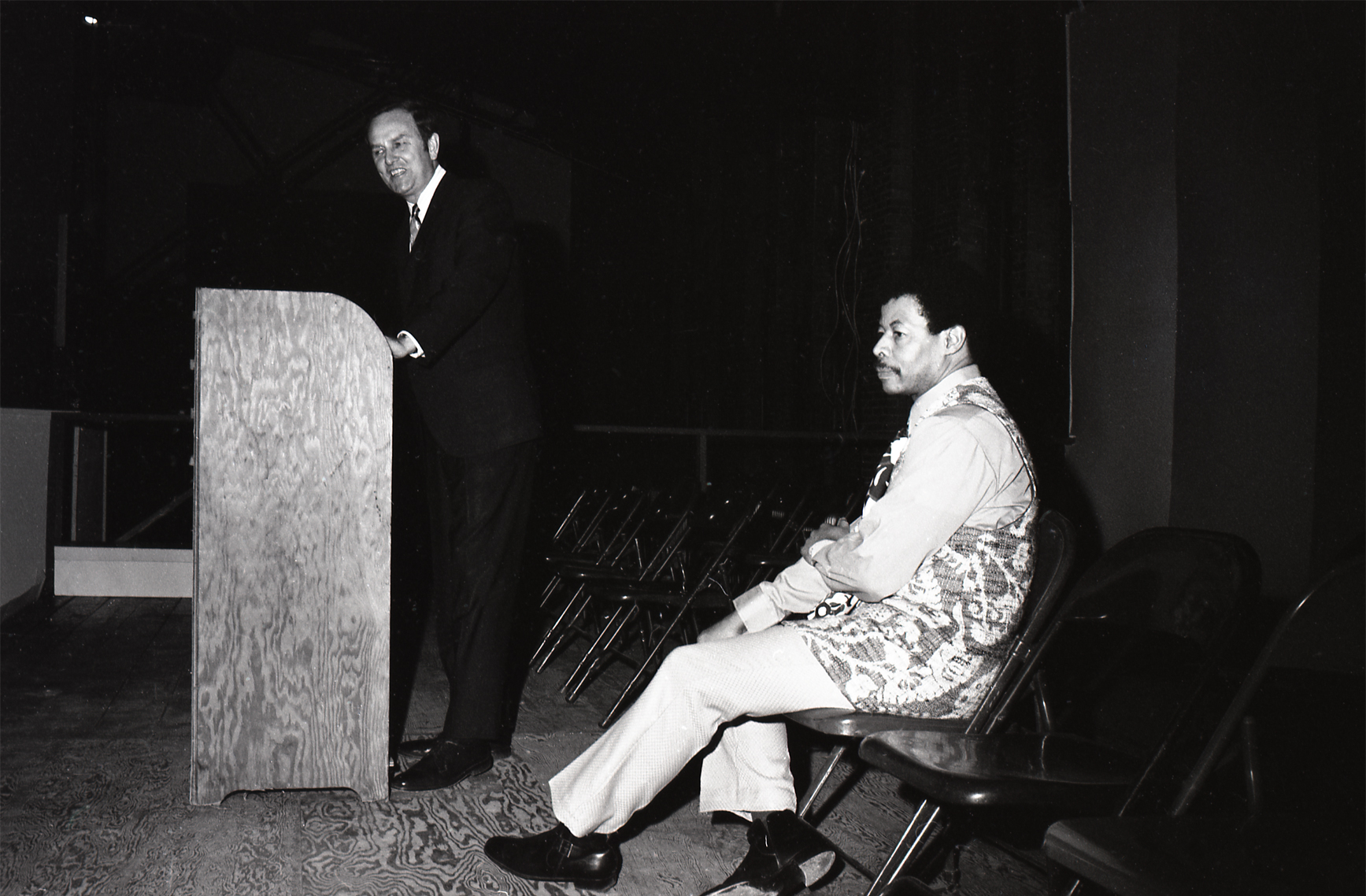
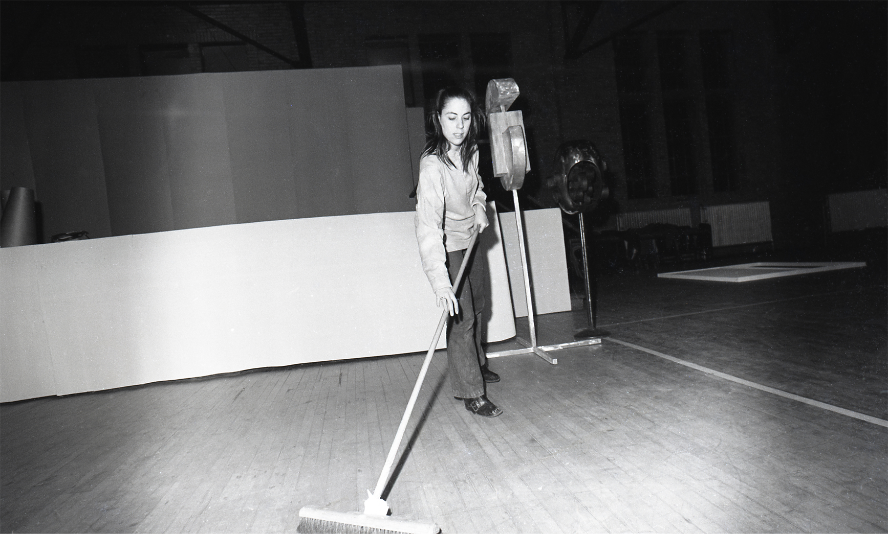 Photograph of Carol Shrier Reed during Afro-American Images 1971 installation, Wilmington Armory, Delaware, 1971. Photograph by Photographers Collaborative (Woldemar Shock and Richard Carter).
In 1968, in addition to teaching, Ricks was in a critical position as program consultant for the Greater Wilmington Development Council. He shared with his mentor, James A. Porter, that plans had begun as early as 1965 to shift the focus of the then Christina Community Center of Old Swedes from recreational programming toward what Ricks saw as a dire need: integrated support of the visual and performing arts for greater New Castle County. Informed by more than 20 years’ work in arts and education in Wilmington, and a summer 1968 feasibility study, Ricks embarked on a holistic development and evaluation process to establish a program that would meet the needs of all ages in personal and cultural growth. His “Wilmington Visual and Performing Arts Center” model addressed new media (television), African American history, theater workshops, and gallery space, for example. Ricks believed that by nurturing first the “various ethnic groups in the immediate community which have made cultural contributions to our society” and then expanding “to encompass a knowledge of worldwide ethnic groups and their contributions to the society of man,” the entirety of Wilmington’s social and cultural life would be enhanced.[1] As Ricks continued to develop and expand the description of the Christina Cultural Arts Center’s programming, he specified emotional, intellectual, aesthetic, perceptual, physical, and social growth as objectives.
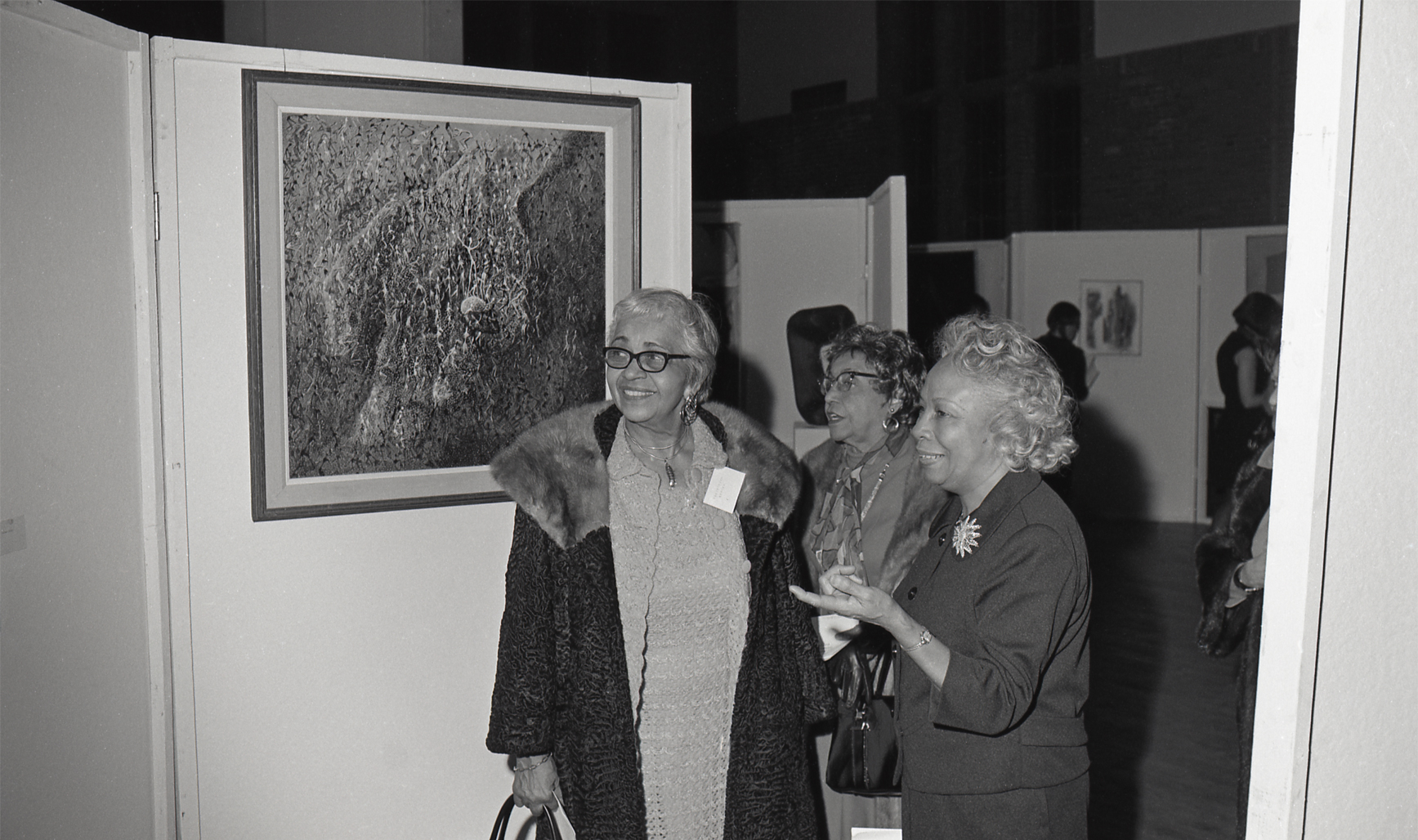 Photograph of (left to right) Delilah W. Pierce, Alma Thomas, and Dorothy Porter with Larry Erskine Thomas’ Africa—The Source during Afro-American Images 1971 opening, Wilmington Armory, Delaware, 1971. Photograph by Photographers Collaborative (Woldemar Shock and Richard Carter).
To begin to understand Ricks’s goals for the 1971 exhibition, it is useful to examine his motivations in establishing an entity with the tagline, “creative use of the arts and sciences for humanity.” Numerous factors likely led to the founding of Aesthetic Dynamics and its ambitious first project, but the 1968 occupation of Wilmington was a probable key local influence. The city’s residents joined in the national mourning of the loss of Dr. Martin Luther King Jr. on April 4, 1968. When the community’s response escalated, the National Guard was activated, and remained in the city for nine months, constituting the longest occupation of a U.S. city following King’s murder. Tensions from the prolonged military presence, coupled with the flight of many downtown residents to the suburbs, created for some a culture of fear and uncertainty about venturing into the city. Such anxieties were mitigated through various solutions initiated by government agencies, nonprofit organizations, and private individuals, such as Ricks.
With the traumatic events of 1968 still fresh, Ricks and the group of dedicated arts professionals established Aesthetic Dynamics and conceptualized a major exhibition to connect the local community with the contemporary contributions of Black artists. Of equal significance for Ricks was a means to publicly recognize and celebrate several distinguished individuals in the field. The exhibition was dedicated to his mentor James Porter, who had passed away on February 28, 1970. Romare Bearden, Loïs Mailou Jones, and Hale Woodruff each received an honorarium for their contributions to the arts and humanities at the February 5 opening events.
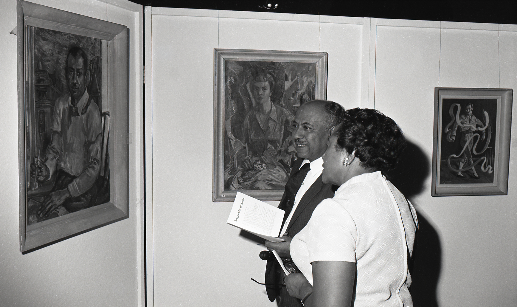 Photograph of Dr. Albert J. Carter and guest with James A. Porter’s Self-Portrait (1957), Shattered Mirror (1955), and Spanish Man with Ribbon (date unknown) during Afro-American Images 1971 opening, Wilmington Armory, Delaware, 1971. Photograph by Photographers Collaborative (Woldemar Shock and Richard Carter).
Descriptions of Afro-American Images 1971 and its objectives from the time vary. The newly founded Delaware State Arts Council was the lead sponsor, and council coordinator Polly Buck announced it as the first original exhibition of art by African Americans in the state. The Wilmington Armory (where the guard was housed during the 1968 occupation) hosted the exhibition, and while rentals were common, the art exhibition, which the writer compared to the 1913 New York Armory show, was a first. The space was selected for its size, location, and status as a community space, with Ricks noting that, “The armory is a place where you can walk in regardless of how you are dressed, unlike a museum.”[2] Afro-American Images 1971 represented the creation of a space for Black artists who were largely excluded from major arts institutions and an experience for Black museumgoers who, in 1971, were likely still experiencing de factor segregation in many parts of the United States, Wilmington included.
Listed on the exhibition pricelist and the catalogue’s title page are the names of Aesthetic Dynamics members, with whom Ricks had established deep connections. Writers, dancers, visual and performing artists who served as teachers, cultural promoters, and social activists gathered to realize Afro-American Images 1971. Poet Lula Cooper published in Wilmington’s The People’s Pulse and was a member of the executive committee of the Concerned Citizens, a multiracial group dedicated to protesting businesses in Wilmington with discriminatory practices in the mid-1960s. Additionally an artist and civil and social justice activist, Cooper served as director of the YWCA Delaware, among other positions. Gertrude Jenkins was a graduate of Delaware State University, settling in Wilmington in 1960 to teach physical education and dance in the public school system. As an active member of Aesthetic Dynamics and Play Crafters, she became a well-known choreographer in Delaware and Pennsylvania. She taught at P.S. DuPont High School for several years and was there when Afro-American Images 1971 was staged. Also at the school was Carol Shrier Reed, an art teacher who shared an office with Ricks. Reed felt Ricks’s plans for Aesthetic Dynamics and the inaugural exhibition were significant, especially considering the recent National Guard occupation. Reed recalls Ricks speaking of the timeliness and urgency to celebrate Black creativity. As an Aesthetic Dynamics member, Reed traveled with Ricks to pick up work from participating artists and helped assemble the partition walls and install the show at the Wilmington Armory. Reed’s father, Alfred, and sister, Linda, assisted with fundraising and marketing of the exhibition.
 Photograph of (left to right) Loïs Mailou Jones, Dr. Albert J. Carter, Delilah W. Pierce, and others during Afro-American Images 1971 opening, Wilmington Armory, Delaware, 1971. Photograph by Photographers Collaborative (Woldemar Shock and Richard Carter).
Photographer Woldemar Shock taught social studies at P. S. DuPont High School, where he met Ricks. In addition to assisting with the installation of Afro-American Images 1971 as an Aesthetic Dynamics member, Shock photographed the works of art for the exhibition catalogue and gathered invaluable documentation of the project, capturing the assembly of the show as well as the opening. Shock’s pictures comprise the greatest visual archive of the exhibition, showing how it was configured in the Wilmington Armory’s vast drill hall and capturing key individuals in attendance like Dr. Albert J. Carter, Loïs Mailou Jones, Delilah W. Pierce, Dorothy Porter, Alma Thomas, and Governor Russell W. Peterson, among others.
Aesthetic Dynamics member Jane Laskaris, on staff at Delaware State University, taught psychology, and her husband, painter Leo Laskaris, taught art at Stanton Central Elementary School. Member Barbara Greenhill was an art instructor at Tatnall School, and Simmie Knox—a key member and collaborator of Ricks—taught art at Howard High School with Robert C. Moore.
 Photograph of Governor Russell W. Peterson and Percy Eugene Ricks during Afro-American Images 1971 opening, Wilmington Armory, Delaware, 1971. Photograph by Photographers Collaborative (Woldemar Shock and Richard Carter).
Perhaps the most fitting way to conclude this essay is by briefly acknowledging the longevity of Ricks’s creative undertaking. Aesthetic Dynamics continues to this day, 50 years after its founding, and over those many years, the collective has presented visual and performance arts programs that celebrate Black creativity. Ricks was explicit in asserting that Afro-American Images 1971 was not assembled for political purposes, but rather with the intention to “make the public, both [B]lack and white, aware of the wealth of artistic power and talent found in Black America.”[3] The group’s membership has grown, fed by arts educators and advocates like Arnold Hurtt, Rita Volkens, Valerie Kennedy, B. Ben Pearce, and Carl Vincent Williams. It is a living entity, a model that shifts to meet the needs of Delaware’s communities, utilizing the “creative use of the arts and science” as inspiration.
Margaret Winslow
Curator of Contemporary Art
Visit the Delaware Art Museum to see the restaging of Percy Ricks’ historic exhibition, co-presented with Aesthetic Dynamics, Inc. Afro-American Images 1971: The Vision of Percy Ricks is on view through January 23, 2022.
1. Percy Ricks, “The Wilmington Visual and Performing Arts Center,” 4, Rose Library, Emory University Archives, James A. Porter, collection no. 1139, box 43, folder 3.
2. Ruth Jillya Kaplan, “75 Black Artists—And Guard’s the Host,” Evening Journal (Wilmington, DE), January 26, 1971, 21.
3. Percy Ricks, “Introduction,” in Afro-American Images 1971 (Wilmington, DE: Aesthetic Dynamics, Inc.), 3.
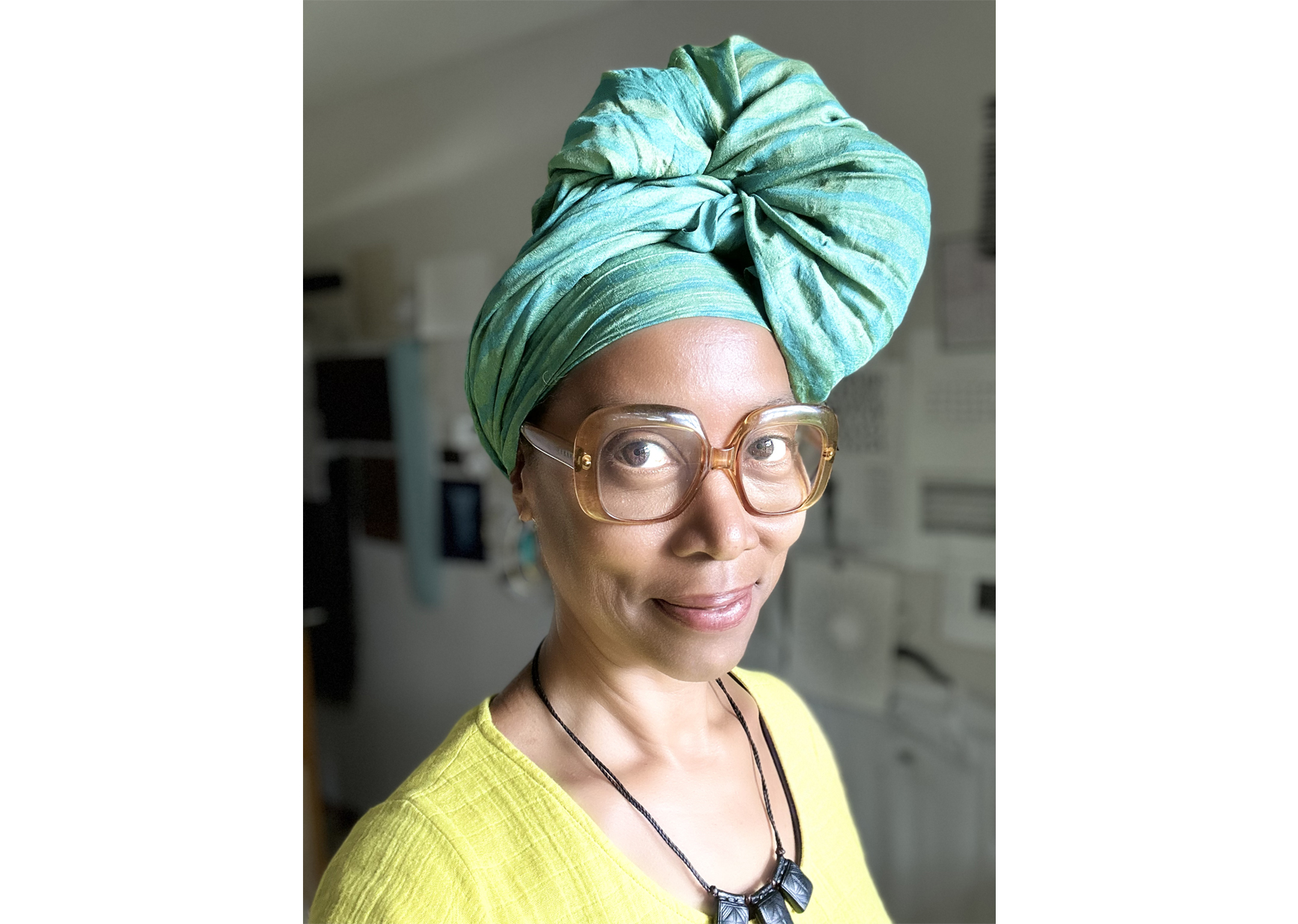
Top: Photograph of Percy Eugene Ricks with unknown painting, 1970. Courtesy of JENN and Associates.
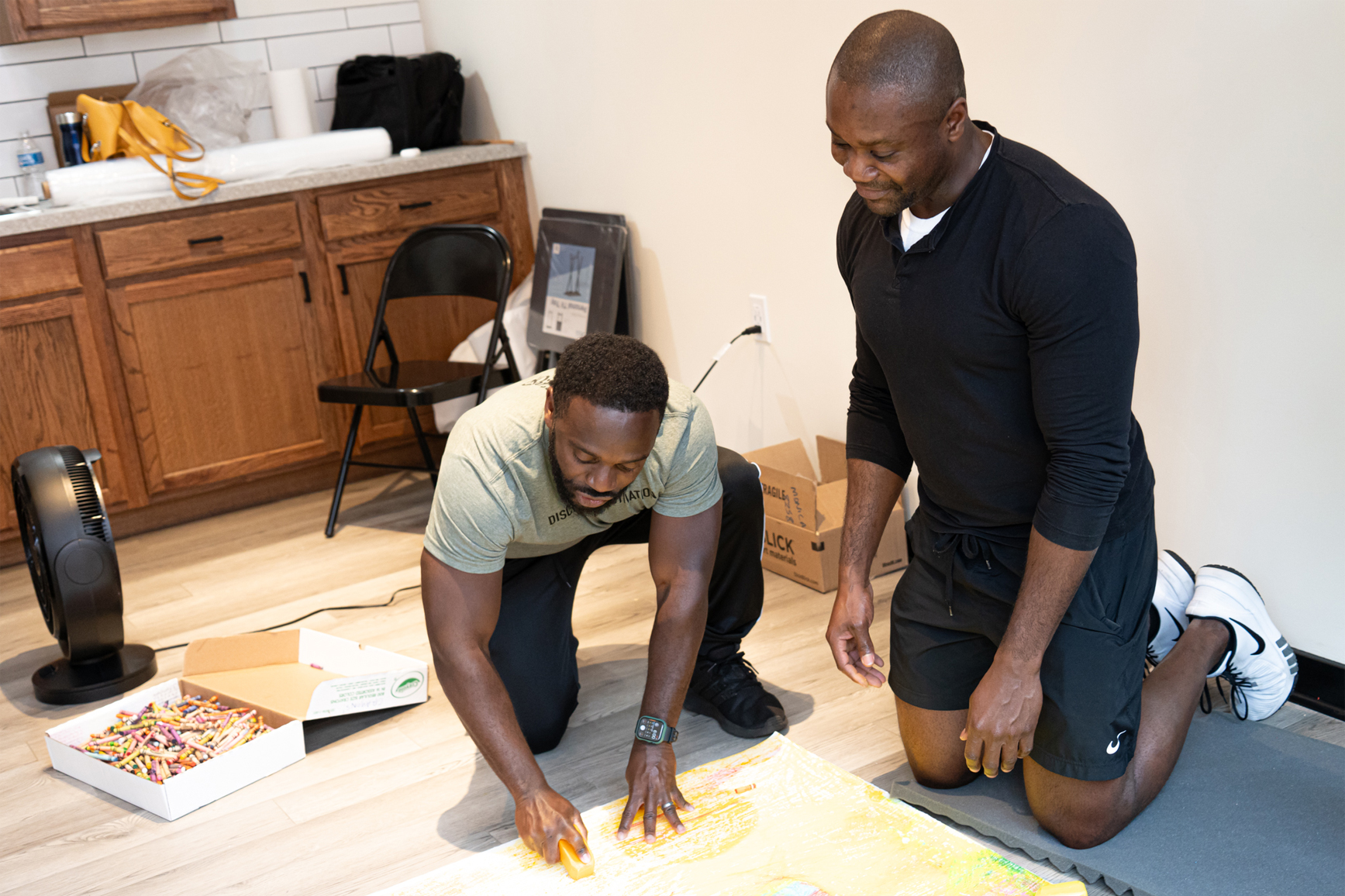
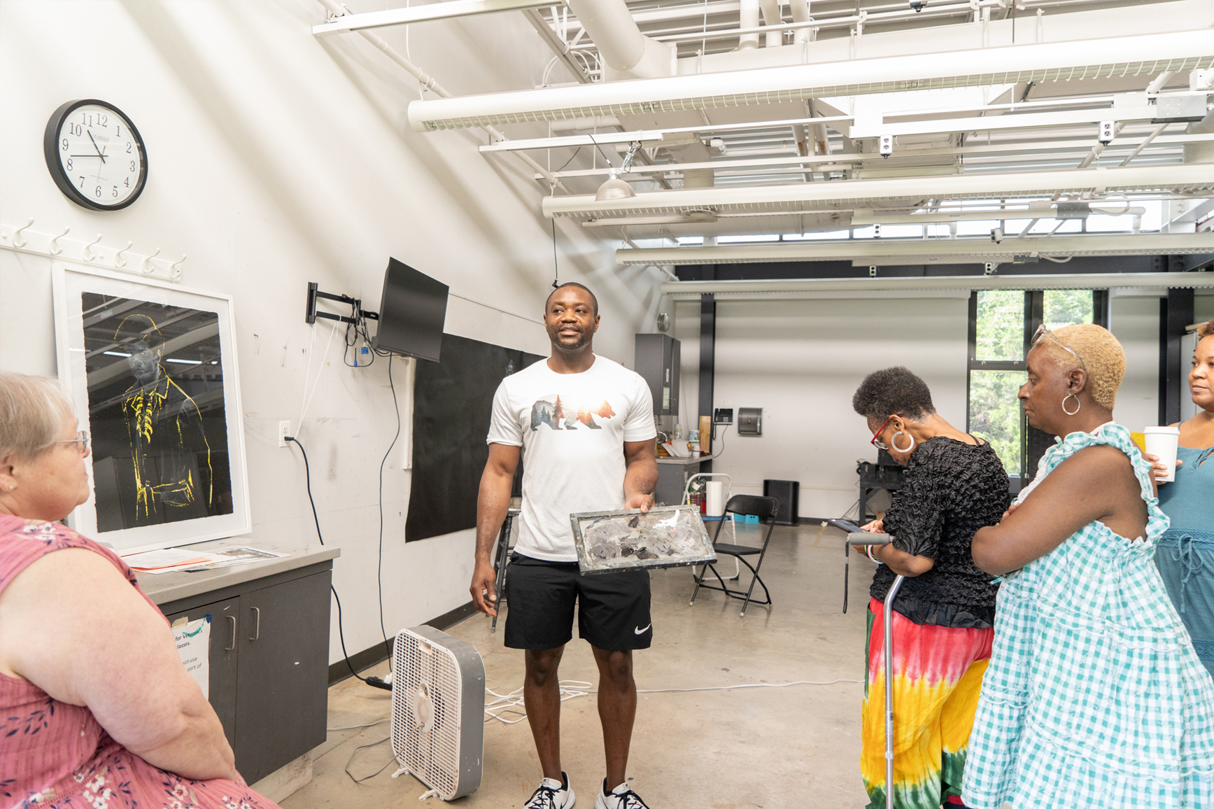
 Written by Joe Soler, PhD, Gallery Learning Assistant
  Fig 1
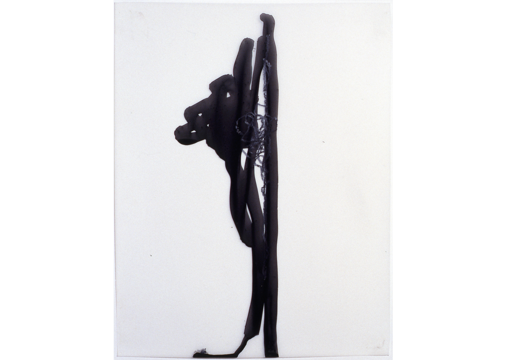
Fig 1 Fig 2
Fig 2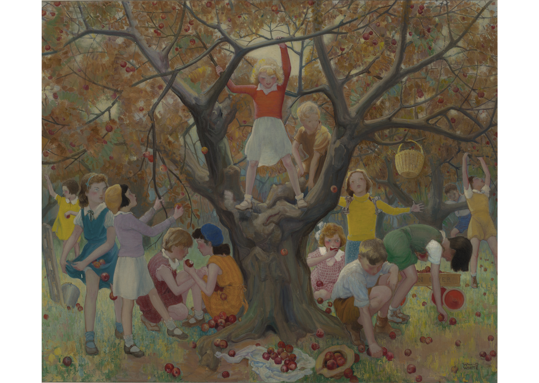 Fig 3
Fig 3
 Written by Alexandra Earl, Pre-doctoral Conservation Fellow and Dorothy Fisher, Lynn Herrick Sharp Curatorial Fellow
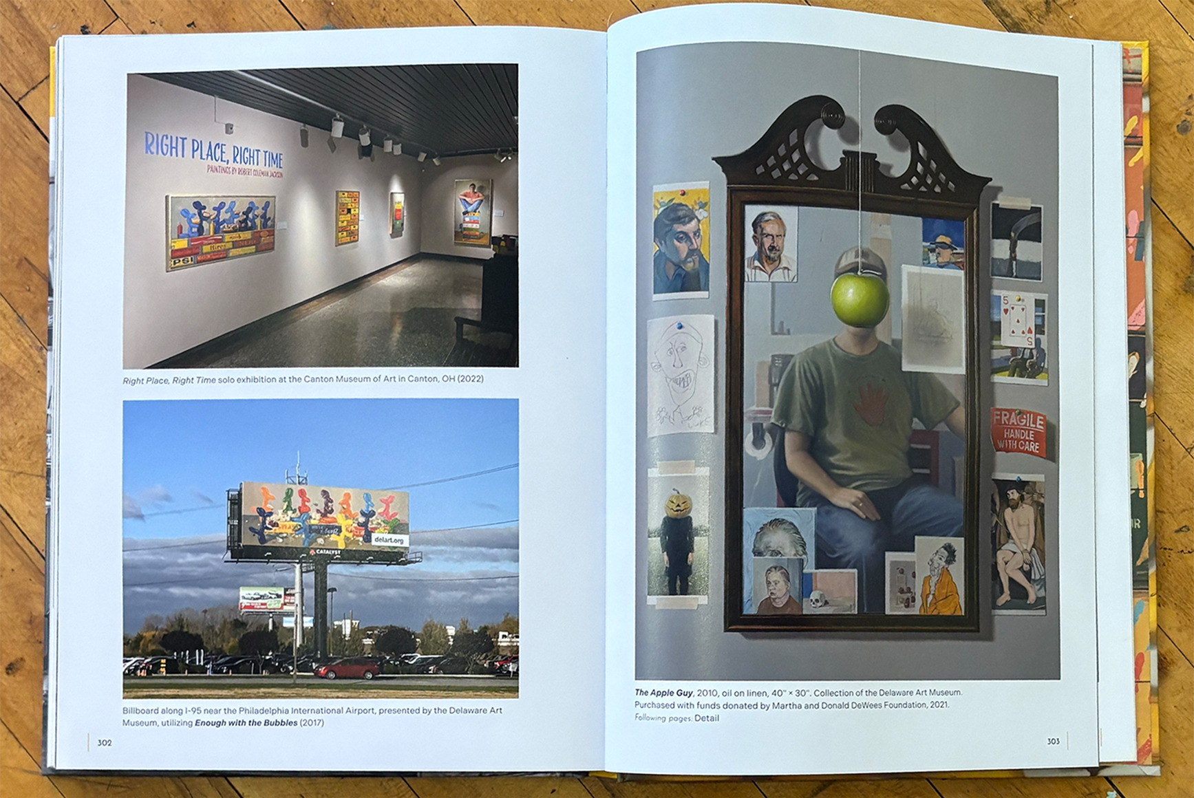
 Written by Heather Campbell Coyle, Curator of American Art
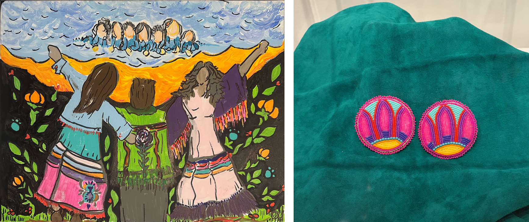 Left to right: Celebrating Ribbons, 2024. Rebecca Jackson-Square (born 1978). Acrylic on board, 16 × 20 inches. Collection of the artist. © Rebecca Jackson-Square. “Everybody’s Got Roaches.”, 2022. Renita Coursey (born 1992). Scrap hide, Miyuki Delica beads, Czech seed beads, Turquoise beads, and sterling silver fingernail posts, each: 2 3/4 × 2 3/4 inches. Collection of the artist. © Renita Coursey.
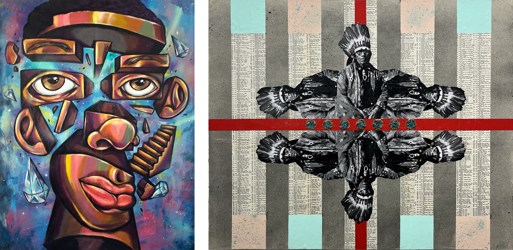 Left to right: Self, 2017. Terrance Vann (born 1991). Acrylic and spray, enamel on canvas, 7 × 5 ft. Courtesy of the artist. © Terrance Vann. 7 Coins For 7 Generations, 2025. Leonard Durham Harmon (born 1983). Acrylic oxidized copper shavings paper on wood panel, 27 × 22 × 2 inches. Collection of the artist. © Leonard Harmon Fine Art.
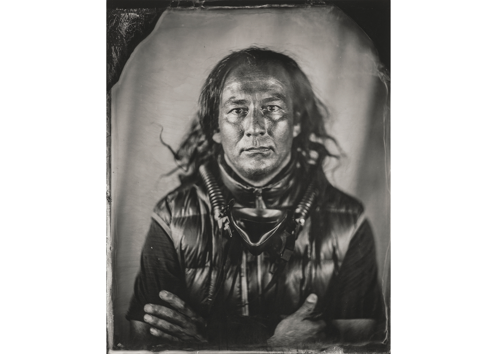
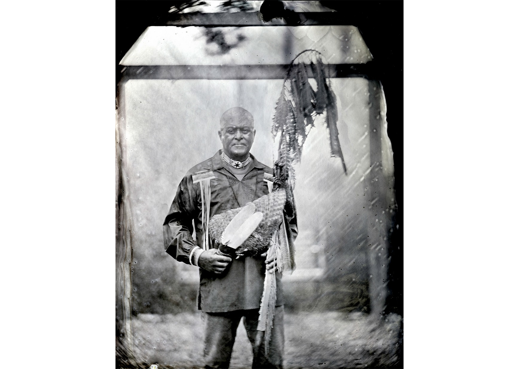
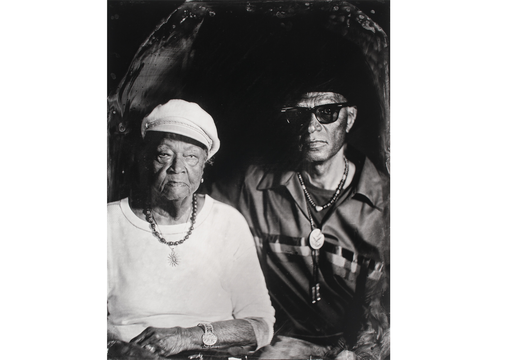 Ms. Sarah “Stump” Johnson and Chief Avery “Leaving Tracks” Johnson in
 Written by Margaret Winslow, Head Curator and Curator of Contemporary Art

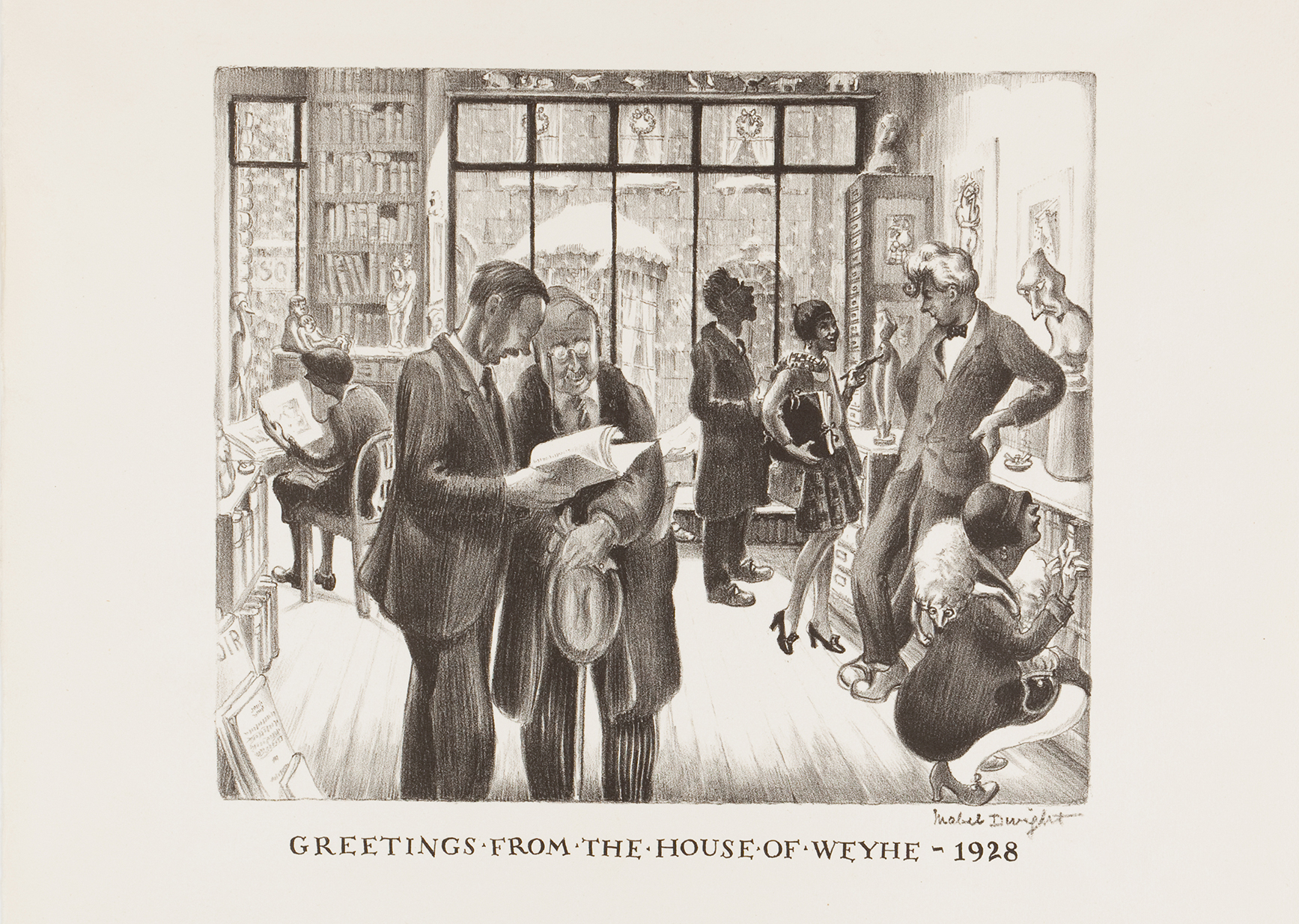
 Merry Old Santa Claus, from Harper’s Weekly, January 1, 1881. Thomas Nast (1840-1902). Printed matter. Helen Farr Sloan Library & Archives, Delaware Art Museum.
 Written by Rachael DiEleuterio, Librarian and Archivist
  Kayla Lookinghorse
 Nataanii Means
 Julietta Zavala
 Written by Nadjah Pennington, Cultural Programs Coordinator
  Creative Destruction, Oscar Eduardo de Paz (born 1982), casein, collage, and black-out poem. Courtesy of the artist.
 Left:
Left: 
 Hilda Delgado, Art Bridges Fellow
 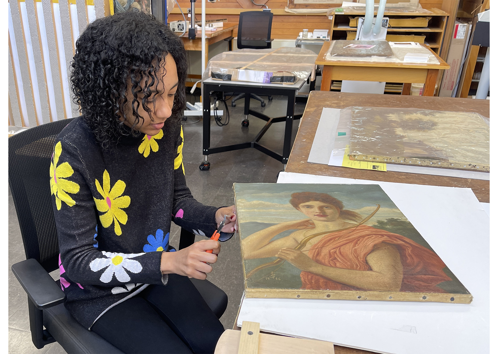 WUDPAC student Taryn Nurse dismounting a painting attributed to Solomon, entitled Atalanta (1866), in preparation for analysis prior to conservation treatment. Image courtesy of Taryn Nurse, Zoey Avery, and WUDPAC.
 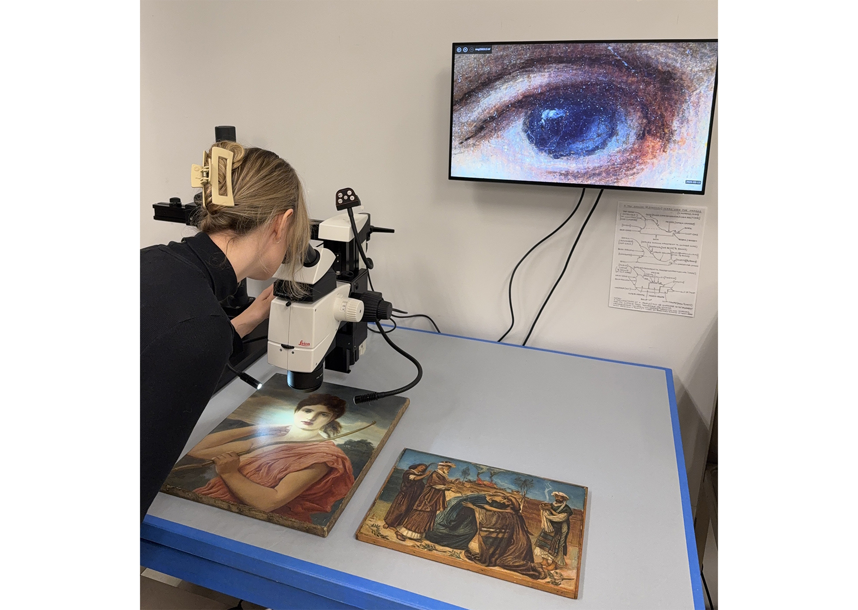 Alexandra Earl using optical microscopy to analyze Diana and
 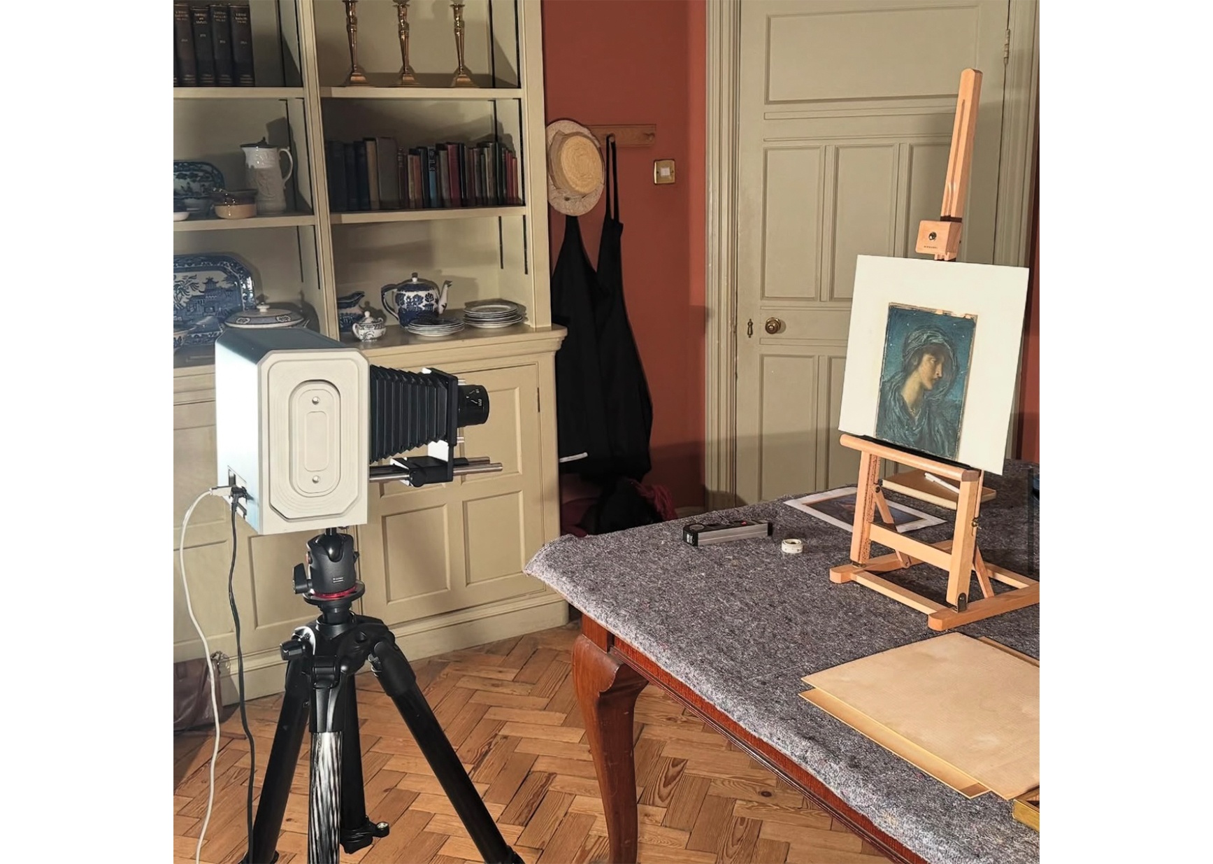 Infrared reflectography (using the Apollo infrared camera) being undertaken on Solomon’s Night at Wightwick Manor, Wolverhampton. Image courtesy of The National Trust and produced with permission of UD Art Conservation.
 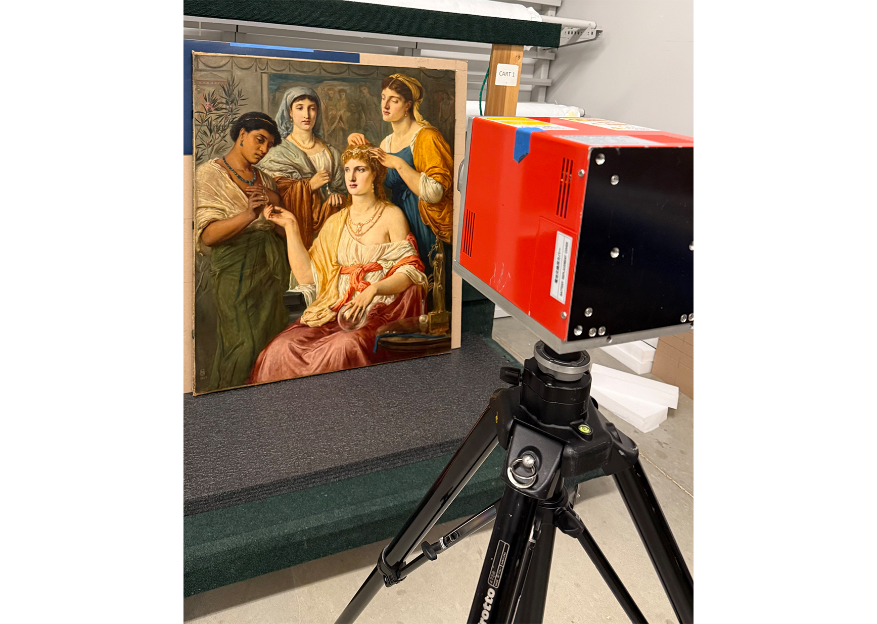 Portable X-radiography in progress on Toilette of a Roman Lady (1869)
 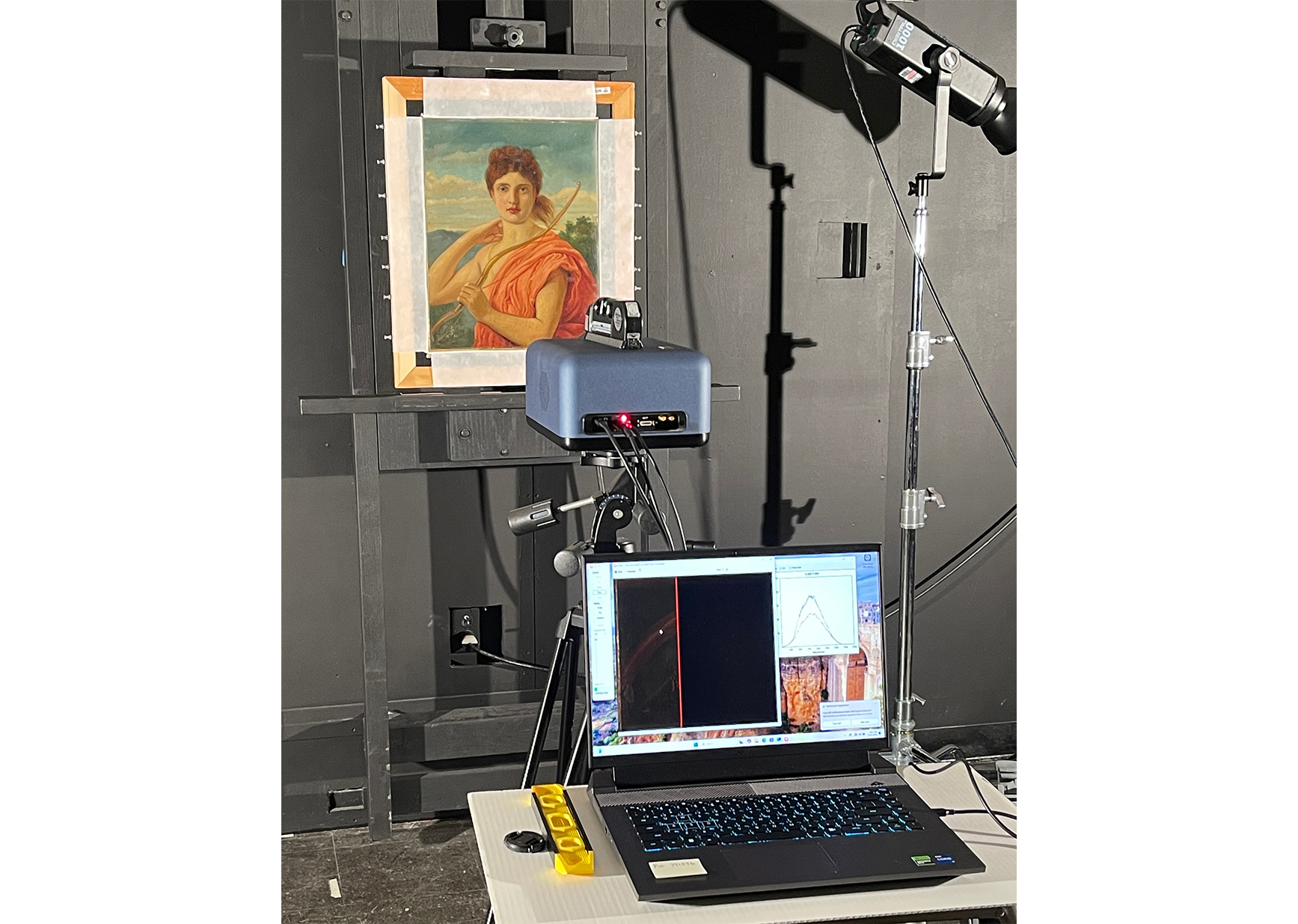 Reflectance imaging spectroscopy of Atalanta (1866). Image courtesy of Taryn Nurse and UD Art Conservation
 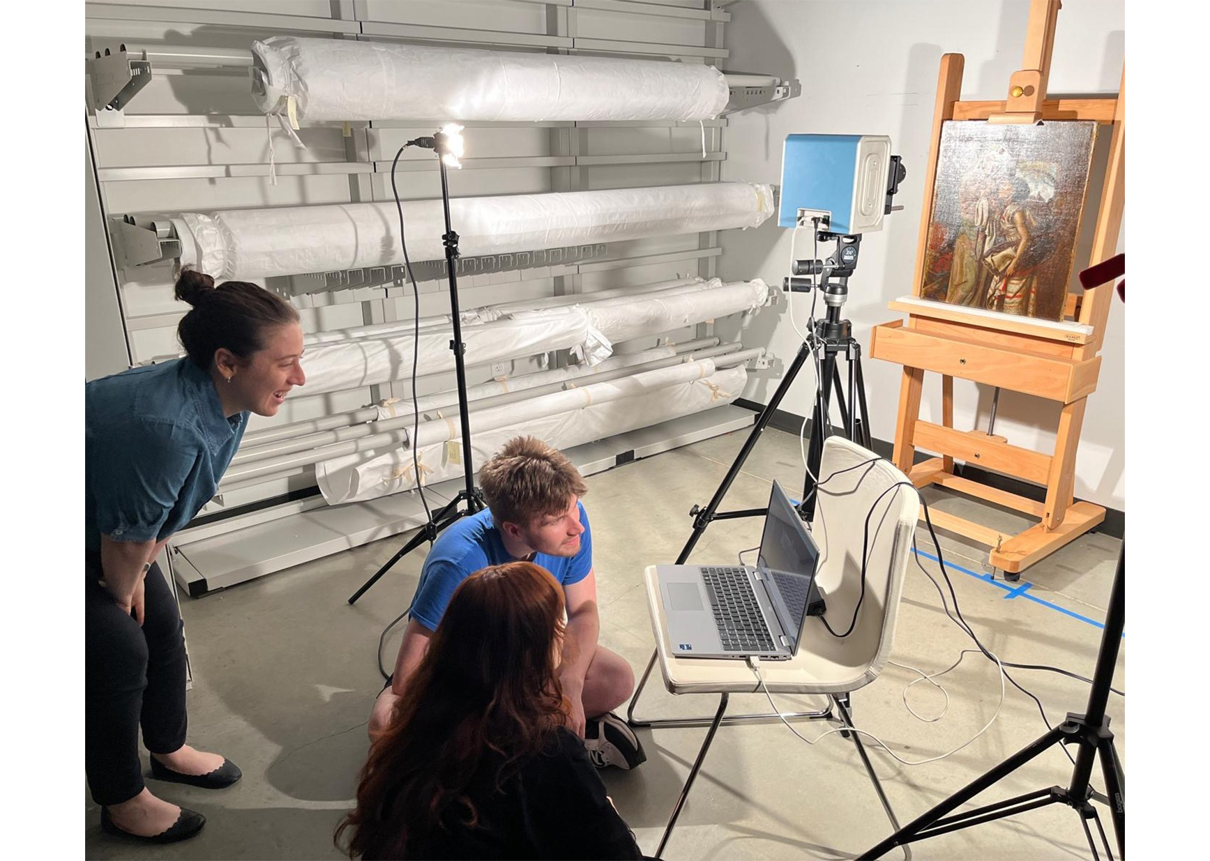 Infrared reflectography (using the Apollo Infrared camera) of The Mother of Moses (1860). Image courtesy of UD Art Conservation.
 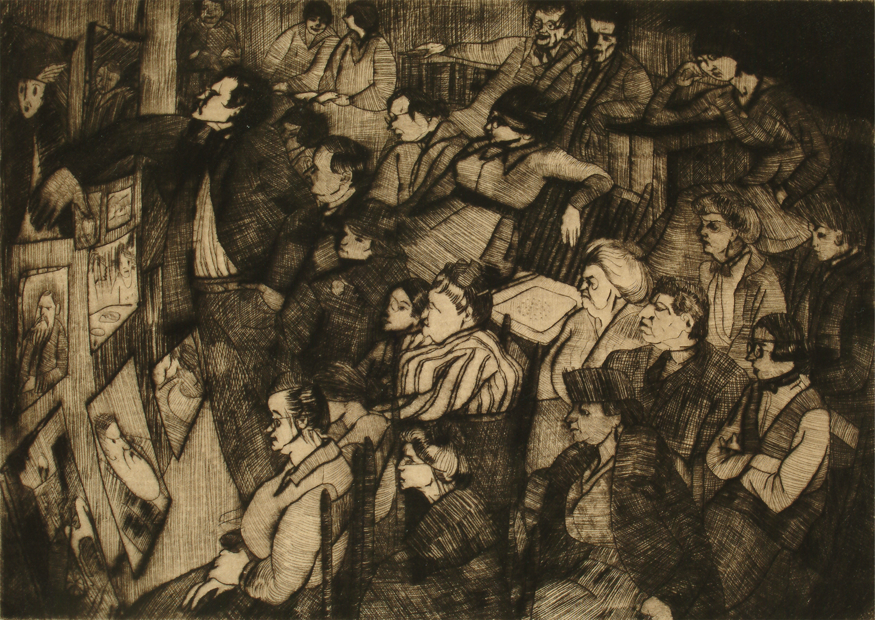 John Sloan’s Lecture, 1919. Peggy Bacon (1895–1987). Drypoint, plate: 4 15/16 x 6 15/16 in. Gift of Helen Farr Sloan, 1979.
 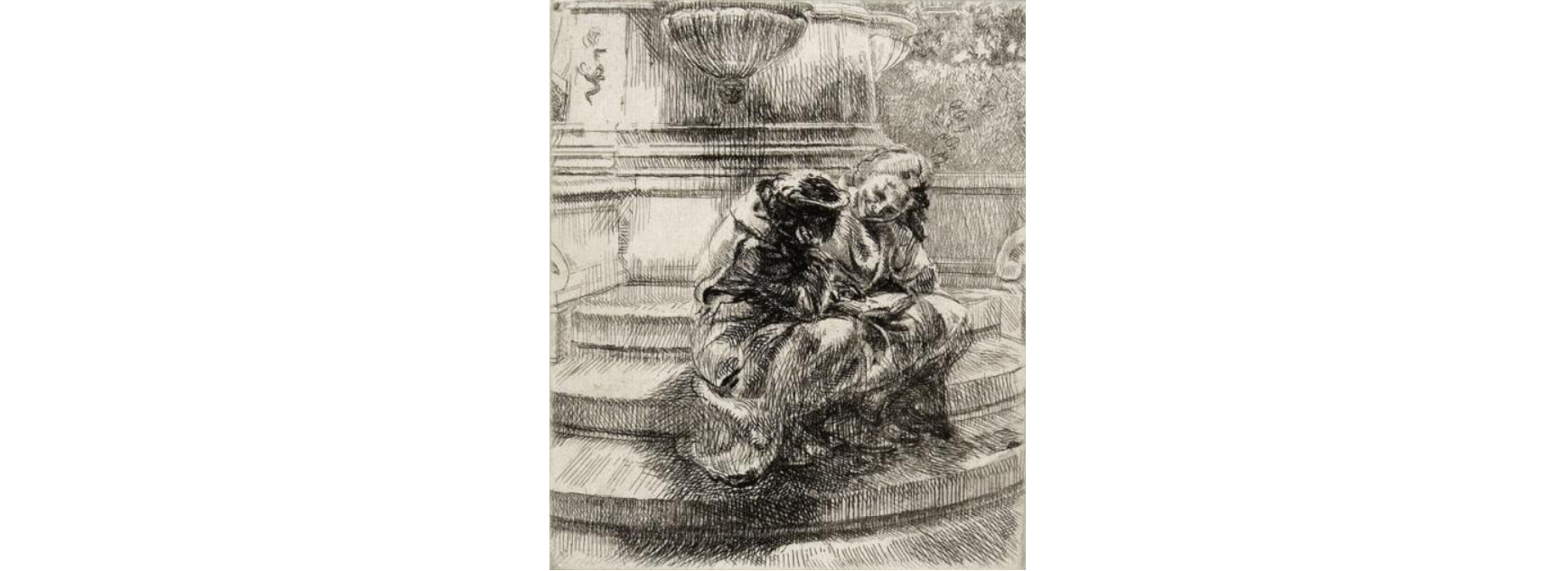 Girls Sitting in Union Square Fountain, 1936. Isabel Bishop (1902–1988). Etching, plate: 5 7/8 x 4 15/16 in. Gift of Helen Farr Sloan, 1978. © Estate of Isabel Bishop.
 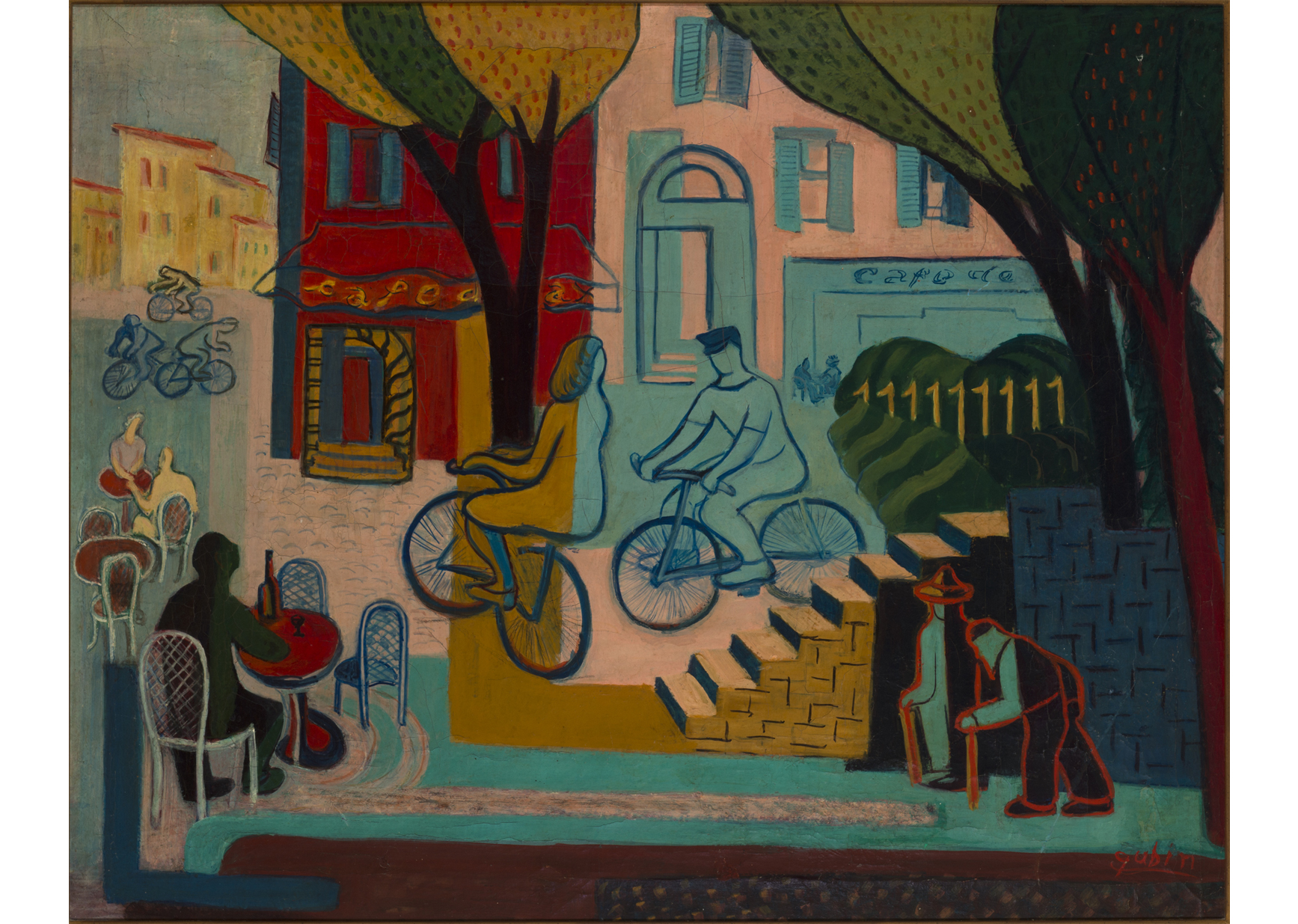 Paris Street Scene, not dated. Selma Gubin (1903–1974). Oil on canvas, 24 x 30 in. Gift of Dr. Joan Gubin Tolchin, 2025. © Estate of the artist.
 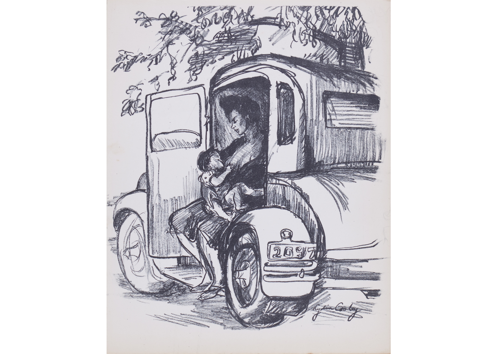 Mother with Child in Automobile, c. 1930. Lydia Cooley (1906–1998). Single-color lithograph, sheet: 11 3/8 × 9 in. Delaware Art Museum, Gift of Linda Goetz Holmes, 1982. © Roy Freeman.
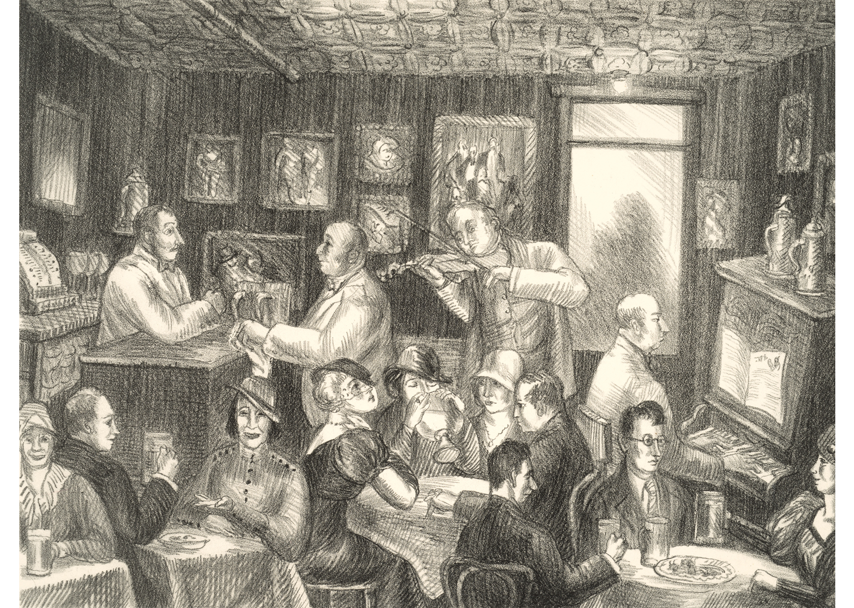 Prohibition Beer, c.1933. Helen Farr Sloan (1911–2005). Lithograph, 10 ¼ x 13 7/8 in. Bequest of Helen Farr Sloan, 2015. © Delaware Art Museum / Artists Rights Society (ARS), New York.
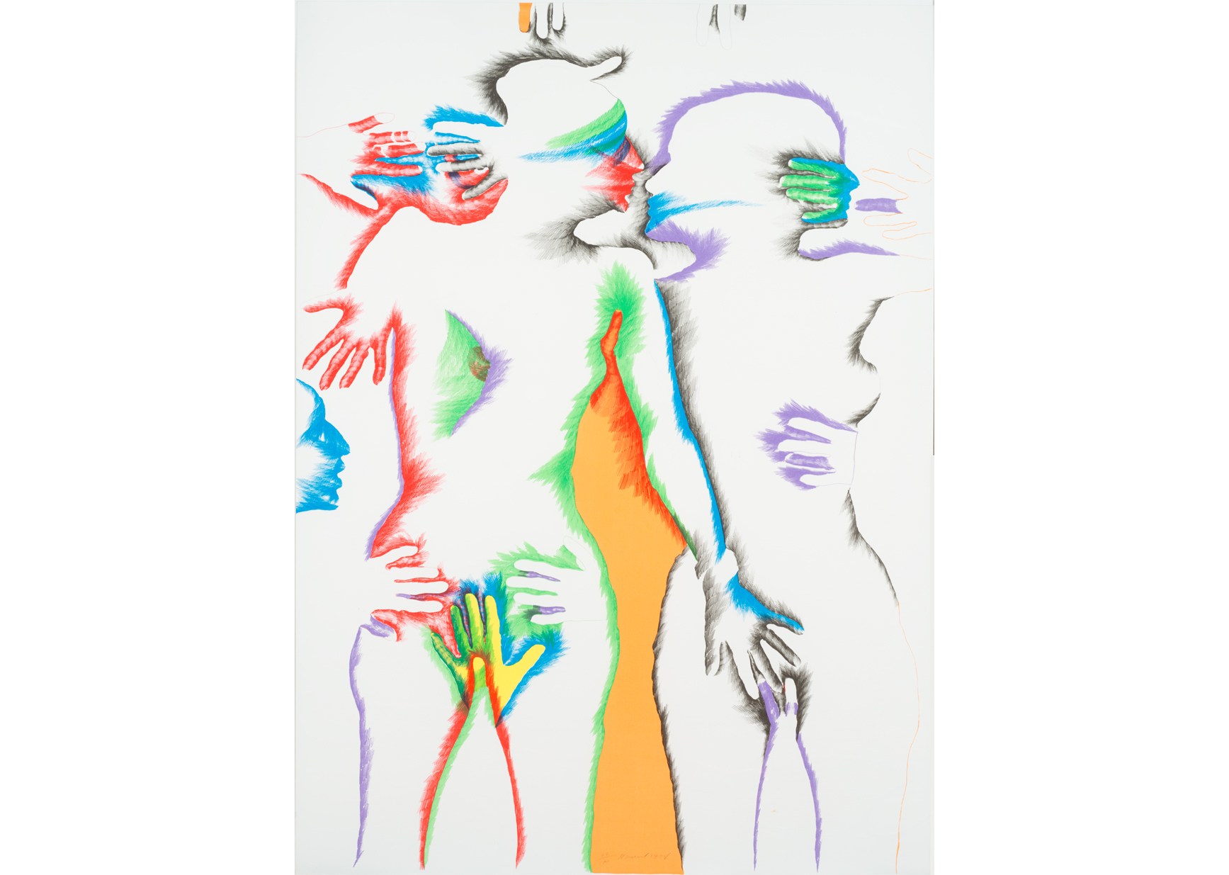 Untitled, 1978. Marisol (1930–2016). Lithograph, sheet: 52 × 38 inches. Delaware Art Museum, Gift of Mr. Robert D. LeBeau, 1981. © 2025 Estate of Marisol / Artists Rights Society (ARS), New York.
 HKL Portfolio / A Suite of Four Works, 1970. William T. Williams (born 1942). Delaware Art Museum, Acquisition Fund, 2023. © William T. Williams, Courtesy of Michael Rosenfeld Gallery LLC, New York, NY.
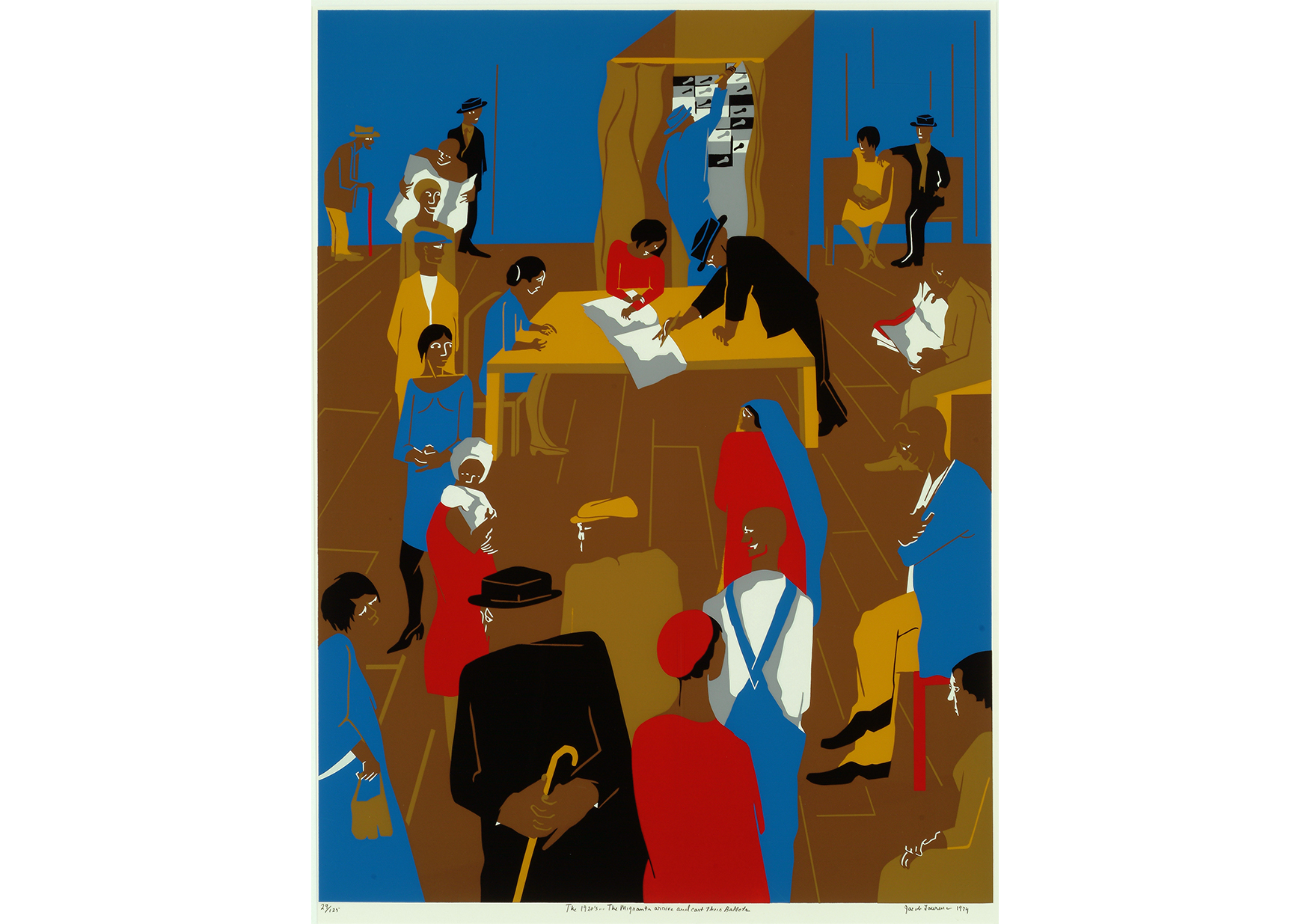 The 1920’s… The Migrants Arrive and Cast Their Ballots, from the Kent Bicentennial Portfolio: Sprint of Independence, 1975. Jacob Lawrence (1917–2000). Seven color screen print, composition: 32 × 24 7/8 inches, sheet: 34 3/4 × 26 inches. Delaware Art Museum, Gift of Lorillard, a Division of Loew’s Theatres, Inc., 1975. © 2025 The Jacob and Gwendolyn Knight Lawrence Foundation, Seattle / Artists Rights Society (ARS), New York.
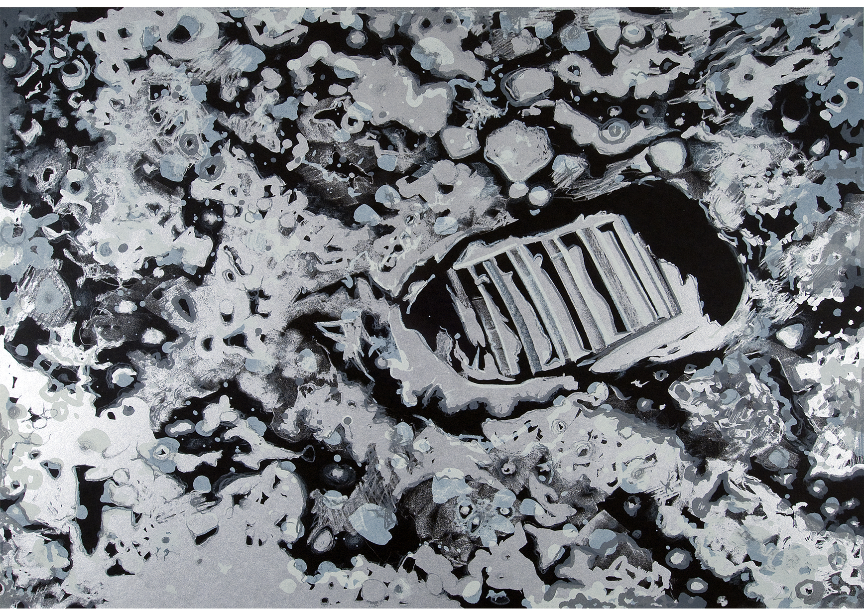 Moon Shot, 1969. Lowell Nesbitt (1933–1993). Color lithograph on black paper, sheet: 22 × 29 1/2 in. Delaware Art Museum, Gift of Reese and Marilyn Palley, 1991. © 2025 Lowell Nesbitt / VAGA for ARS, New York, NY.
 Merce, from the Merce Cunningham Portfolio, 1974, published 1975. Andy Warhol (1928–1987). Screen print, composition: 27 3/16 × 18 7/8 in, sheet: 30 × 20 1/16 in. Delaware Art Museum, F. V. du Pont Acquisition Fund, 2015. © 2025 The Andy Warhol Foundation for the Visual Arts, Inc. / Licensed by Artists. Rights Society (ARS), New York.
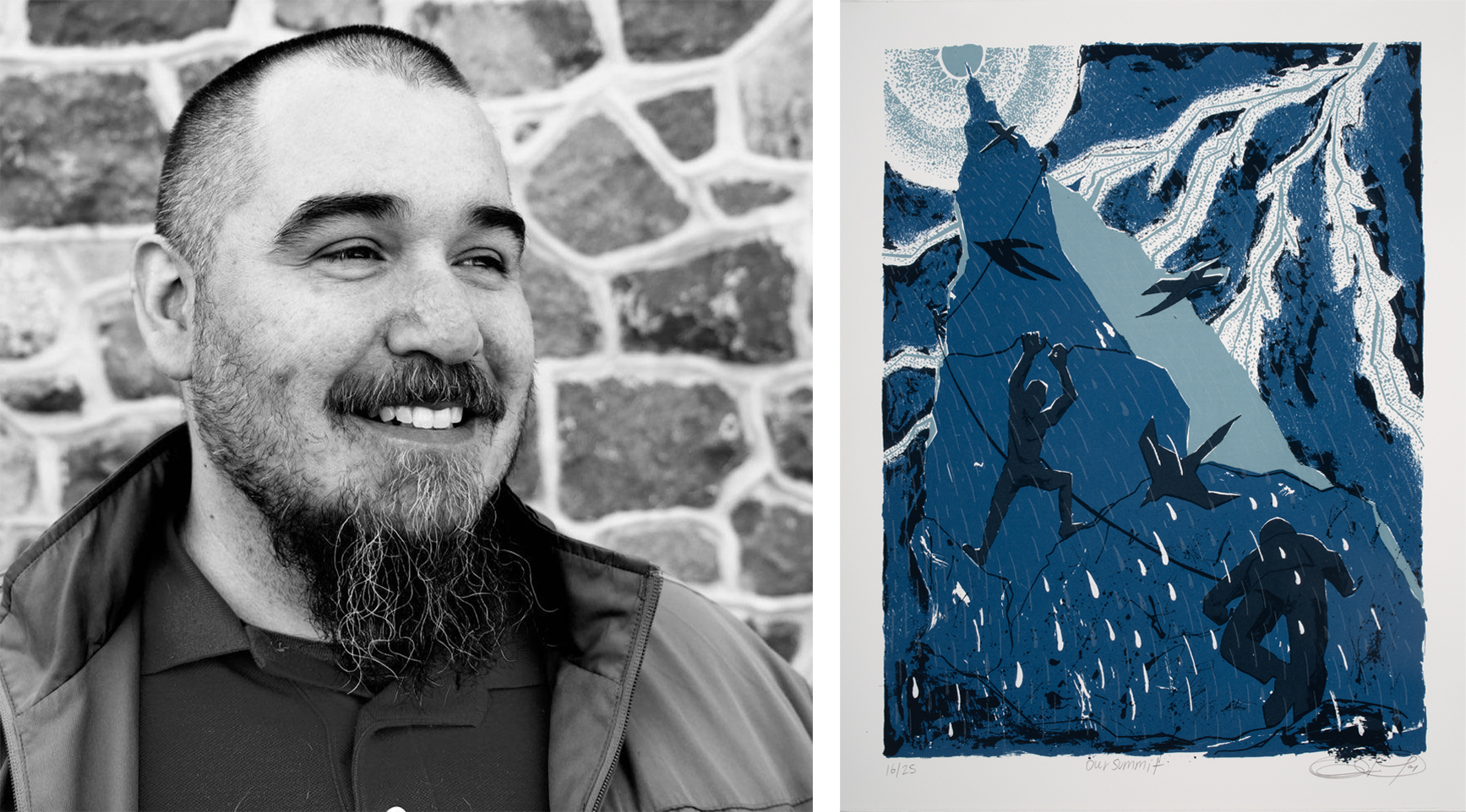 Oscar Eduardo de Paz. Photo by Jea Street Jr. Our Summit, 2025. Oscar Eduardo de Paz (born 1982). Screen print, composition: 16 3/16 × 12 1/8 inches. sheet: 18 5/16 × 14 1/8 inches. Commissioned by the Delaware Art Museum, with contributions from Art Bridges, 2025. © Oscar de Paz.
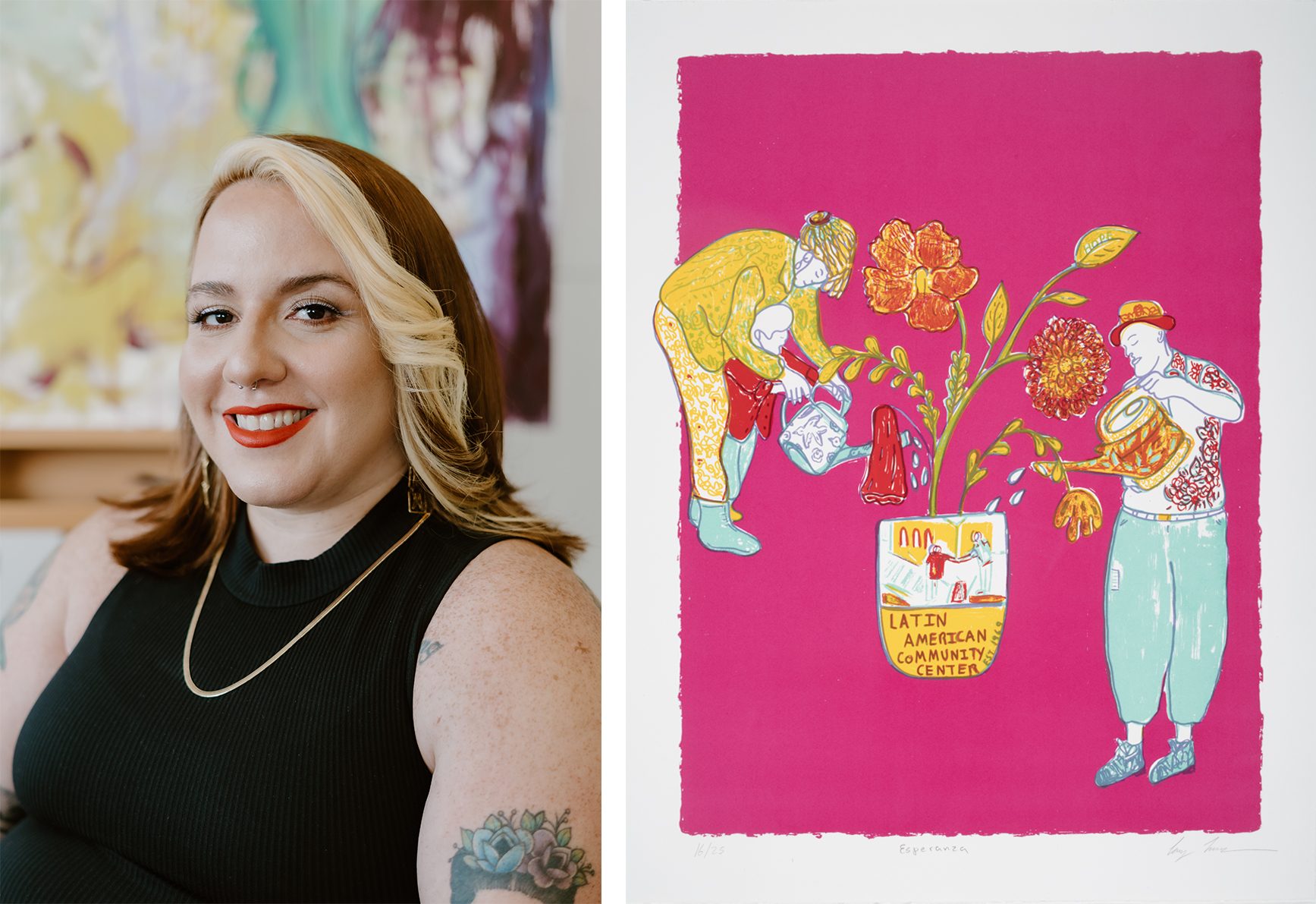 Constanza (Cony) Madariaga. Photo by Denise Lorca. Esperanza, 2025. Cony Madariaga (born 1990). Screen print, composition: 15 3/4 × 12 1/4 inches. sheet: 18 1/8 × 14 1/8 inches. Commissioned by the Delaware Art Museum, with contributions from Art Bridges, 2025. © Cony Madariaga.
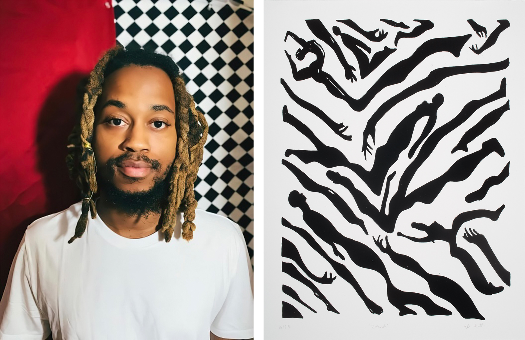 Alim Smith. Photo by Becky Rickert. “Zebruh”, 2025. Alim Smith (born 1990). Screen print, composition: 15 7/8 × 12 inches, sheet: 18 1/16 × 14 inches. Commissioned by the Delaware Art Museum, with contributions from Art Bridges, 2025. © Alim Smith.
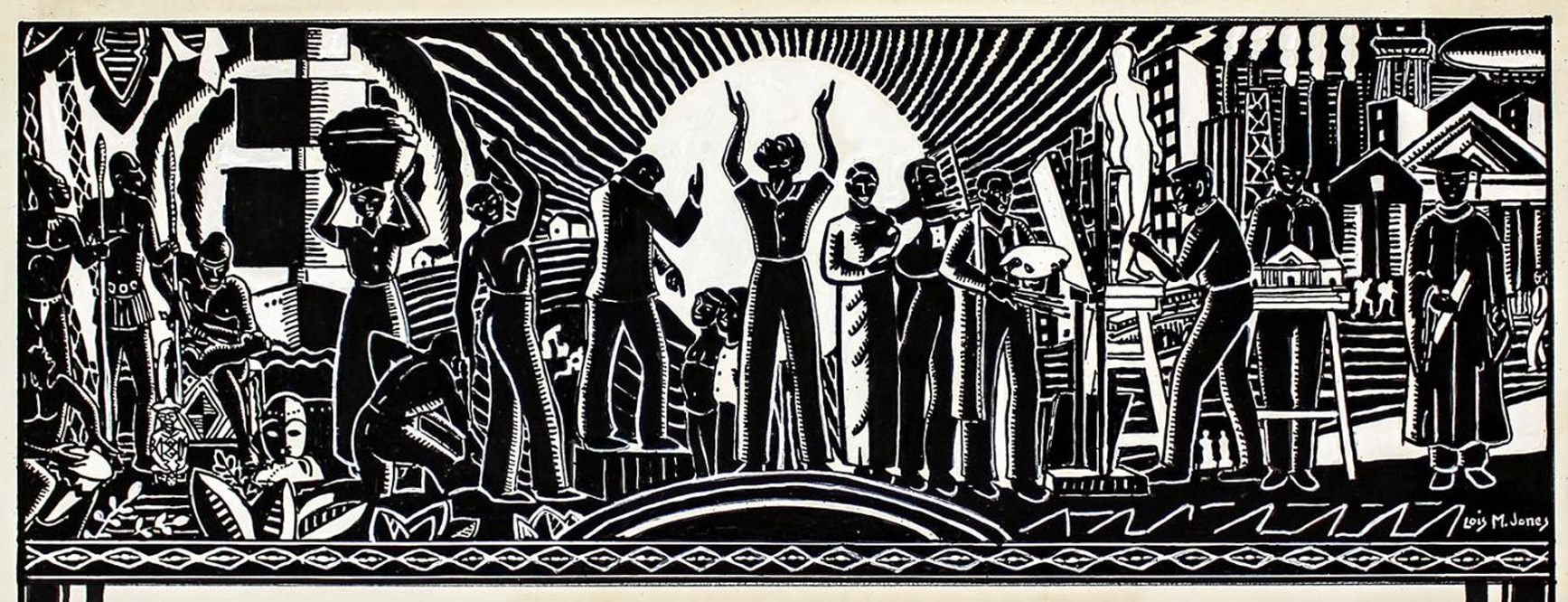 Heritage: Illustration for Important Events and Dates in Negro History, 1936. Loïs Mailou Jones (1905–1998). Brush and ink over lithograph on paper, 7 ½ x 19 ¼ inches. The Johnson Collection, Spartanburg, South Carolina.
 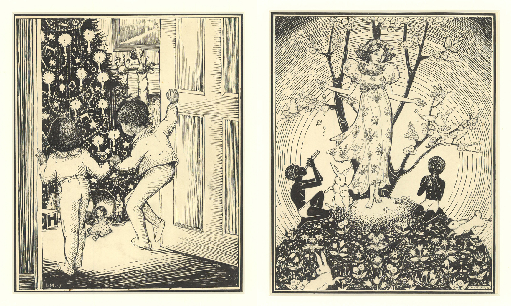 Left to right: My Christmas Tree, 1935. For The Picture-Poetry Book by Gertrude Parthenia McBrown (Washington, D.C.: Associated Publishers, Inc., 1935). Loïs Mailou Jones (1905–1998). Ink on paper, 11 ¾ x 8 ¾ inches. University of Findlay’s Mazza Museum. The Voice of Spring, 1935. For The Picture-Poetry Book by Gertrude Parthenia McBrown (Washington, D.C.: Associated Publishers, Inc., 1935). Loïs Mailou Jones (1905–1998). Ink on paper, 11 ¾ x 8 ¾ in. University of Findlay’s Mazza Museum.
 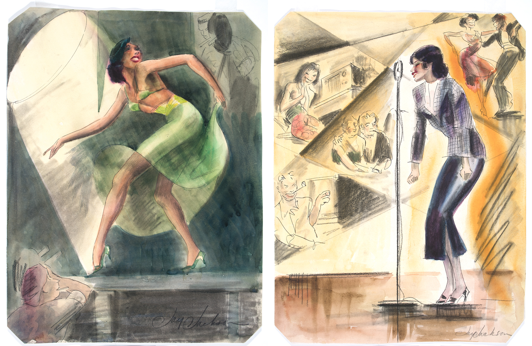 Left to right: Etta Moten Barnett Dancing, c. 1940. Jay Jackson (1905–1954). Watercolor, ink, and charcoal on paper, 12 5/8 x 9 5/8 inches. Delaware Art Museum, Acquisition Fund, 2022. Etta Moten Barnett Singing, c. 1940. Jay Jackson (1905–1954). Watercolor, ink, and charcoal on paper, 12 5/8 x 9 9/16 inches. Delaware Art Museum, Acquisition Fund, 2022.
 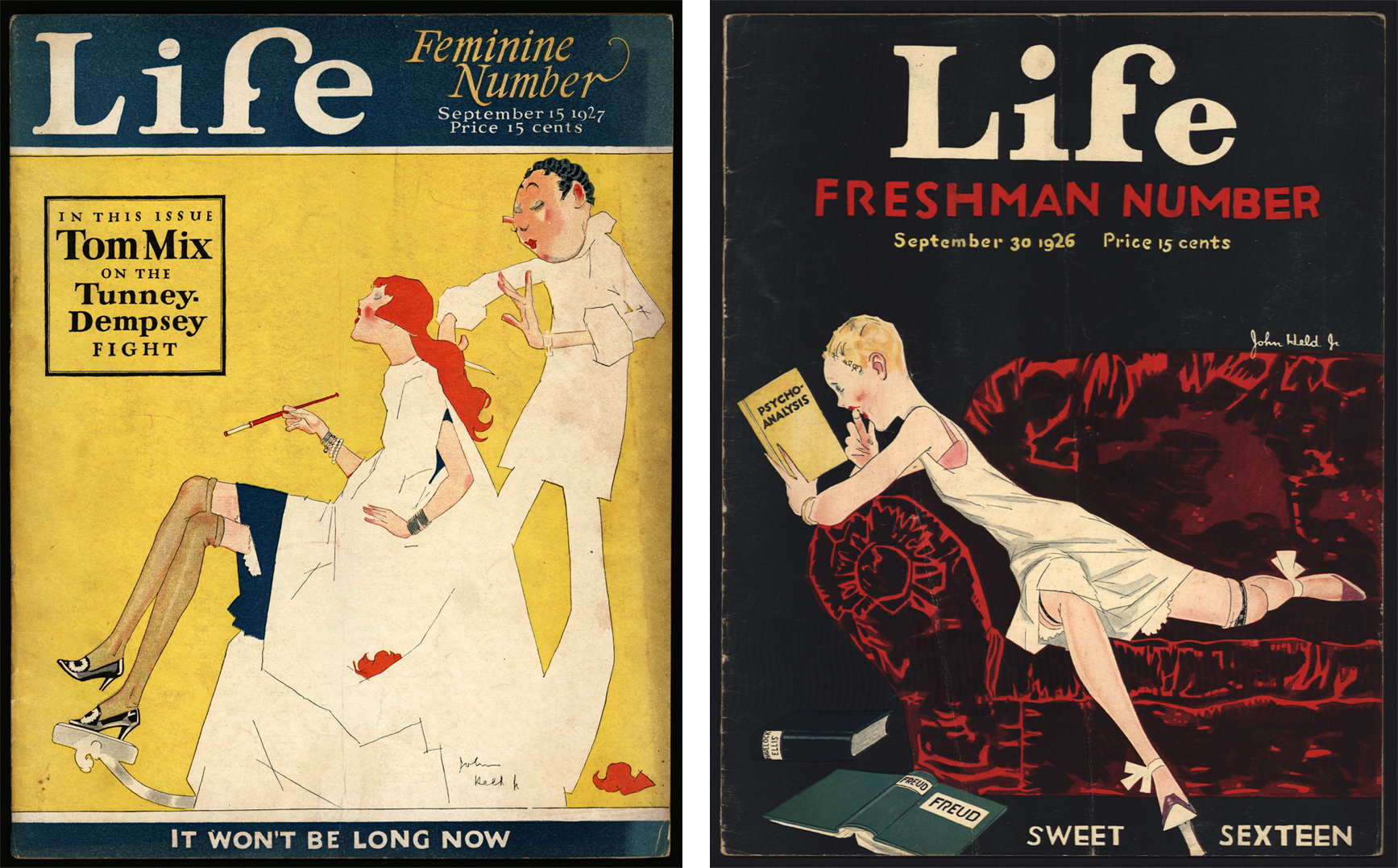 Left to right: John Held, Jr. (1889-1958), cover for Life, September 15, 1927. Printed matter. Delaware Art Museum, Helen Farr Sloan Library & Archives. John Held, Jr. (1889-1958), cover for Life, June 3, 1926. Printed matter. Delaware Art Museum, Helen Farr Sloan Library & Archives.
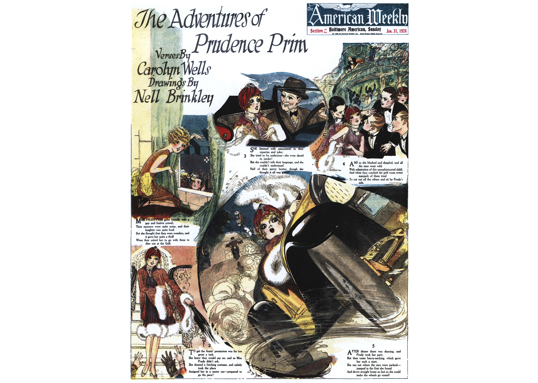 Nell Brinkley (1886-1944), The Adventures of Prudence Prim, from American Weekly, Chicago Herald and Examiner, January 31, 1926. Printed matter. Delaware Art Museum, Helen Farr Sloan Library & Archives.
 The Admirable Hostess, from Advertisement for Wallace Silver, published in The Saturday Evening Post, January 8, 1921. Neysa Moran McMein (1888–1949). Pastel on board, 30 1/8 × 28 5/8 inches. Acquisition Fund, 2022.
 New Year’s Eve, for an advertising calendar for Brown & Bigelow, 1928. Stanley Arthurs (1877–1950). Oil on canvas, 35 ½ x 26 3/8 inches. Delaware Art Museum, Louis du Pont Copeland Memorial Fund, 1930.
 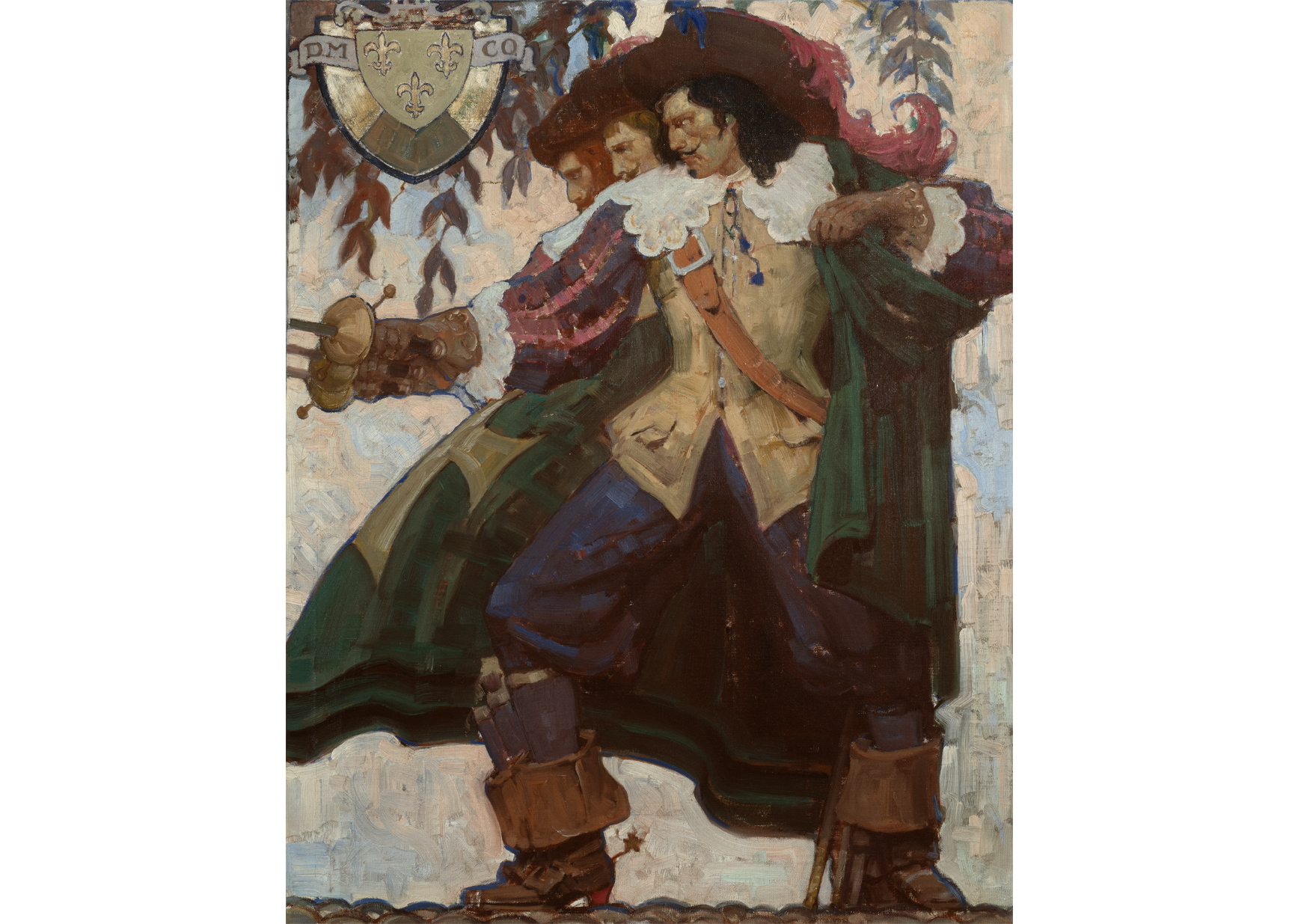 Cover for The Three Musketeers by Alexandre Dumas (Boston: Dodd, Mead and Company, 1929). Mead Schaeffer (1898–1980). Oil on canvas, 32 x 26 inches. Collection of Brock and Yvonne Vinton.
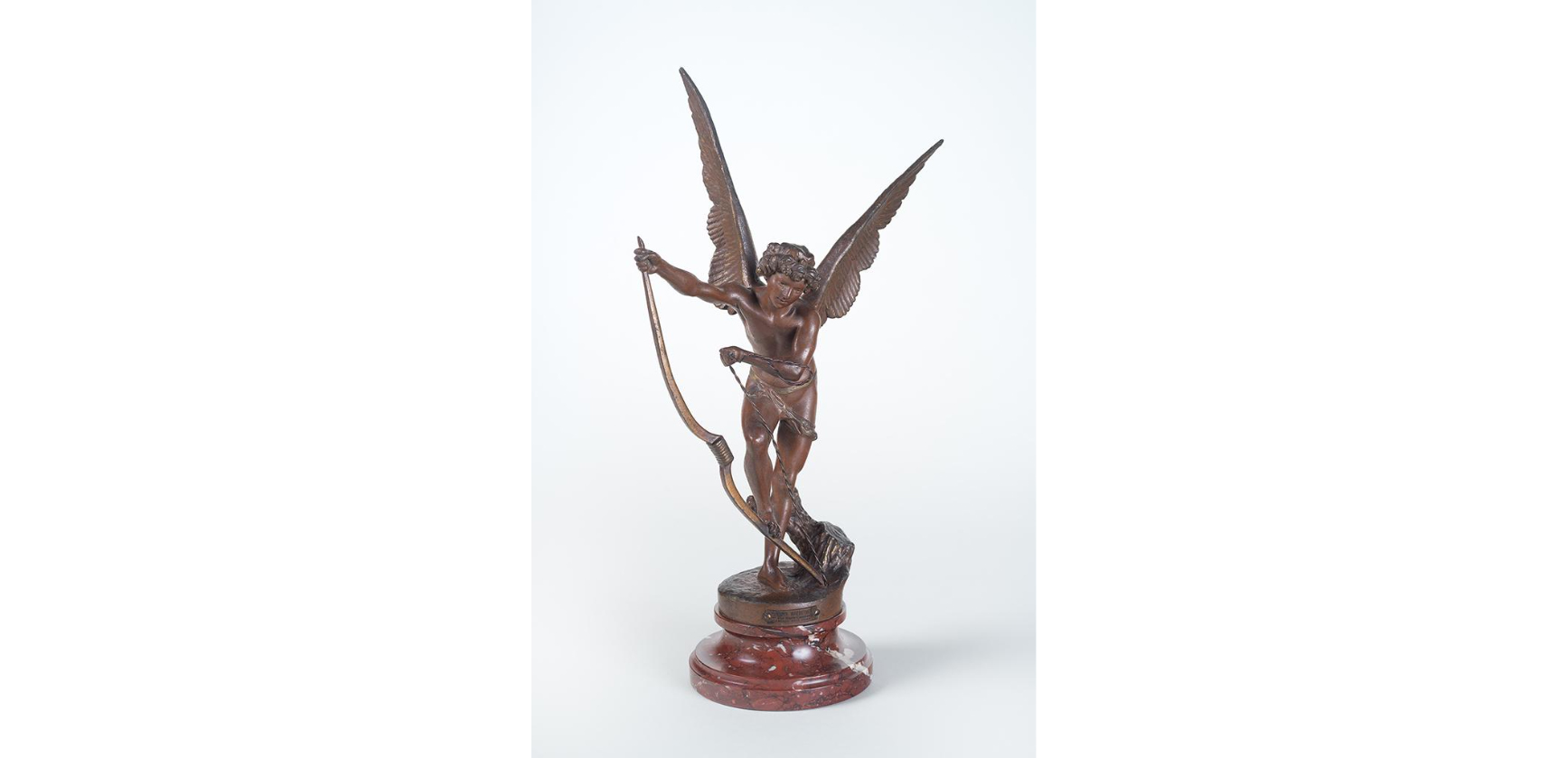 L’Amour Irresistible, 1896. Maria Zambaco (1843–1914). Spelter, patinated bronze, and gold. F. V. du Pont Acquisition Fund, 2022.
 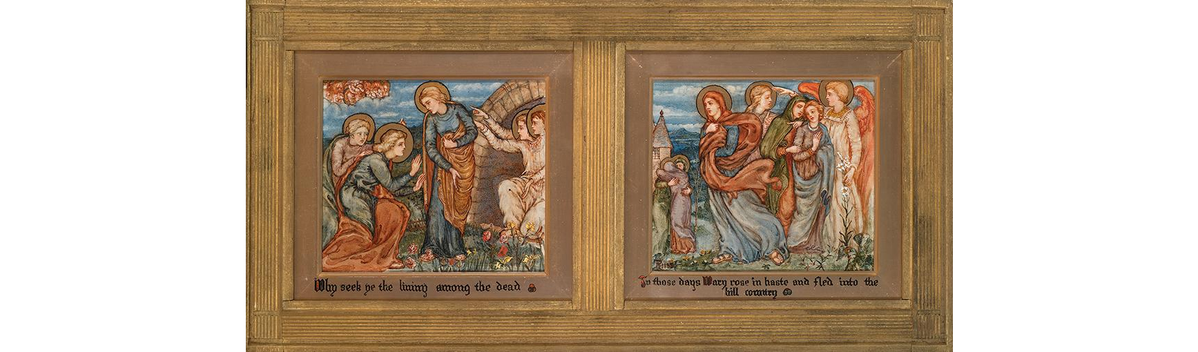 The Resurrection: Why seek Ye the Living among the Dead; In those days Mary rose in haste and fled into the hill country, 1888. Phoebe Anna Traquair (1852–1936). Each panel: 7 1/2 × 8 3/4 in. Delaware Art Museum, F. V. du Pont Acquisition Fund in honor of Thomas Clarkson Taylor Brokaw, 2023.
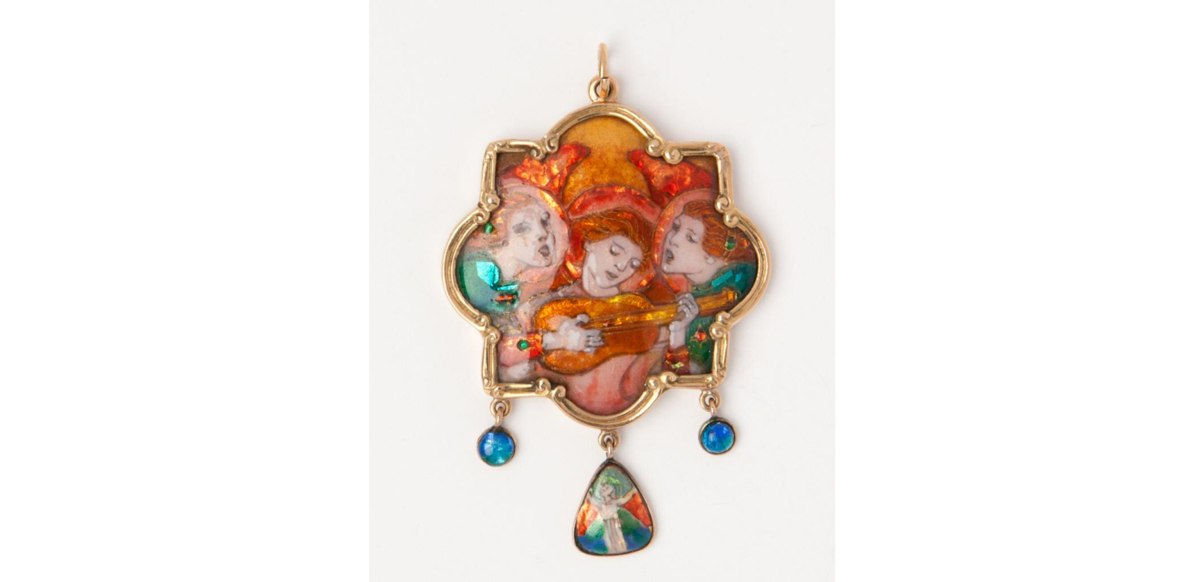 Pendant: The Song, 1904. Phoebe Anna Traquair (1852–1936). Polychrome enamel and silver foil on copper set in gold. 2 1/8 × 1 7/8 in. (5.4 × 4.8 cm). Gift of Mrs. H. W. Janson, 1976.
  St. Columba’s Farewell to the White Horse, 1868. Alice Boyd (1825–1897). Oil on board, 7/8 × 19 7/8 inches. Acquisition Fund, 2011.
 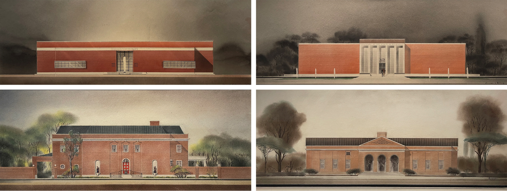 Four renderings of possible designs for the Delaware Art Museum by Victorine and Samuel Homsey, 1937.
 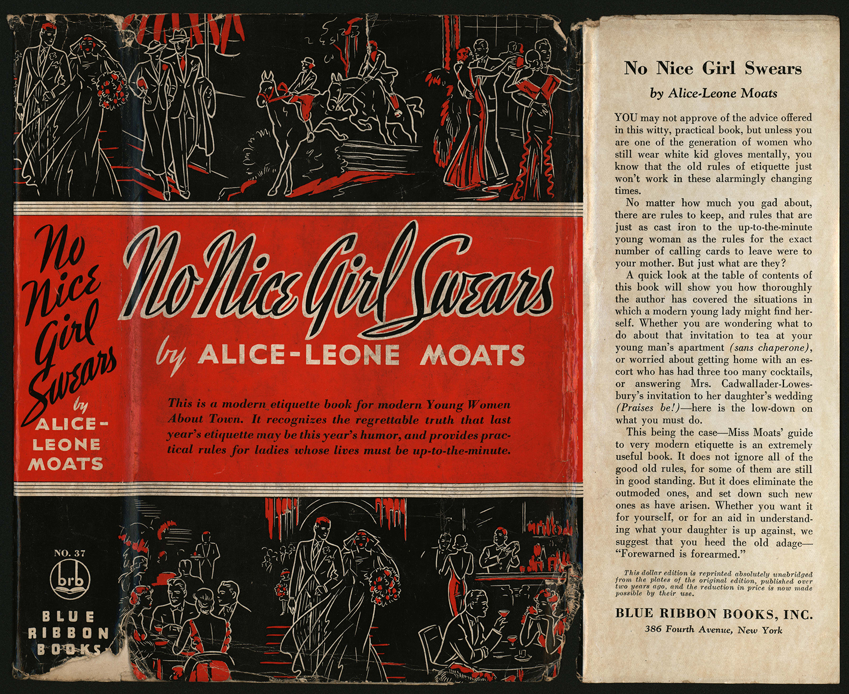 Book Jacket for No Nice Girl Swears by Alice-Leone Moats (New York: A. A. Knopf, 1933). Helen Farr Sloan Library & Archives, Delaware Art Museum.
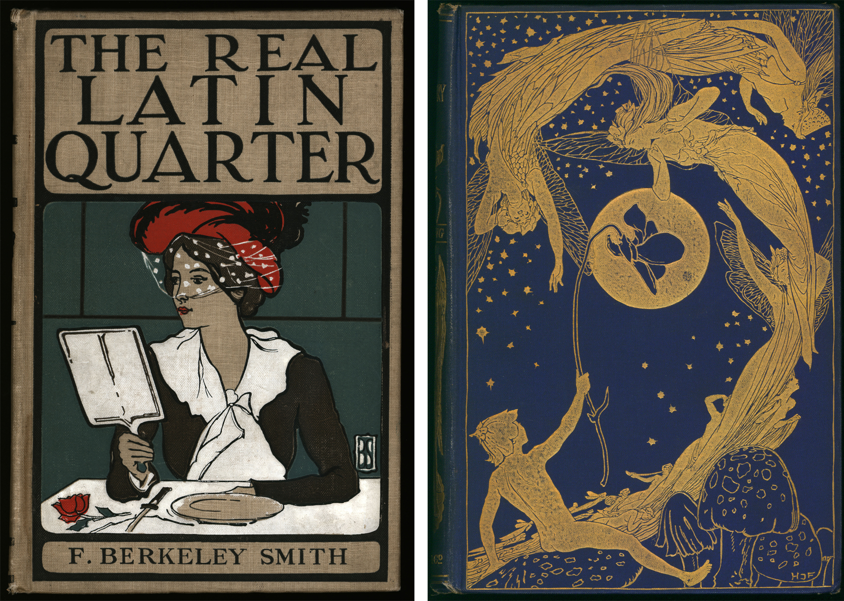 F. Berkeley Smith (1869-1931), binding for The Real Latin Quarter, by F. Berkeley Smith (New York: Funk & Wagnalls, 1901). M. G. Sawyer Collection of Decorative Bindings, Helen Farr Sloan Library & Archives. Henry Justice Ford (1860-1941), binding for The Violet Fairy Book, edited by Andrew Lang (London: Longman’s, Green, and Co., 1901). M. G. Sawyer Collection of Decorative Bindings, Helen Farr Sloan Library & Archives.
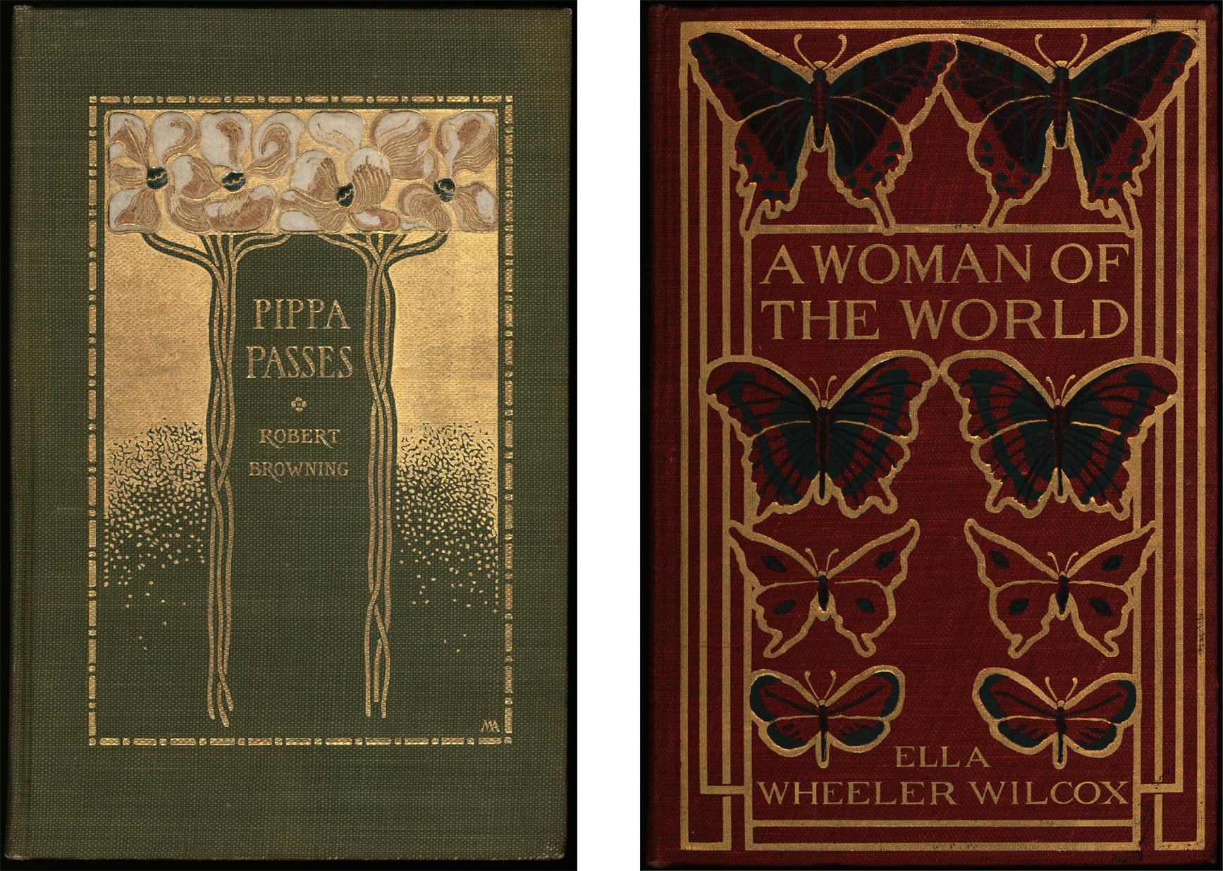 Margaret Armstrong (1867-1944), binding for Pippa Passes, by Robert Browning (New York: Dodd, Mead & Co., 1903). M. G. Sawyer Collection of Decorative Bindings, Helen Farr Sloan Library & Archives. A Woman of the World, by Ella Wheeler Wilcox (Boston: L. C. Page, 1905). M. G. Sawyer Collection of Decorative Bindings, Helen Farr Sloan Library & Archives.
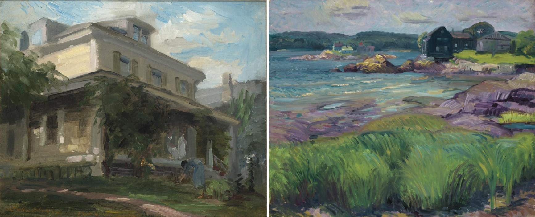 Left to right: Our Home, Fort Washington, Pennsylvania, I, 1910. John Sloan (1871–1951). Oil on linen mounted to board, 8 1/2 × 10 1/2 inches. Delaware Art Museum, Gift of Helen Farr Sloan, 1980.
© Delaware Art Museum / Artists Rights Society (ARS), New York. Green Grass and Purple Rocks, 1915. John Sloan (1871–1951). Oil on canvas, 20 1/4 × 24 1/4 inches. Delaware Art Museum, Gift of H. Beatty Chadwick, 1982. © Delaware Art Museum / Artists Rights Society (ARS), New York.
Left to right: Our Home, Fort Washington, Pennsylvania, I, 1910. John Sloan (1871–1951). Oil on linen mounted to board, 8 1/2 × 10 1/2 inches. Delaware Art Museum, Gift of Helen Farr Sloan, 1980.
© Delaware Art Museum / Artists Rights Society (ARS), New York. Green Grass and Purple Rocks, 1915. John Sloan (1871–1951). Oil on canvas, 20 1/4 × 24 1/4 inches. Delaware Art Museum, Gift of H. Beatty Chadwick, 1982. © Delaware Art Museum / Artists Rights Society (ARS), New York. 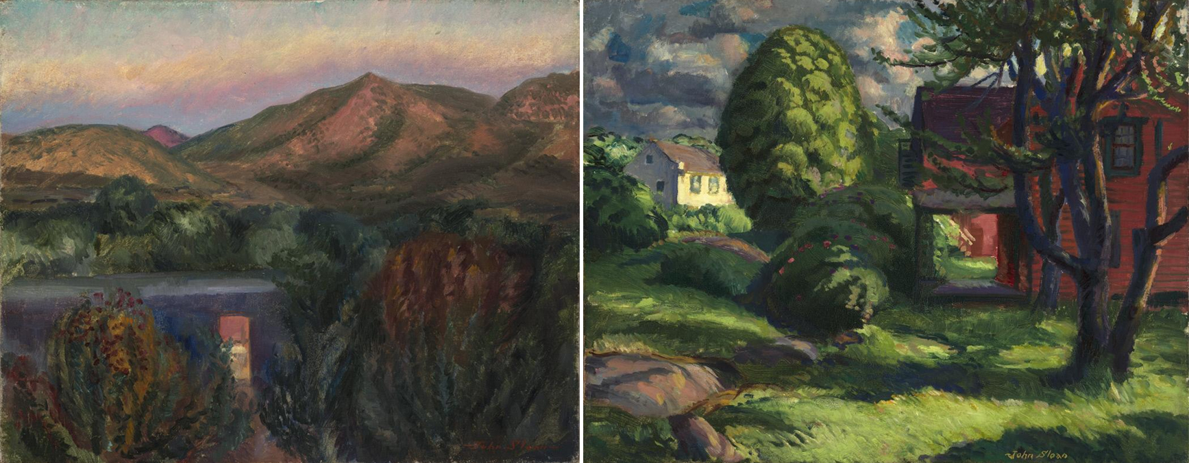 Left to right: East at Sunset, Kitchen Door, 1920. John Sloan (1871–1951). Oil on canvas, 16 × 20 inches. Delaware Art Museum, Gift of the John Sloan Trust, 2006. © Delaware Art Museum / Artists Rights Society (ARS), New York. Long Shadows, 1918. John Sloan (1871–1951). Oil on canvas, 20 × 26 inches. Delaware Art Museum, Gift of the John Sloan Trust, 2006. © Delaware Art Museum / Artists Rights Society (ARS), New York.
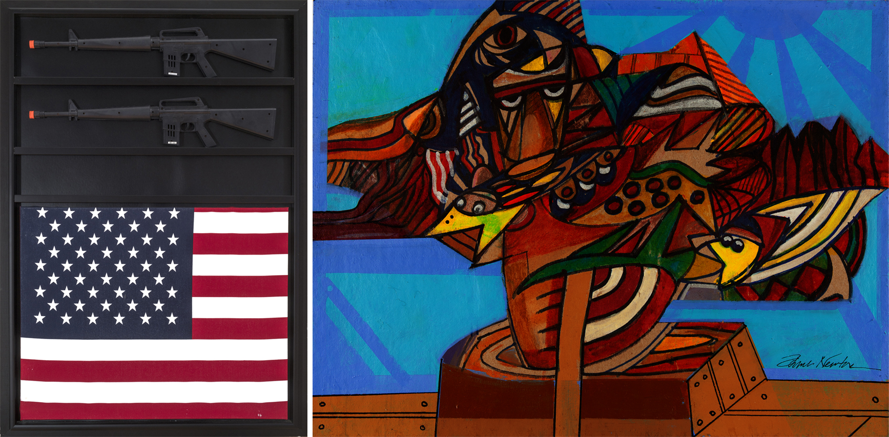 Left: American Sixties II, c. 1970. James E. Newton (1941–2022). Mixed media assemblage, 49 5/8 x 34 5/8 x 4 1/2 inches. Private Collection. © Estate of James E. Newton. Right: They Came Before Columbus VI, 2007. James E. Newton (1941–2022). Ink and acrylic on board, 12 × 16 inches. Private Collection. © Estate of James E. Newton.
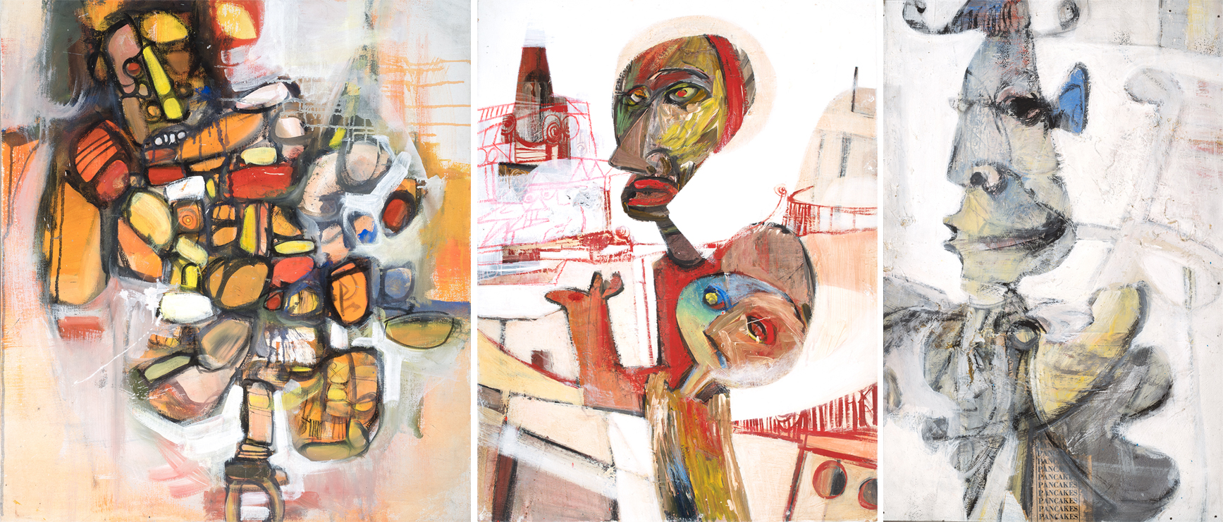 Left: Hunchback of Notre Dame, 1966. James E. Newton (1941–2022). Mixed media on canvas, 40 × 36 1/4 inches. Private Collection. © Estate of James E. Newton. Middle: Mausoleum of Lazarus, 1967. James E. Newton (1941–2022). Mixed media on board, 31 3/4 × 24 inches. Private Collection. © Estate of James E. Newton. Right: Don Quixote, 1966. James E. Newton (1941–2022). Mixed media on canvas, 23 × 15 inches. Private Collection. © Estate of James E. Newton.
 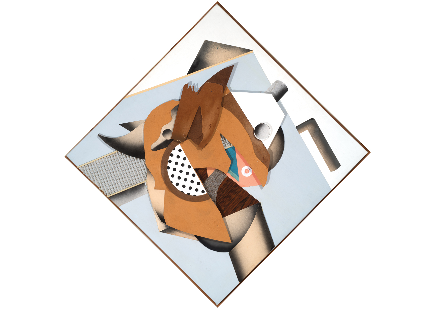 Piggly Wiggly, 1967. James E. Newton (1941–2022). Mixed media, 42 × 41 1/4 × 7 inches, support: 57 1/2 × 56 1/2 × 7 inches. Private Collection. © Estate of James E. Newton.
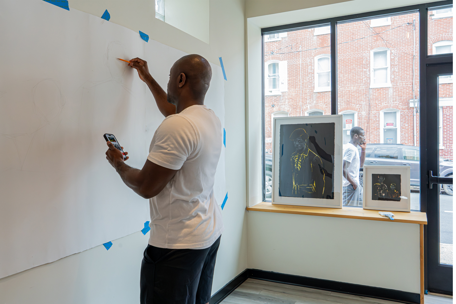
 Tight, 1993. Sharon Louden (born 1964). Ink and graphite on double sided mylar, 11 × 8 1/2 inches. Delaware Art Museum, Gift of Sally and Wynn Kramarsky, 2009. © Sharon Louden.
 Untitled, 1998. Alyson Shotz (born 1964). Mixed media on paper, 9 × 12 inches. Delaware Art Museum, Gift of Sally and Wynn Kramarsky, 2009. © Alyson Shotz.
 Mars Wanderings (detail)
 According to what, 2023. David Meyer (born 1963). Steel, variable dimensions. Courtesy of the artist. © David Meyer. Photo by Shannon Woodloe.
 Laura Briggs Photography.
 Meghan Newberry Photography. Sculpture:
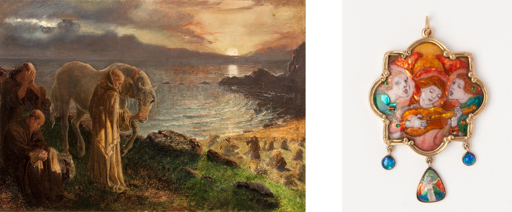
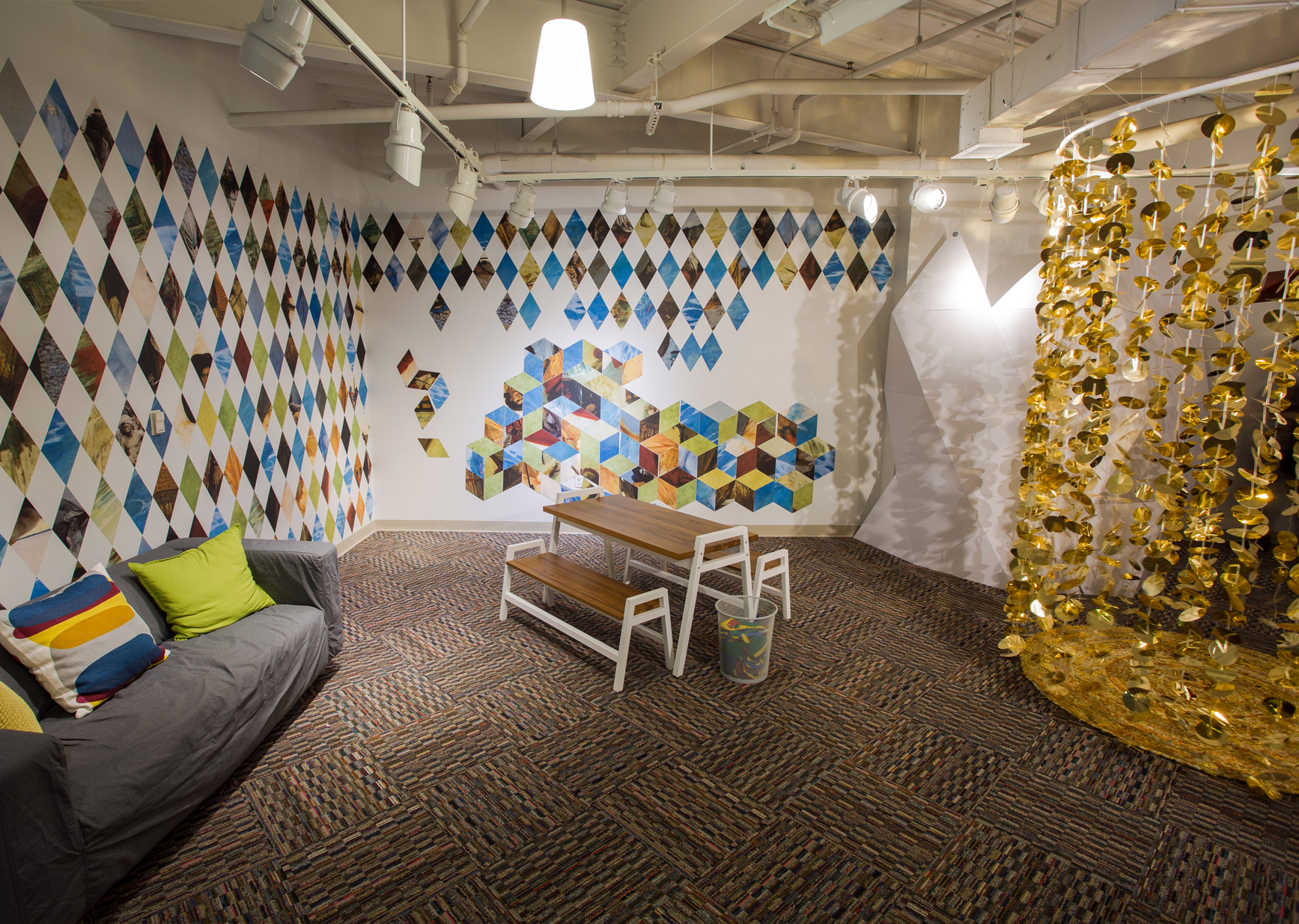 Kaleidoscope Cove was designed by the Volta Family in 2016.
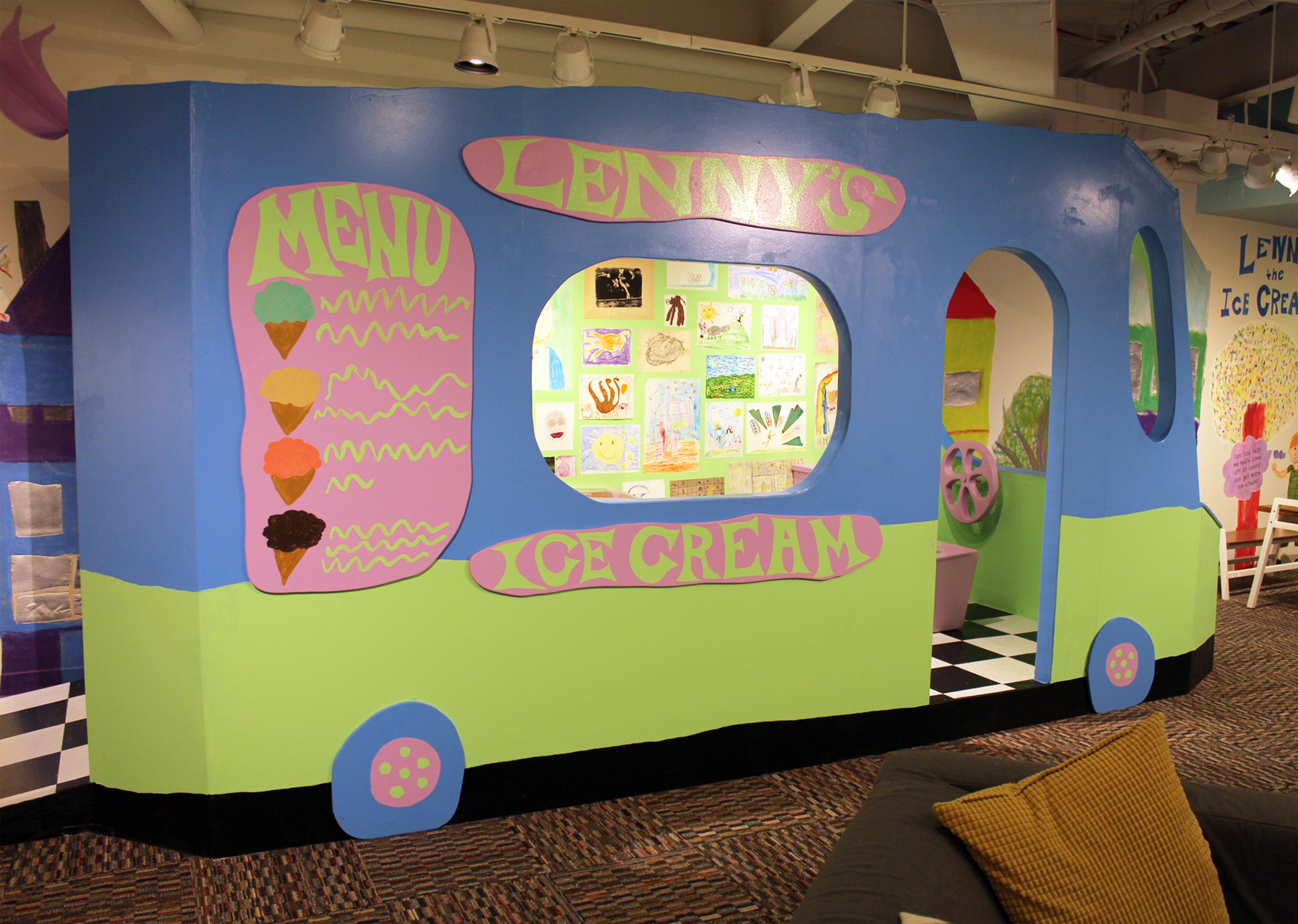 Lenny the Ice Cream Man was dreamed up by the Smith Family in 2017.
 Creative Power was the work of the Silverman Family in 2018.
 Glorious Truth (part 2) River Reporter, August 2022 (2), 2022. Anna Bogatin Ott (born 1970). Metallic paint on newspaper, 12 13/16 × 19 7/8 inches. sheet: 13 5/8 × 20 7/8 in. (34.6 × 53 cm). Courtesy of the artist. © Anna Bogatin Ott.
 Left to right: Moon_1L21, 2019 – 2022. Anna Bogatin Ott (born 1970). Archival pigment print on aluminum, 12 × 12 inches. Courtesy of the artist. © Anna Bogatin Ott. Mars_15L2B, 2021 – 2022. Anna Bogatin Ott (born 1970). Archival pigment print on aluminum, 12 × 12 inches. Courtesy of the artist. © Anna Bogatin Ott.
 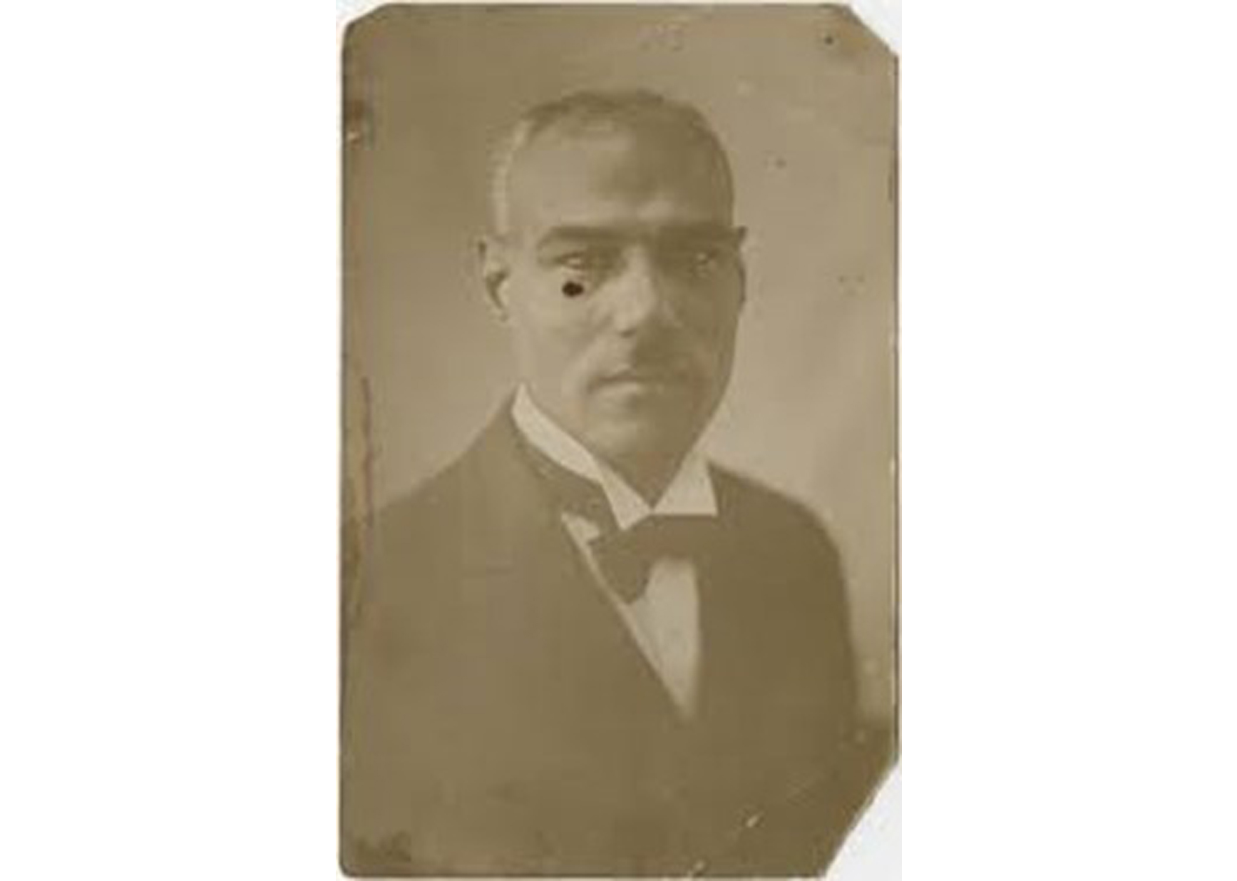 Portrait of Edwin Harleston (1882 – 1931). Courtesy of the College of Charleston
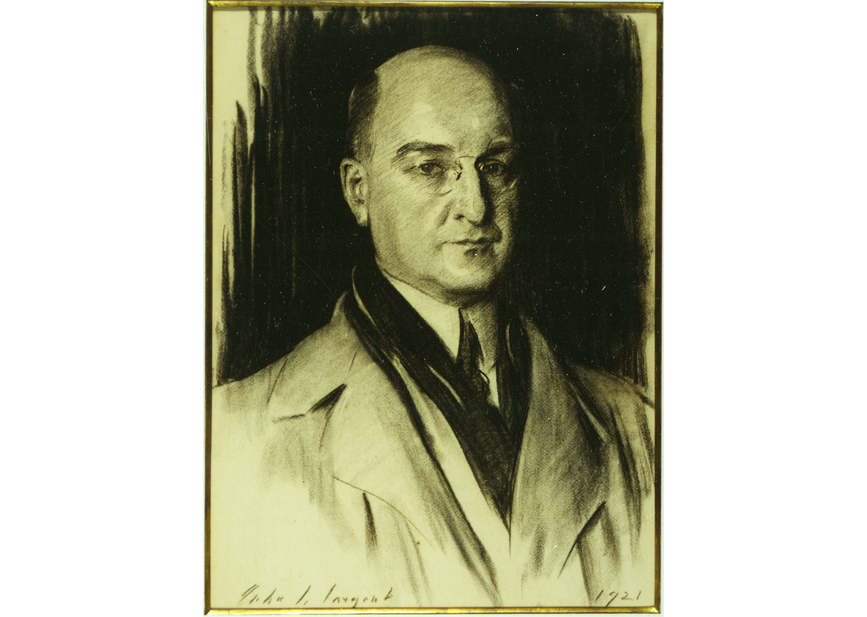 John Singer Sargent (1856 – 1925). Portrait of Pierre S. Dupont (1921). Image courtesy of Longwood Gardens
 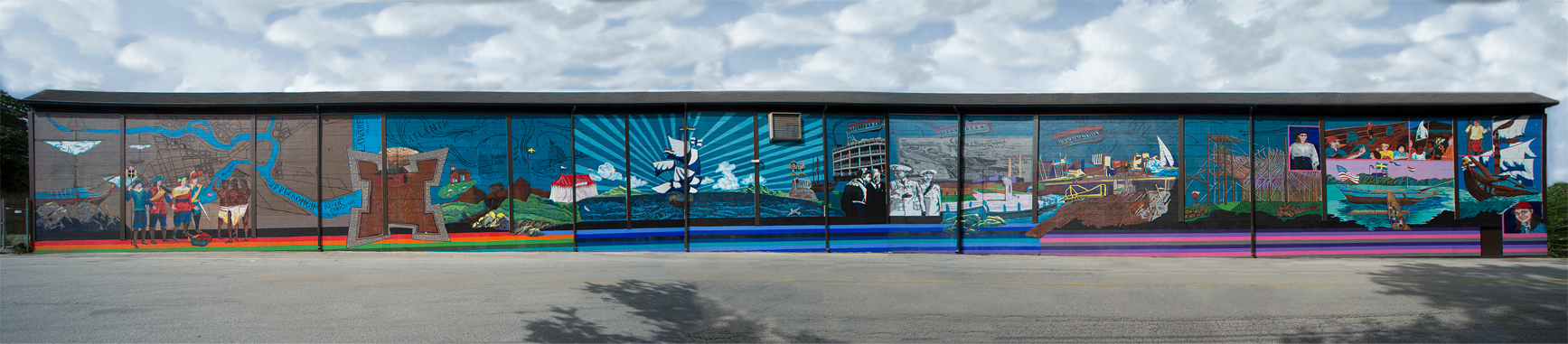 Full length Kalmar Nyckel Mural courtesy of Michael Kalmbach.
 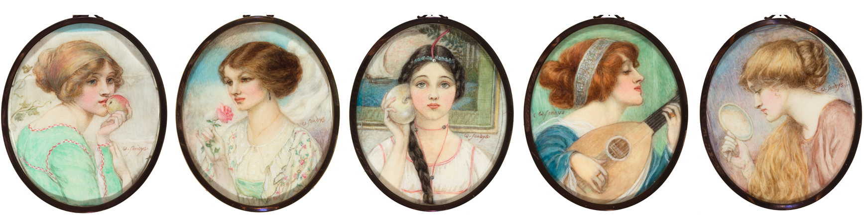 Left to Right: Taste; Smell; Hearing; Touch; Seeing, 1911-1912. Winifred Sandys (1875–1944). Watercolor on ivory, 3 × 2 1/2 inches. Delaware Art Museum, Samuel and Mary R. Bancroft Memorial, 1935.
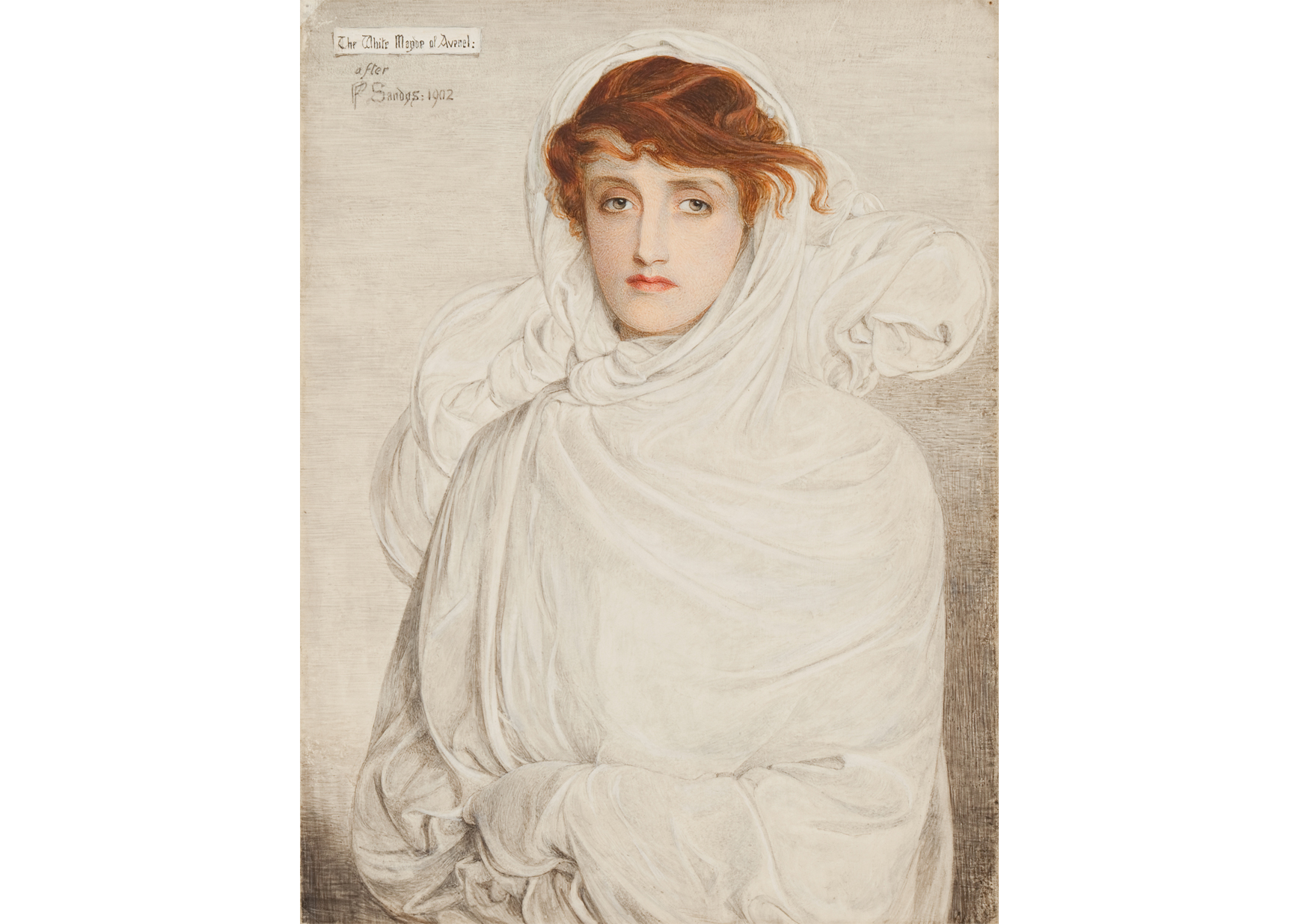 White Mayde of Avenel, after 1902. Winifred Sandys (1875–1944). Watercolor on vellum, 8 × 6 inches. Delaware Art Museum, Samuel and Mary R. Bancroft Memorial, 1935.
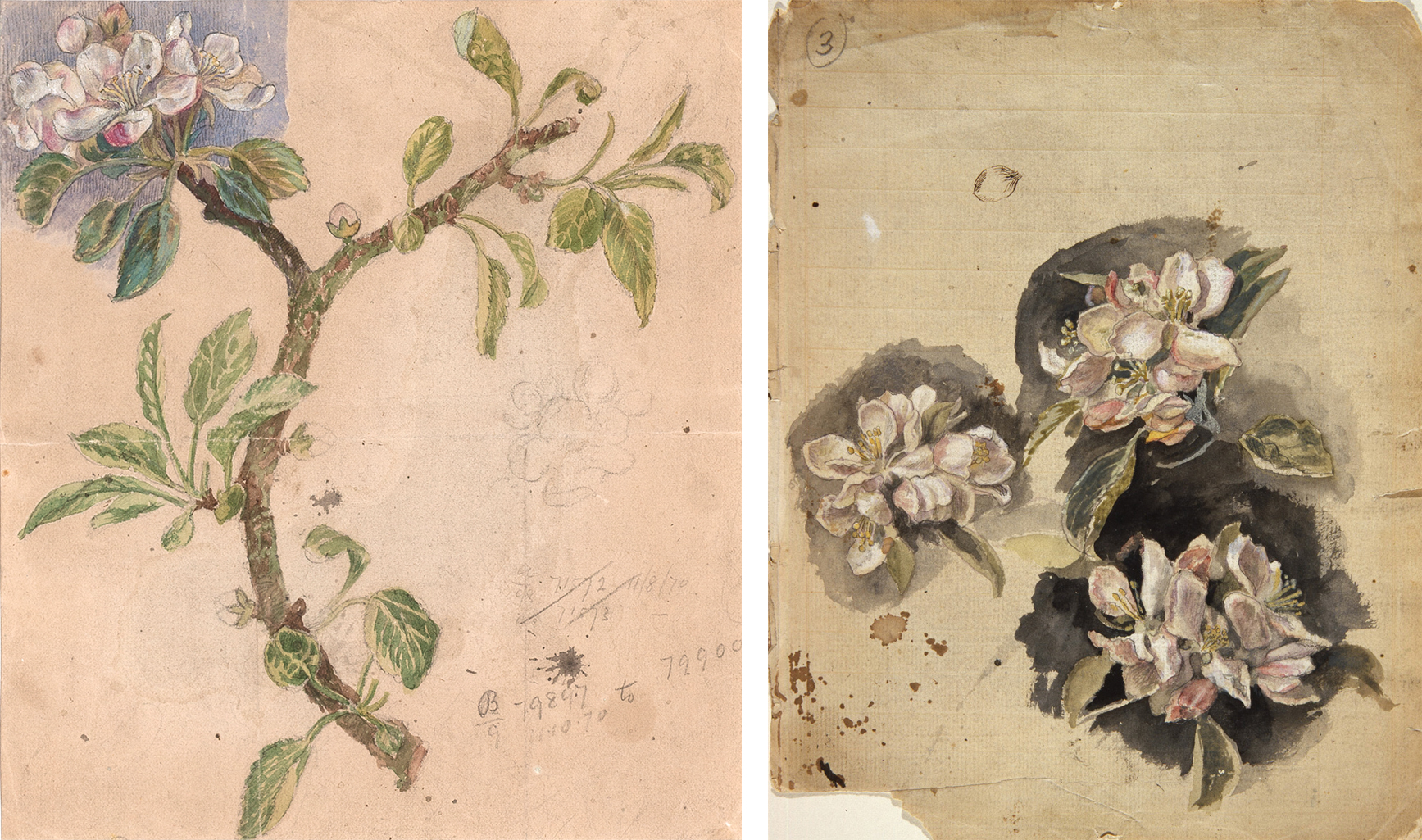 Left: Apple Stem, 1878. Frederic James Shields (1833–1911). Graphite, watercolor and gouache on buff paper, 9 × 7 1/2 in. Delaware Art Museum, Samuel and Mary R. Bancroft Memorial, 1935.
Right: Apple Blossom, c. 1878. Frederic James Shields (1833–1911). Graphite, ink, watercolor, and gouache on buff paper, 9 9/16 x 7 11/16 in. Delaware Art Museum, Samuel and Mary R. Bancroft Memorial, 1935.
Left: Apple Stem, 1878. Frederic James Shields (1833–1911). Graphite, watercolor and gouache on buff paper, 9 × 7 1/2 in. Delaware Art Museum, Samuel and Mary R. Bancroft Memorial, 1935.
Right: Apple Blossom, c. 1878. Frederic James Shields (1833–1911). Graphite, ink, watercolor, and gouache on buff paper, 9 9/16 x 7 11/16 in. Delaware Art Museum, Samuel and Mary R. Bancroft Memorial, 1935.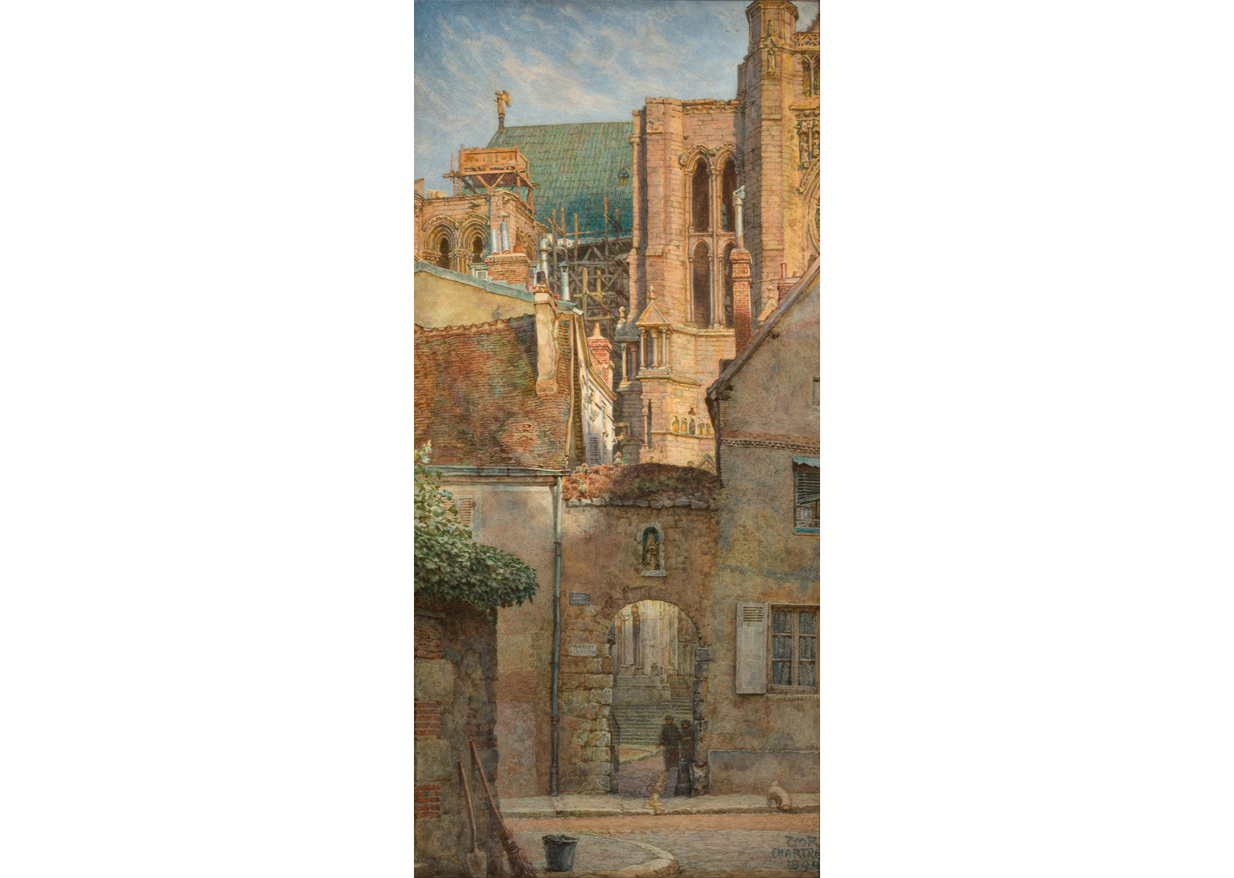 A Gate leading to the North Transept of Chartres Cathedral, France, 1894. Thomas Matthews Rooke (1842–1942). Watercolor over graphite, 19 1/4 × 9 ¼ in. Delaware Art Museum, Samuel and Mary R. Bancroft Memorial, 1935.
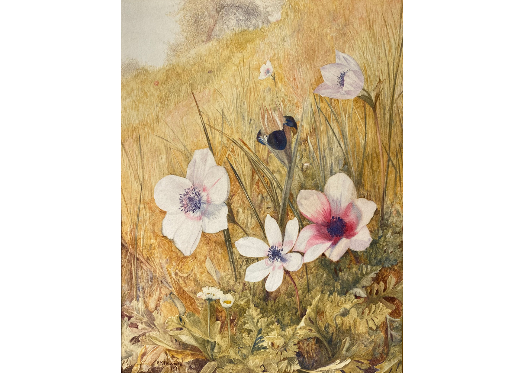 Anemones, 1884. Henry Roderick Newman (1843–1917). Watercolor on paper, 9 1/2 × 7 1/4 in. Paul Worman Fine Art, Worcester, MA.
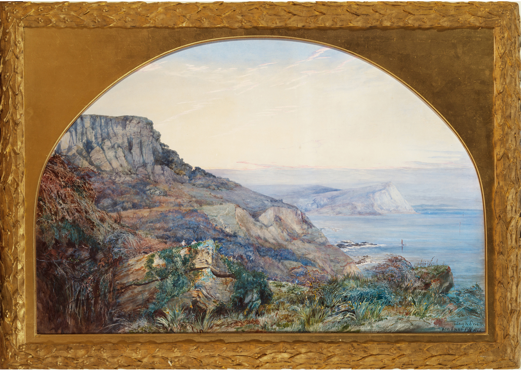 Ventnor, Isle of Wight, 1856. Barbara Leigh Smith Bodichon (1827–1891). Watercolor and gouache on paper [with scratching out], 28 × 42 1/2 inches. Delaware Art Museum, F. V. du Pont Acquisition Fund, 2016.
 Figure 2. Promotional paper band, which originally would have been wrapped around the dust jacket
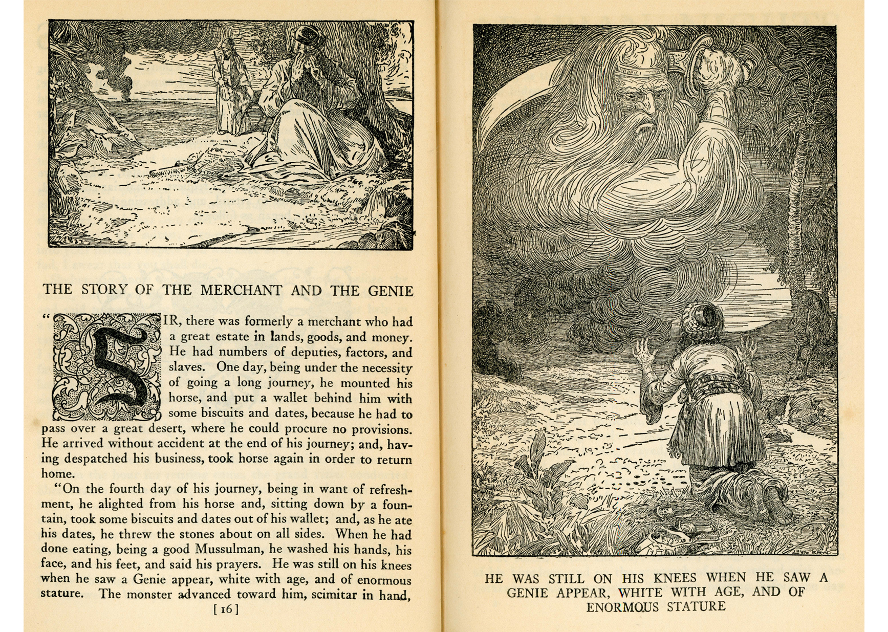 Figure 3. Rhead’s illustrations from The Arabian Nights Entertainments
 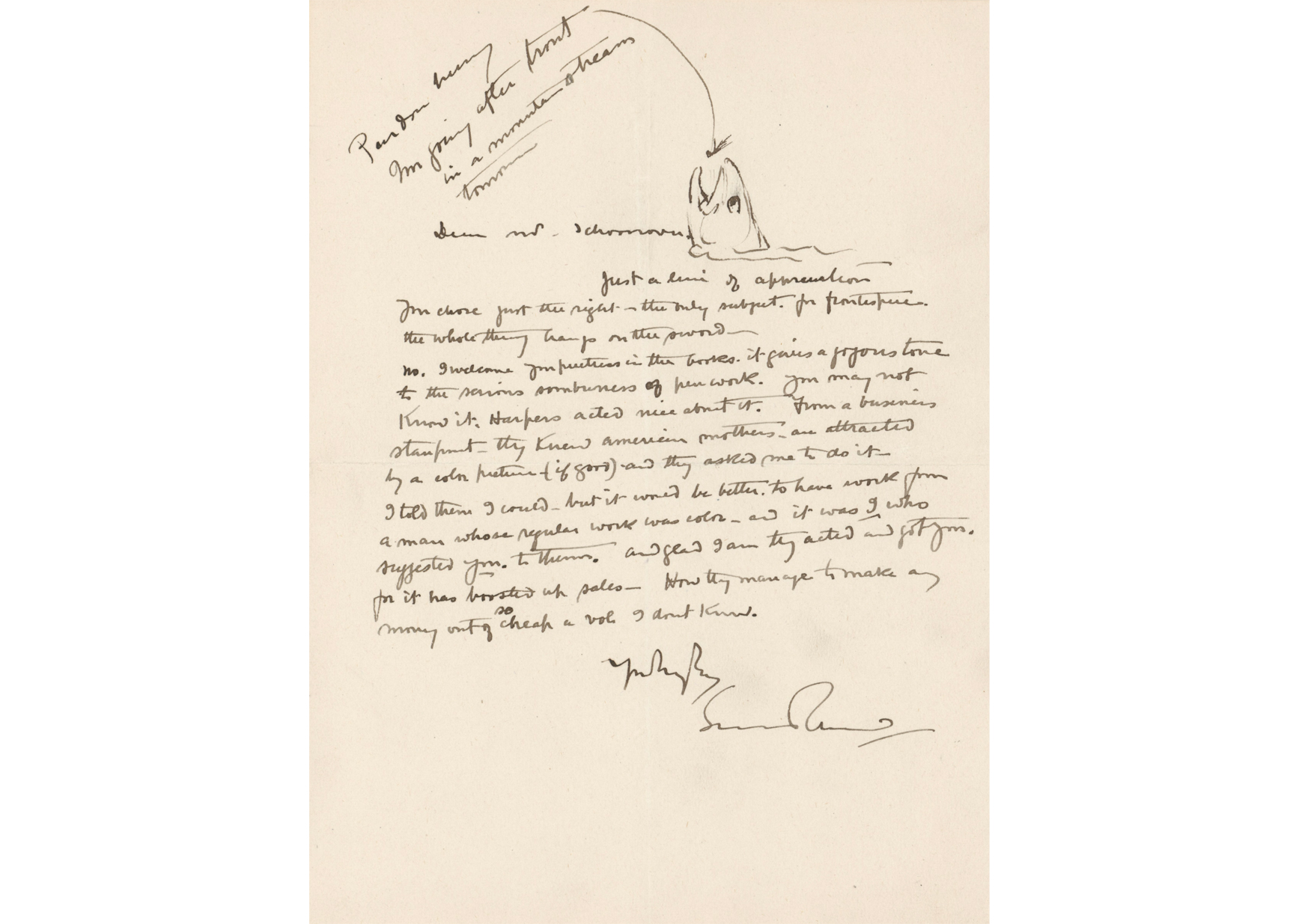 Figure 4. Letter from Louis Rhead to Frank E. Schoonover, c. 1923. Frank E. Schoonover Manuscript Collection, Helen Farr Sloan Library & Archives, Delaware Art Museum
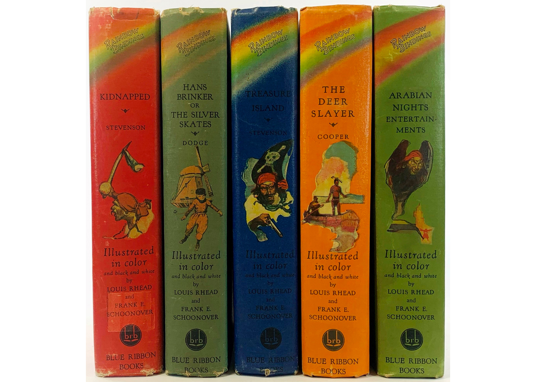 Figure 5. A selection of Rainbow Bindings from the Frank E. Schoonover Library Collection showing Schoonover’s spine illustrations
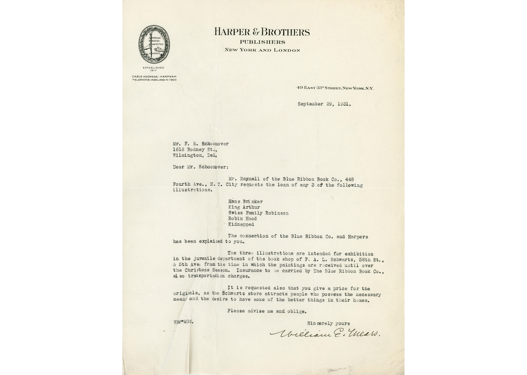 Figure 6. Letter from William E. Mears, Harper & Brothers, to Frank E. Schoonover, 1931. Frank E. Schoonover Manuscript Collection, Helen Farr Sloan Library & Archives, Delaware Art Museum. In this letter Mears asks Schoonover to send three of his original paintings for display in the book department of F. A. O. Schwartz over the Christmas season. He also requests a price for the originals, “as the Schwartz store attracts people who possess the necessary means and the desire to have some of the better things in their homes.” Schoonover sent five paintings for display, all of which were returned to him in early 1932.
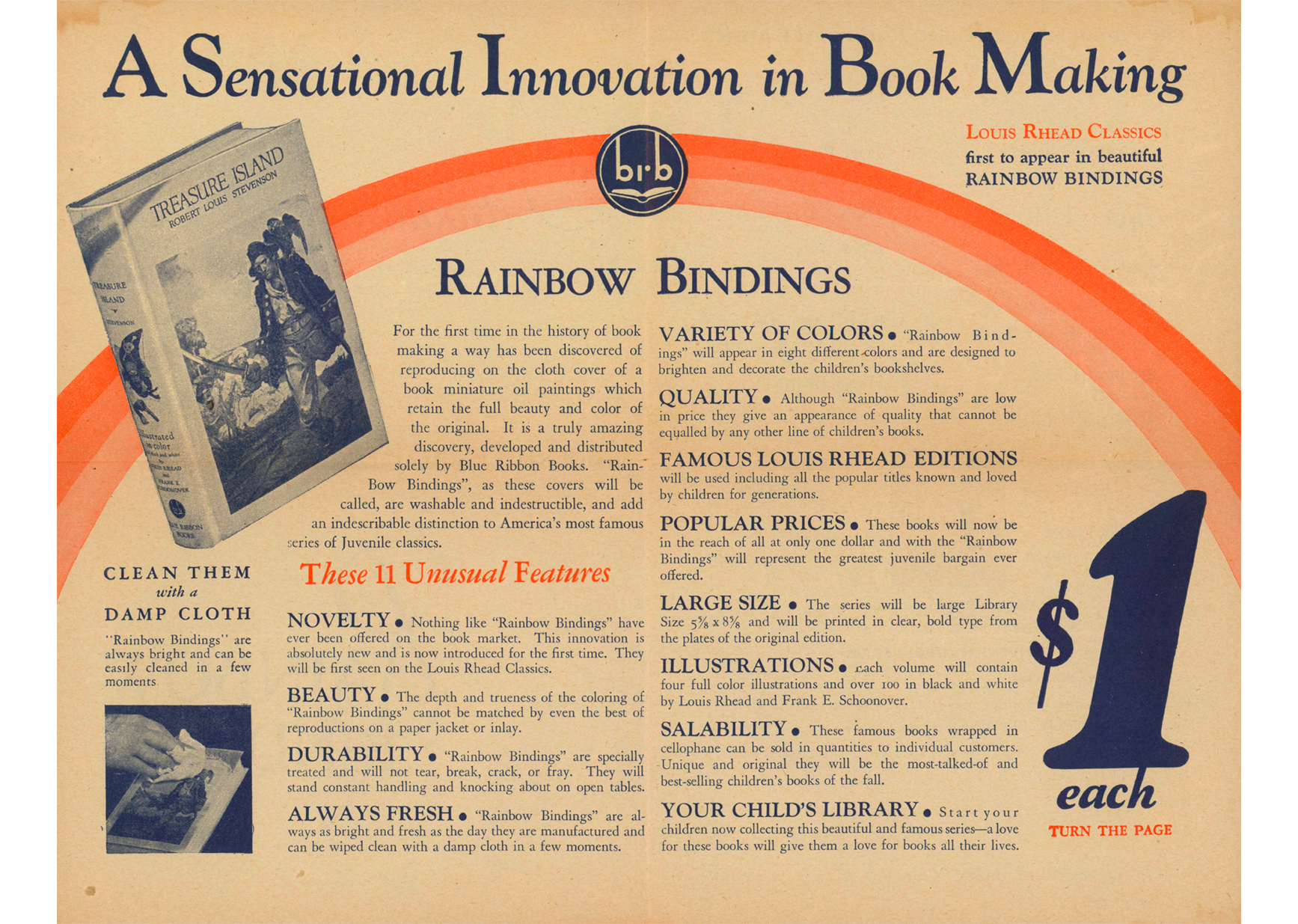
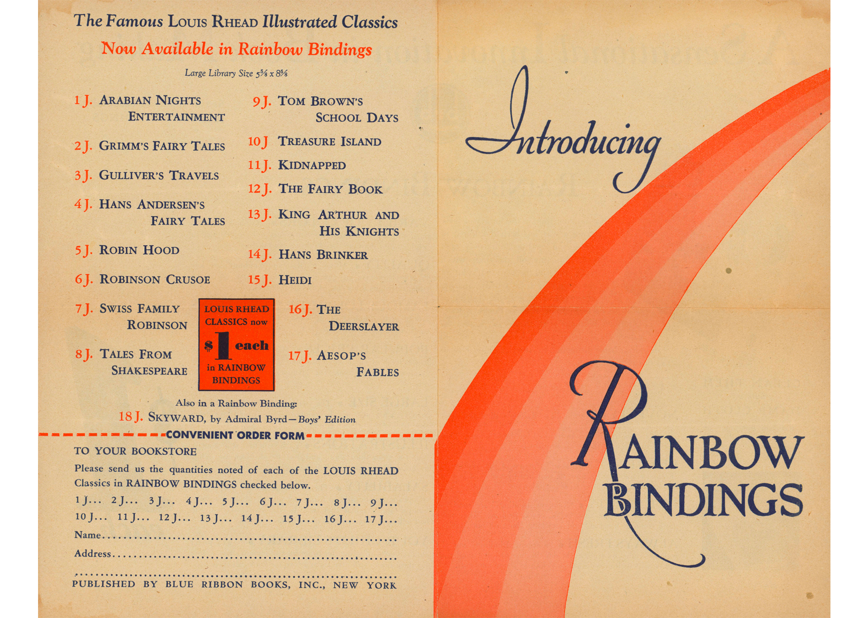 Figures 7 and 8. “Introducing Rainbow Bindings” advertising brochure. Helen Farr Sloan Library & Archives, Delaware Art Museum, Gift of Robert and Mary Walsh.
 Left to right: Square, Circles, Arcs, and Lines Together, 2019. Wes Memeger (born 1939). Acrylic on canvas, 72 x 72 inches. Courtesy of the artist. © Wes Memeger. Square Dance, 1999–2000. Wes Memeger (born 1939). Acrylic on canvas, 48 x 48 inches. Courtesy of the artist. © Wes Memeger.
 Ziptych with Solid Cylinder Plus 3 Open Cylinders, 2017. Wes Memeger (born 1939). Acrylic on shaped canvas with acrylic and Plexiglas, cylinders on board, 27 7/8 x 74 x 1 ½ inches. Courtesy of the artist. © Wes Memeger.
  Left to right: Towards Disharmony II, 2003. Wes Memeger (born 1939). Acrylic on canvas, 36 x 36 inches. Collection of Kim Memeger. © Wes Memeger. Towards Harmony, 2004. Wes Memeger (born 1939). Acrylic on canvas, 12 x 12 inches. Courtesy of the artist. © Wes Memeger.

 Left to right:
  Left to right: Hieronymus Bosch: Garden of Earthly Delights, 2015. Stan Smokler (born 1944). Welded steel assemblage with found and fabricated objects, bronze, and paint, 49 × 29 × 28 inches. Courtesy of the artist. © Stan Smokler. Photograph by Terry Roberts. | Fibonacci, 2013. Stan Smokler (born 1944). Steel and paint, 20 x 19 x 13 inches. Courtesy of the artist. © Stan Smokler. Photograph by Terry Roberts.
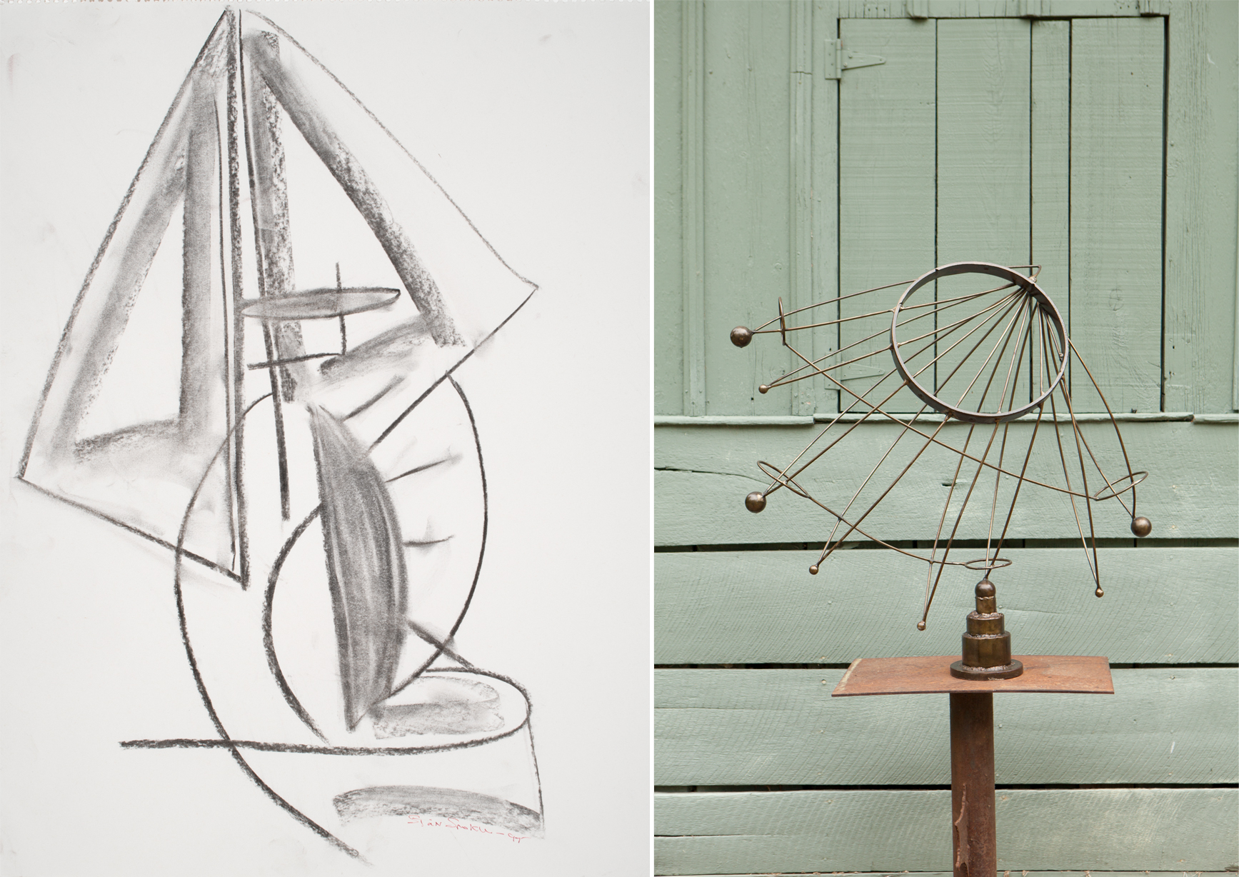 Left to right: Untitled drawing, 1997. Stan Smoker (born 1944). Charcoal on paper, 24 x 18 inches. Courtesy of the artist. © Stan Smokler. Photograph by Carson Zullinger. | Hemisphere, 2009. Stan Smokler (born 1944). Steel, 37 x 38 x 18 inches. © Stan Smokler. Photograph by Terry Roberts.
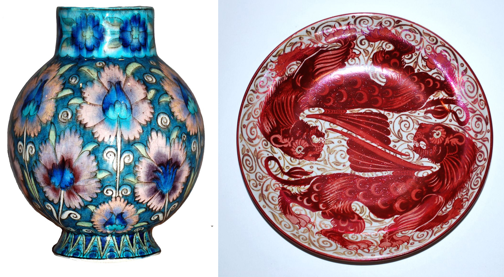 Left to right – Figure 2: William De Morgan, Vase with persian floral decoration, 1888-1897. Earthenware. De Morgan Foundation. Figure 3: William De Morgan, Red and gold lustre dish with winged felines, 1872-1904. Earthenware. De Morgan Foundation.
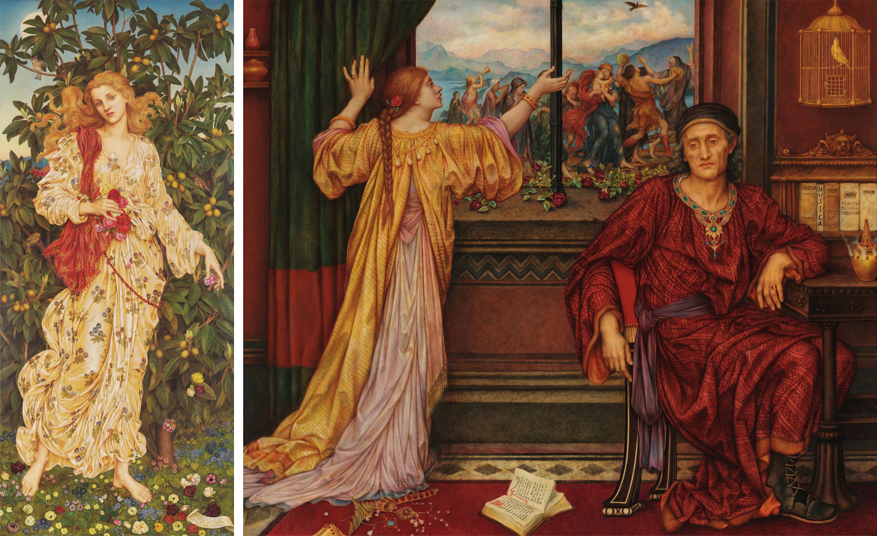 Left to right – Figure 4: Evelyn De Morgan, Flora, 1894. Oil on canvas. De Morgan Collection, Courtesy of the De Morgan Foundation. Figure 5: Evelyn De Morgan, The Gilded Cage, c. 1900. Oil on canvas. De Morgan Collection, Courtesy of the De Morgan Foundation.
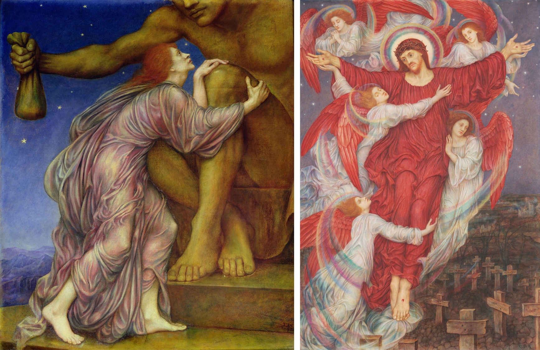 Left to right – Figure 6: Evelyn De Morgan, The Worship of Mammon, 1900-1909. Oil on canvas. De Morgan Collection, Courtesy of the De Morgan Foundation. Figure 7: Evelyn De Morgan, The Red Cross, 1914-1916. Oil on canvas. De Morgan Collection, Courtesy of the De Morgan Foundation.
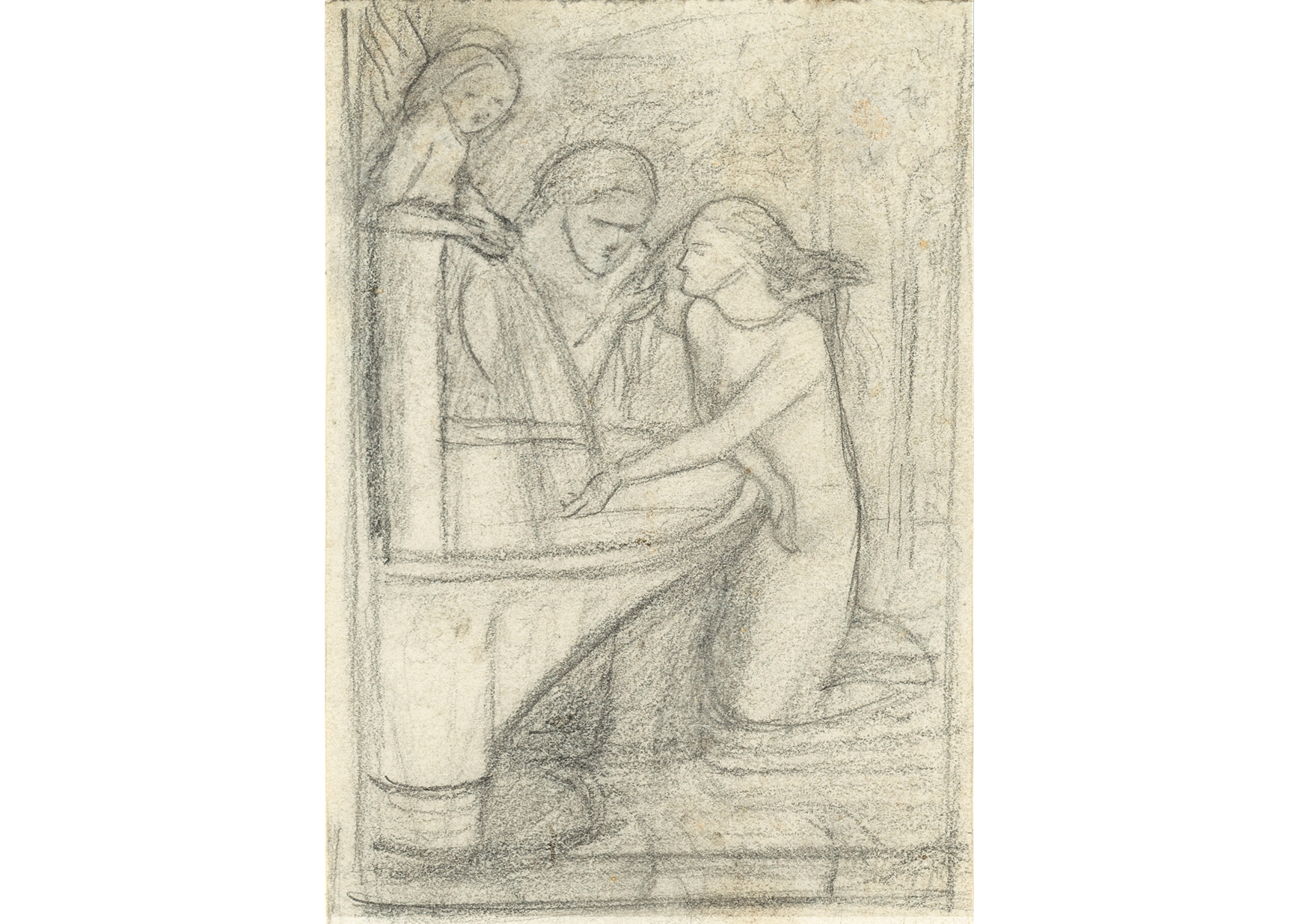 ILL. #2: Sketch for ‘La Belle Dame sans merci’, c. 1855. Elizabeth Eleanor Siddal (1829–1862). Graphite on paper, image: 4 1/8 × 2 7/8 inches. Delaware Art Museum, Acquisition Fund, 2007.
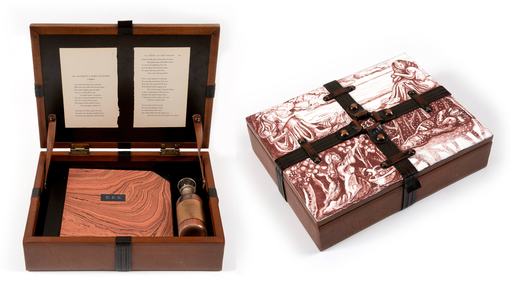 ILLs. #3 and #4: Elizabeth Siddal: ‘I Wake Again’, 2020. Holly Trostle Brigham (born 1965). Painted and velvet lined wooden box with metal hinges; leather book with lithography, screen print, hair, and hand dyed paper; dried pigment in apothecary bottle and book pages, 10 1/4 × 13 × 3 1/4 inches. Courtesy of the artist. © Holly Trostle Brigham.
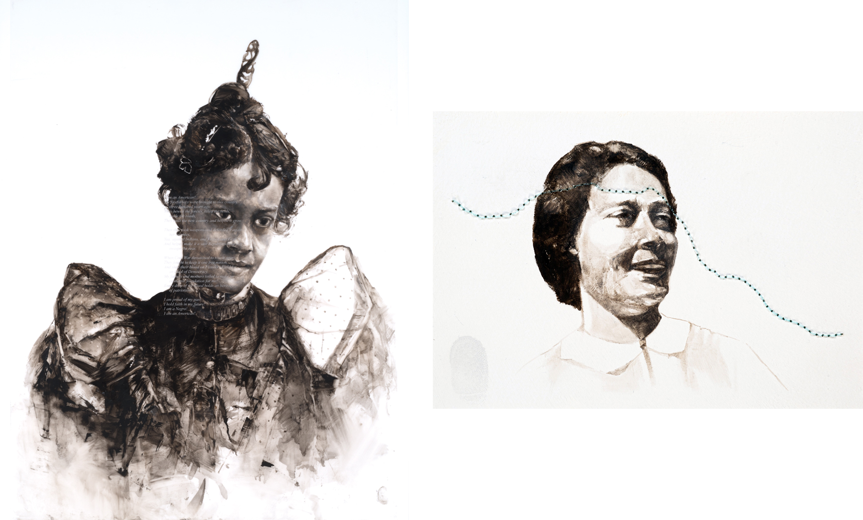 Left to right: I AM (Queen), 2021. Charles Edward Williams (born 1984). Oil on mylar with etched glass, 36 1/2 x 25 3/4 inches. Commissioned by the Delaware Art Museum; Acquisition Fund, 2021. © Charles Edward Williams. | Wish You Were Here #2, 2021. Charles Edward Williams (born 1984). Oil, fishing line on watercolor paper, 5 x 7 inches. Commissioned
by the Delaware Art Museum. Courtesy of the artist. © Charles Edward Williams.
Left to right: I AM (Queen), 2021. Charles Edward Williams (born 1984). Oil on mylar with etched glass, 36 1/2 x 25 3/4 inches. Commissioned by the Delaware Art Museum; Acquisition Fund, 2021. © Charles Edward Williams. | Wish You Were Here #2, 2021. Charles Edward Williams (born 1984). Oil, fishing line on watercolor paper, 5 x 7 inches. Commissioned
by the Delaware Art Museum. Courtesy of the artist. © Charles Edward Williams. Photograph by Mitchell Kearney.
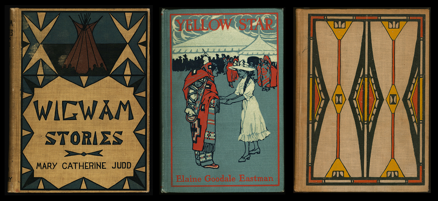 Left to right: Wigwam Stories told by North American Indians, by Mary Catherine Judd (Boston: Ginn & Company, 1901), Special Collections, Helen Farr Sloan Library and Archives, Delaware Art Museum. | Yellow Star, by Elaine Goodale Eastman (Boston: Little, Brown and Company, 1911), Special Collections, Helen Farr Sloan Library and Archives, Delaware Art Museum. | The Indians’ Book, by Natalie Curtis (New York: Harper and Brothers, 1923), Special Collections, Helen Farr Sloan Library and Archives, Delaware Art Museum.
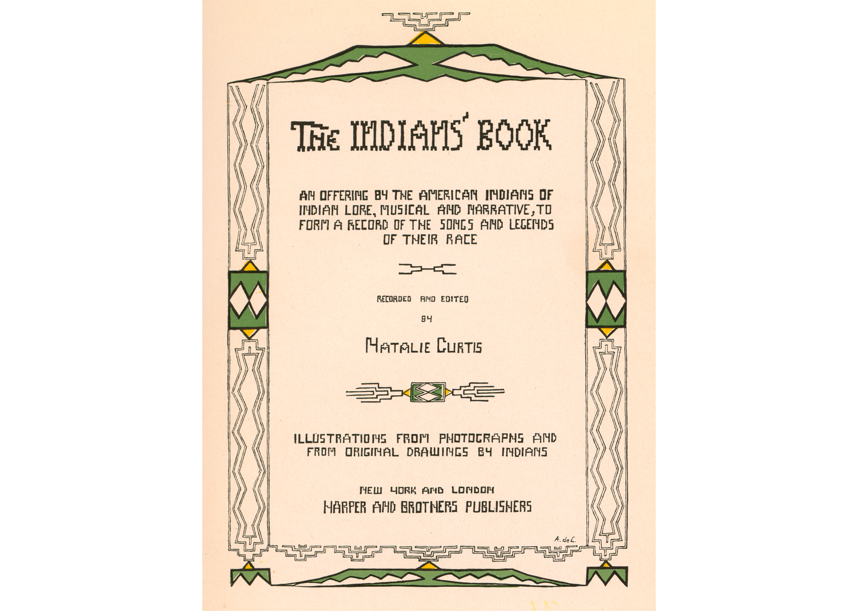 Title page for The Indians’ Book, by Natalie Curtis (New York: Harper and Brothers, 1923). Angel De Cora (c. 1868-1919). Special Collections, Helen Farr Sloan Library and Archives, Delaware Art Museum.
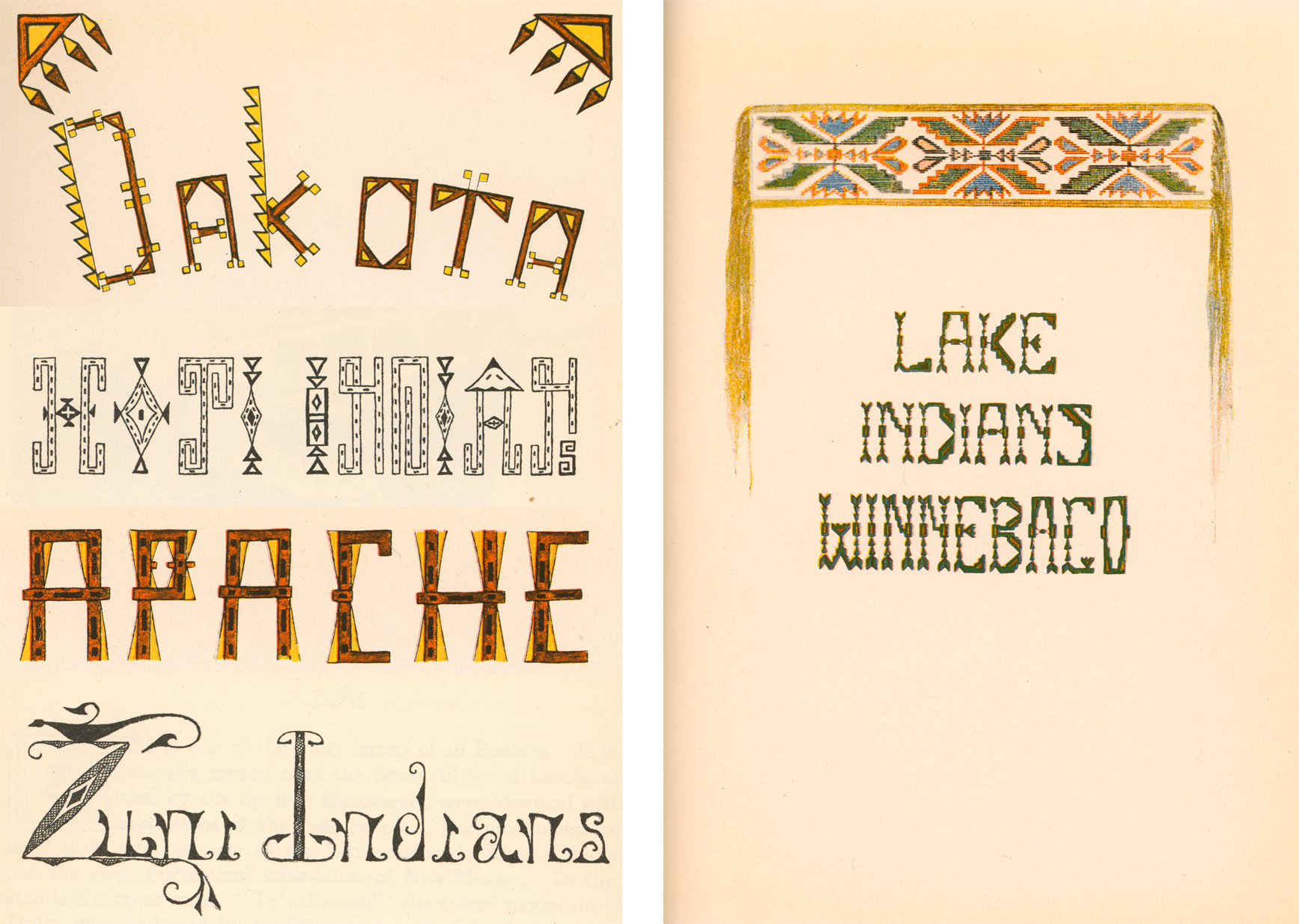 Chapter title page lettering for The Indians’ Book, by Natalie Curtis (New York: Harper and Brothers, 1923). Angel De Cora (c. 1868-1919). Special Collections, Helen Farr Sloan Library and Archives, Delaware Art Museum.
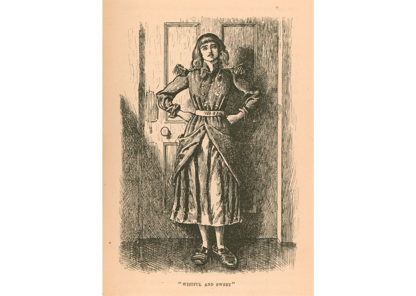 Wistful and sweet, from Trilby, by George du Maurier (New York: Harper & Brothers, 1895). M. G. Sawyer Collection of Decorative Bindings, Helen Farr Sloan Library & Archives, Delaware Art Museum.
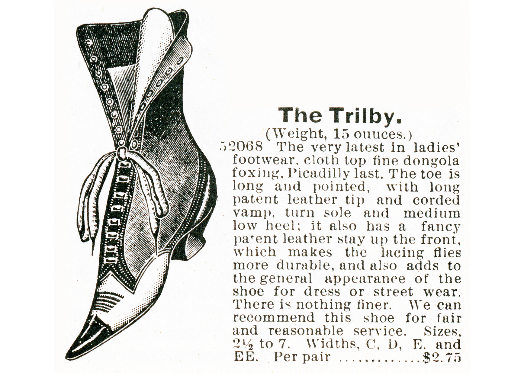 Advertisement for The Trilby from the Montgomery Ward & Company Catalogue & Buyers’ Guide, 1895. Helen Farr Sloan Library & Archives, Delaware Art Museum.
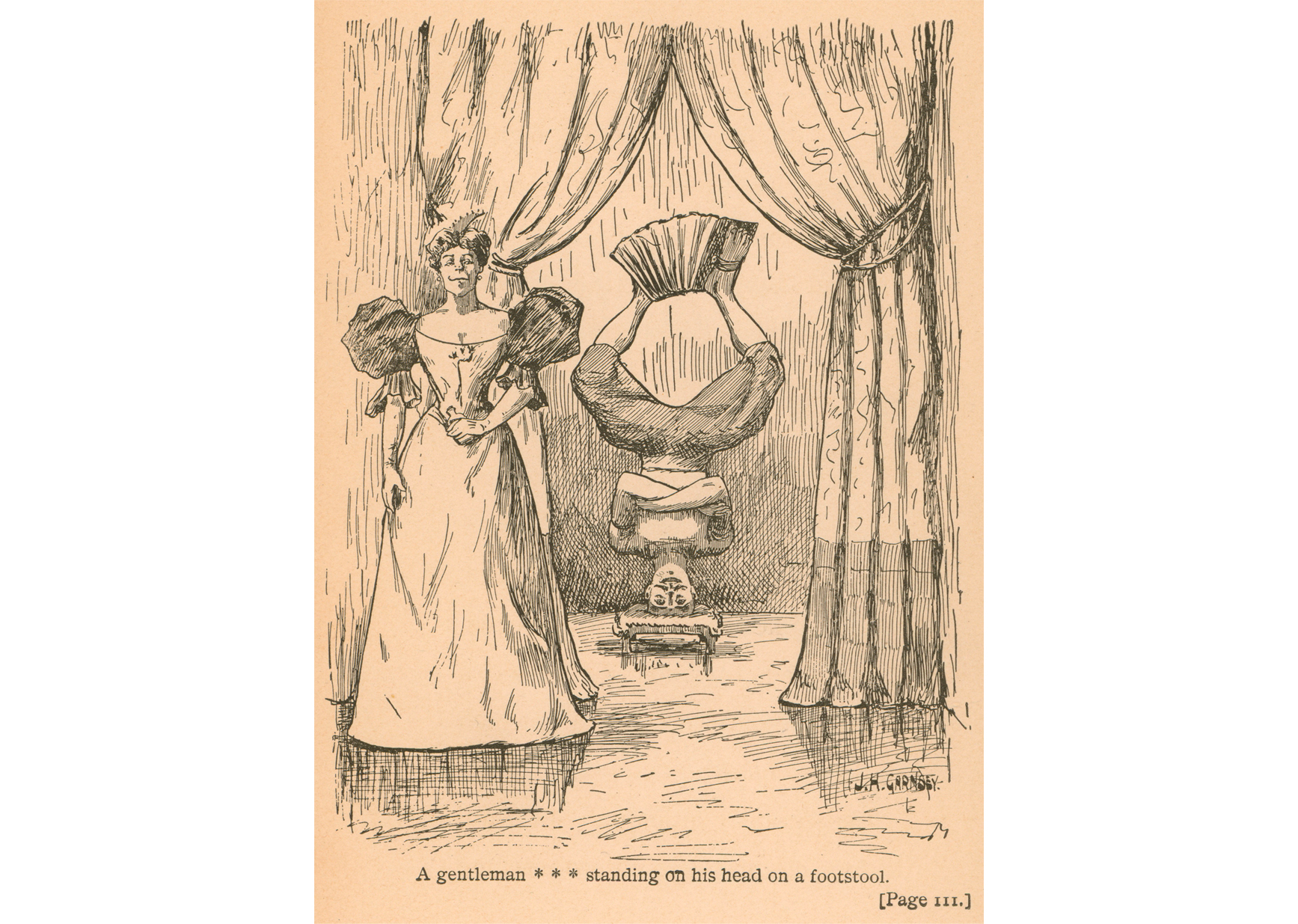 A gentleman . . . standing on his head on a footstool, from Billtry, by Mary Kyle Dallas (New York: The Merriam Company, 1895). Carol Jording Rare Book Acquisition Fund, Helen Farr Sloan Library & Archives, Delaware Art Museum.
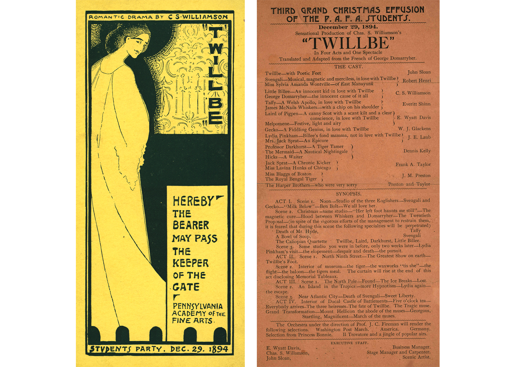 Ticket and playbill for the performance of Twillbe at the Pennsylvania Academy of the Fine Arts, December 1894. John Sloan Manuscript Collection, Helen Farr Sloan Library & Archives, Delaware Art Museum.
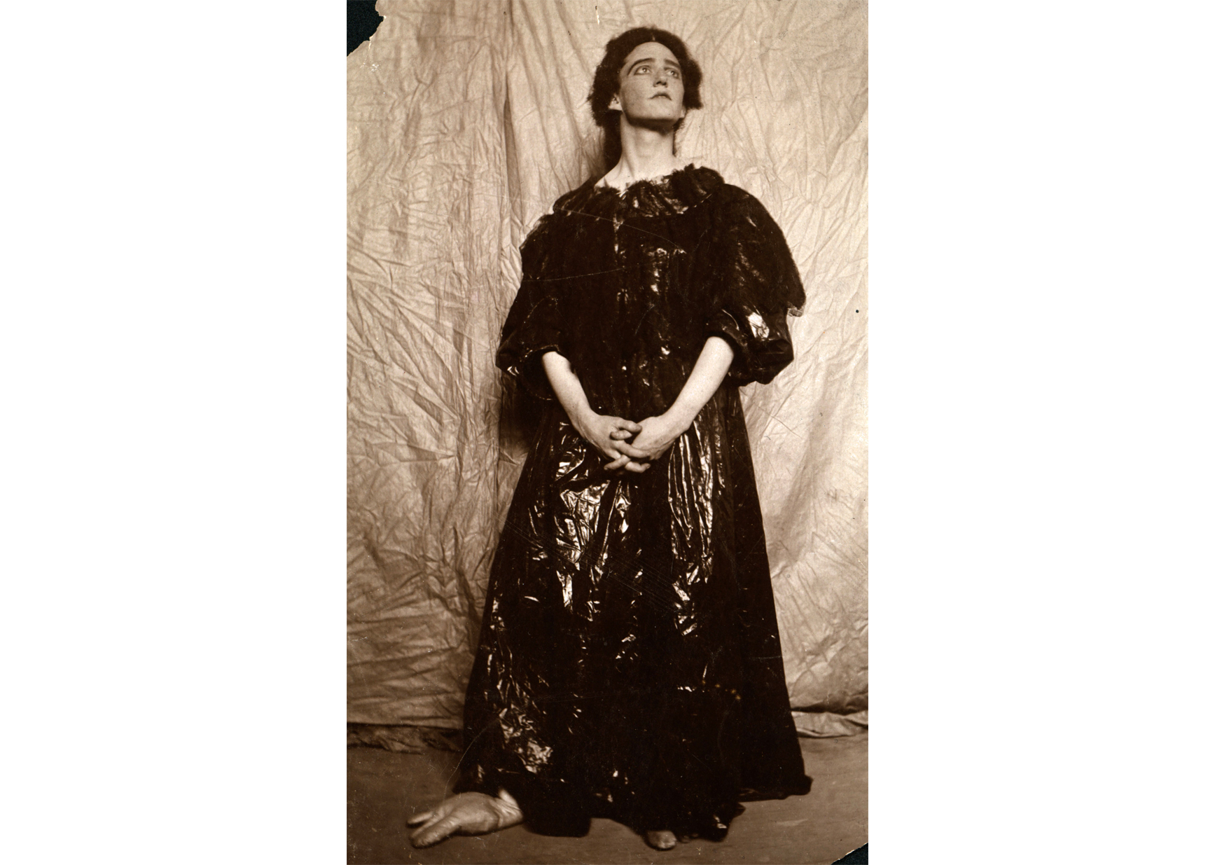 Photograph of John Sloan as Twillbe, 1894. John Sloan Manuscript Collection, Helen Farr Sloan Library & Archives, Delaware Art Museum.
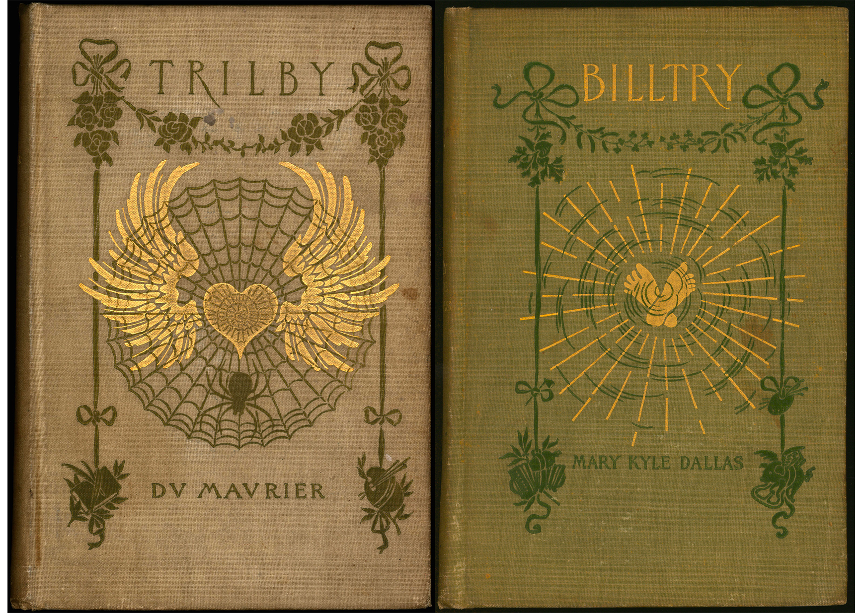 Left: Trilby, by George du Maurier (New York: Harper & Brothers, 1895). M. G. Sawyer Collection of Decorative Bindings, Helen Farr Sloan Library & Archives, Delaware Art Museum. Right: Billtry, by Mary Kyle Dallas (New York: The Merriam Company, 1895). Carol Jording Rare Book Acquisition Fund, Helen Farr Sloan Library & Archives, Delaware Art Museum.
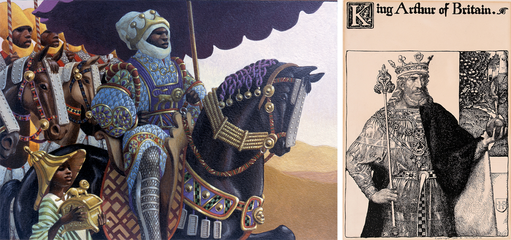 Left to right: Mansa Musa King of Mali, 2001. Cover illustration for Mansa Musa: The Lion of Mali, by Khephra Burns, (Gulliver Books, 2001). Diane Dillon (born 1933) and Leo Dillon (1933–2012). Gouache on Bristol board, composition: 6 x 8 1/2 inches, sheet: 10 x 12 1/8 inches. Courtesy of the artist. © Diane and Leo Dillon. | King Arthur of Britain and decorated initial K with title and design, 1903. Illustration for “The Story of King Arthur and His Knights,” by Howard Pyle, in St. Nicholas, January 1903. Howard Pyle (1853–1911). Ink and graphite on illustration board, composition: 9 1/8 × 6 3/16 inches, sheet: 11 11/16 × 9 1/16 inches. Delaware Art Museum, Gift of Anne Poole Pyle, 1920.
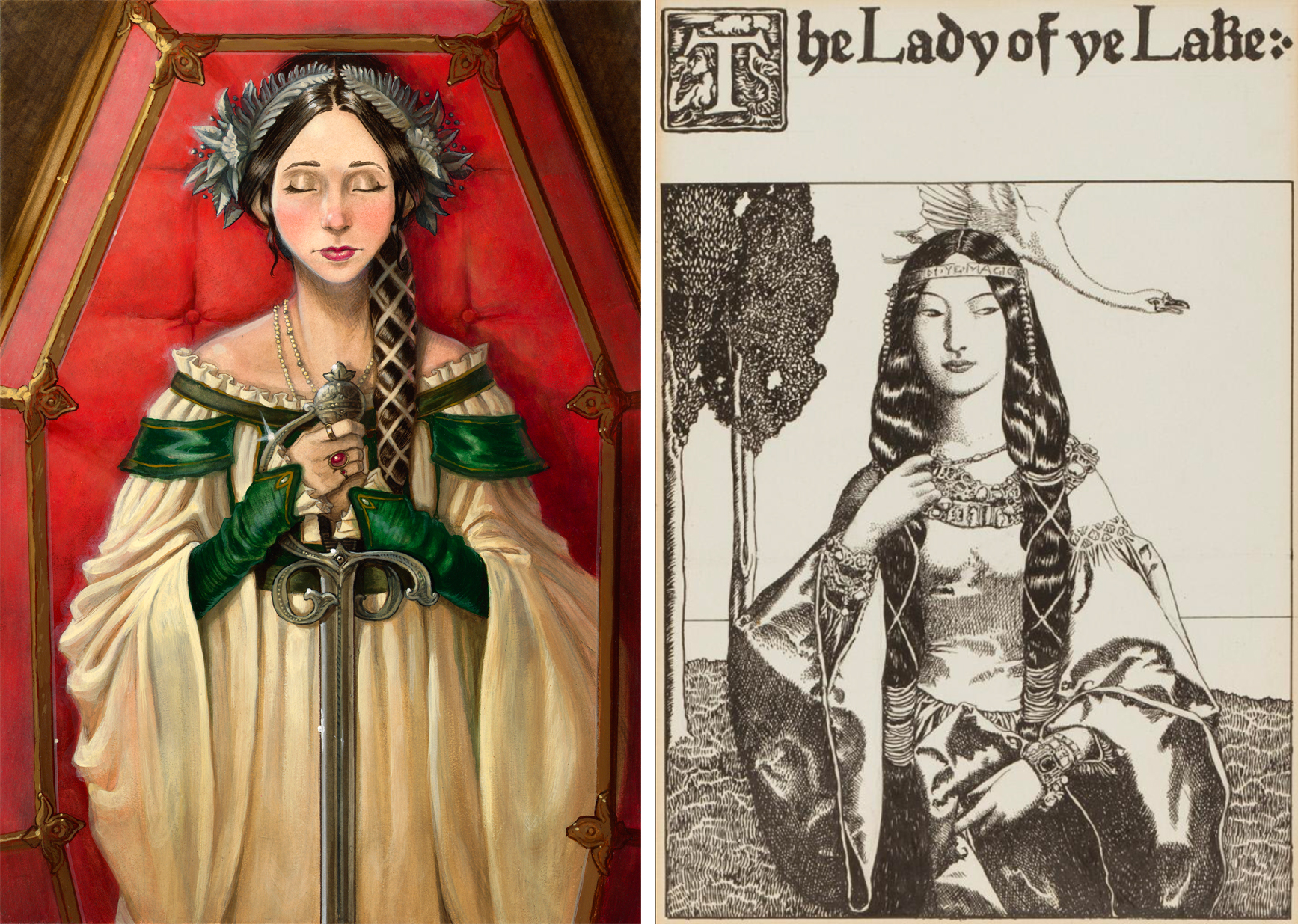 Left to right: The Ironwood Tree, 2004. Cover illustration for The Ironwood Tree, The Spiderwick Chronicles Book 4, by Holly Black and Tony DiTerlizzi, (Simon & Schuster, 2004). Tony DiTerlizzi (born 1969). Acryla gouache on plate-finish Bristol board, 14 3/4 x 10 3/8 inches, frame: 23 7/8 x 19 inches. Courtesy of the artist. Spiderwick Chronicles © Tony DiTerlizzi & Holly Black. | The Lady of Ye Lake and decorated initial T with title and design, 1903 from The Story of King Arthur and His Knights, by Howard Pyle (New York: Charles Scribner’s Sons, 1903). Howard Pyle (American illustrator, 1853–1911). Ink and graphite on illustration board, composition: 9 1/16 × 6 1/4 inches, sheet: 14 5/8 × 11 1/8 inches. Delaware Art Museum, Museum Purchase, 1912.
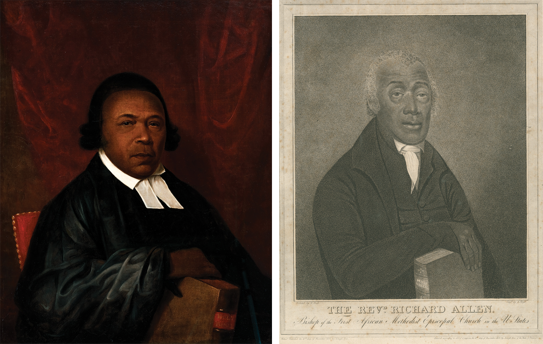 Left to right:
 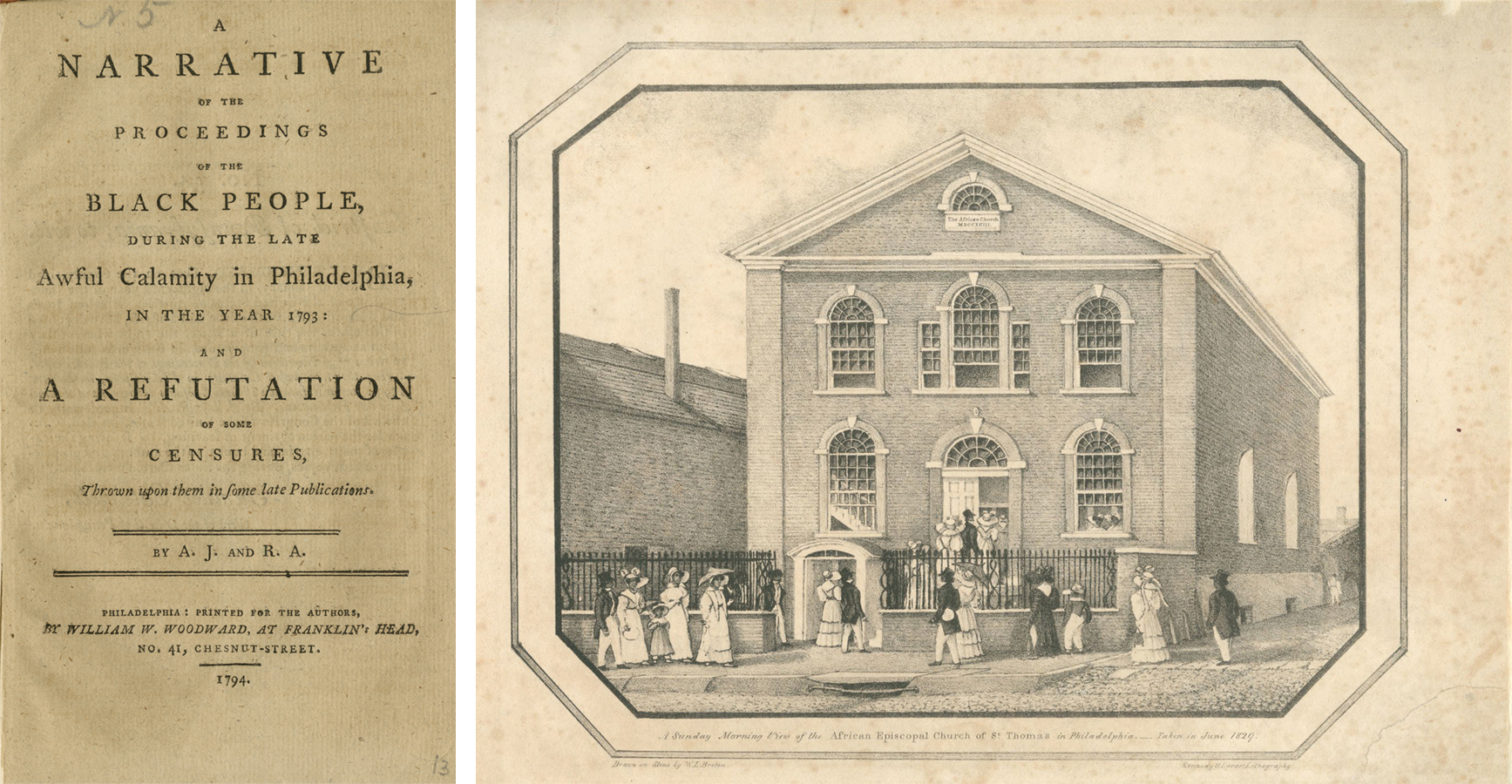 Left to right: Title Page, A Narrative of the Proceedings of the Black People, 1794. Absalom Jones (1746–1818) and Richard Allen (1760–1831). Library Company of Philadelphia. A Sunday Morning View of the African Episcopal Church of St. Thomas in Philadelphia, 1829. Kennedy & Lucas from a drawing by W. L. Breton (c. 1733–1859). Lithograph, 9 3/4 x 13 3/4 inches. Library Company of Philadelphia.
 Facing each other at last, the girl white, shaking, her eyes aflame (detail), 1909.
 Saved, 1887. Adolf Brütt.
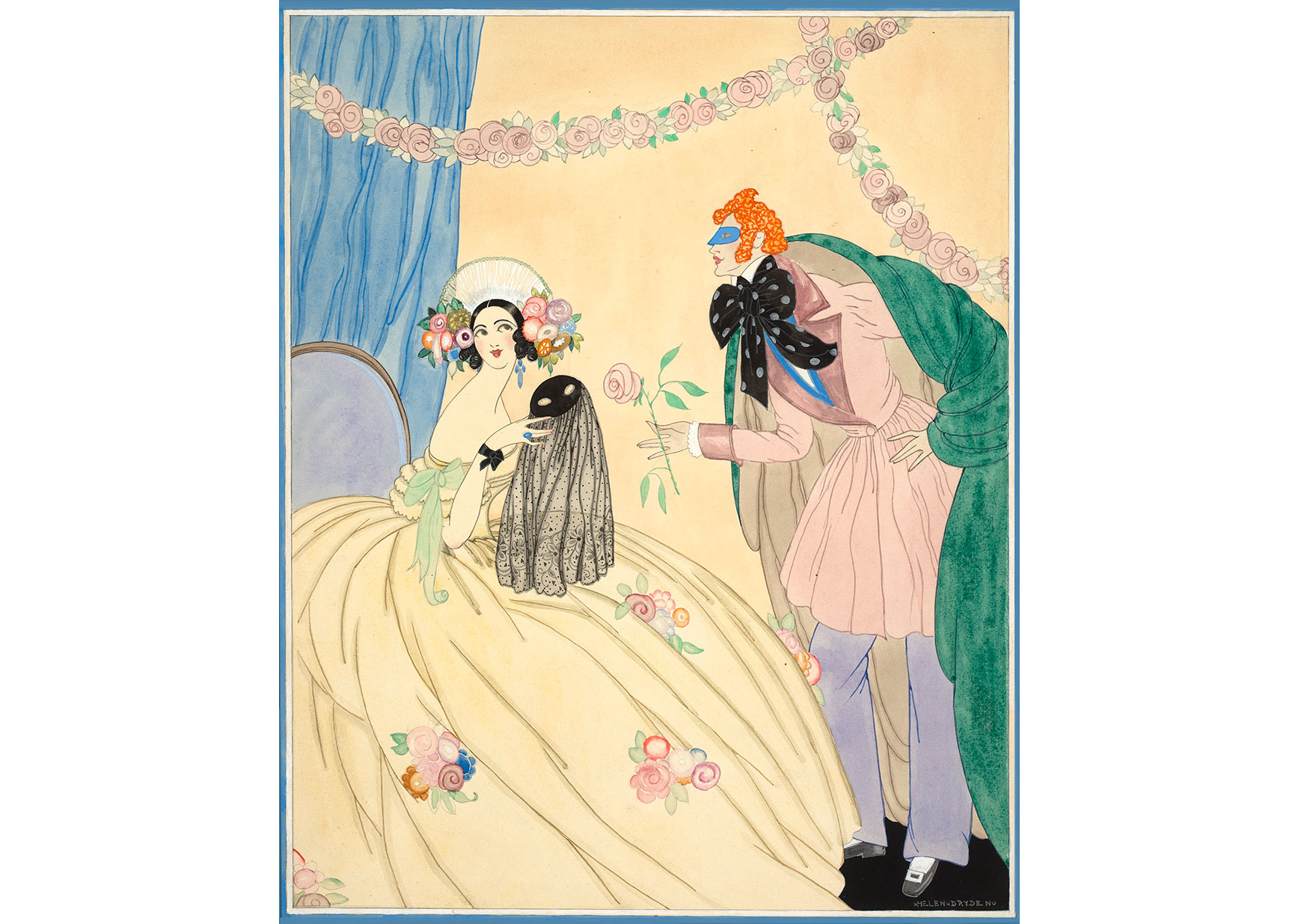 Above: Cover for Vogue, December 15, 1922. Helen Dryden (1882–1981). Gouache, ink, and watercolor on paper, 19 × 15 1/2 inches. Delaware Art Museum, Acquisition Fund, 1992.
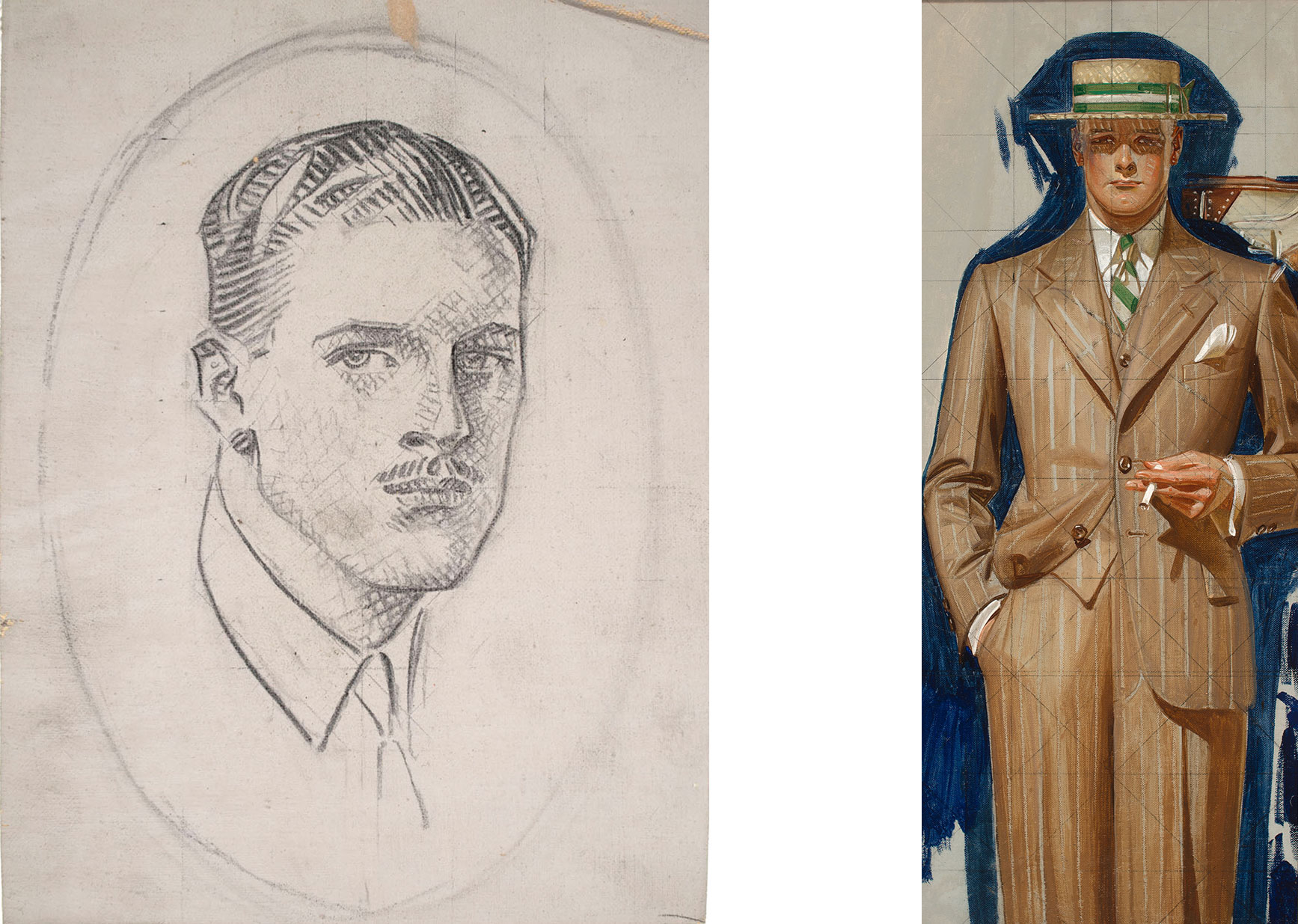 Above, left to right: Portrait Head (Possible Study for Arrow Collar Advertisement), c. 1925. J.C. Leyendecker (1874–1951). Graphite on coated canvas, 10 3/8 x 7 5/8 inches. Delaware Art Museum, Gift of Helen Farr Sloan, 1984; Accessioned, 2020. | Figure Study for a Kuppenheimer Advertisement, 1929. J.C. Leyendecker (1874–1951), Oil on (linen) canvas, 22 x 9 1/4 inches. Delaware Art Museum, Acquisition Fund, 2016.
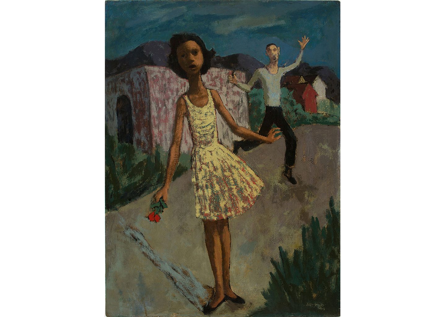 The Bouquet, 1949. Hughie Lee-Smith (1915–1999). Oil on Masonite, 23 3/4 × 17 3/4 inches. Delaware Art Museum, Acquisition Fund, 2018 © Estate of Hughie Lee-Smith / VAGA for ARS, New York, NY.
 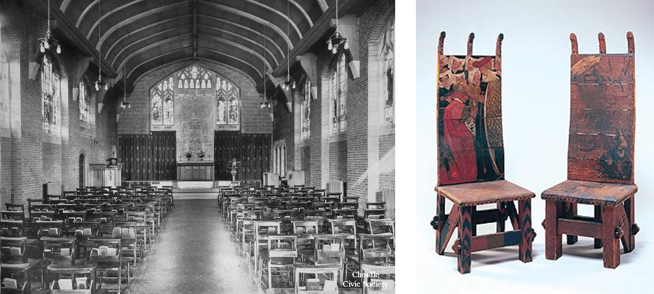 Above, left to right: Cheadle Royal Hospital Chapel, c. 1920. Cheadle Civic Society Archives. | The Arming of a Knight and Glorious Gwendolen’s Golden Hair, 1856-1857. William Morris (1834-1896) and Dante Gabriel Rossetti (1828-1882). Painted deal, leather, and nails, Delaware Art Museum, Acquired through the Bequest of Doris Wright Anderson and through the F. V. du Pont Acquisition Fund, 1997.
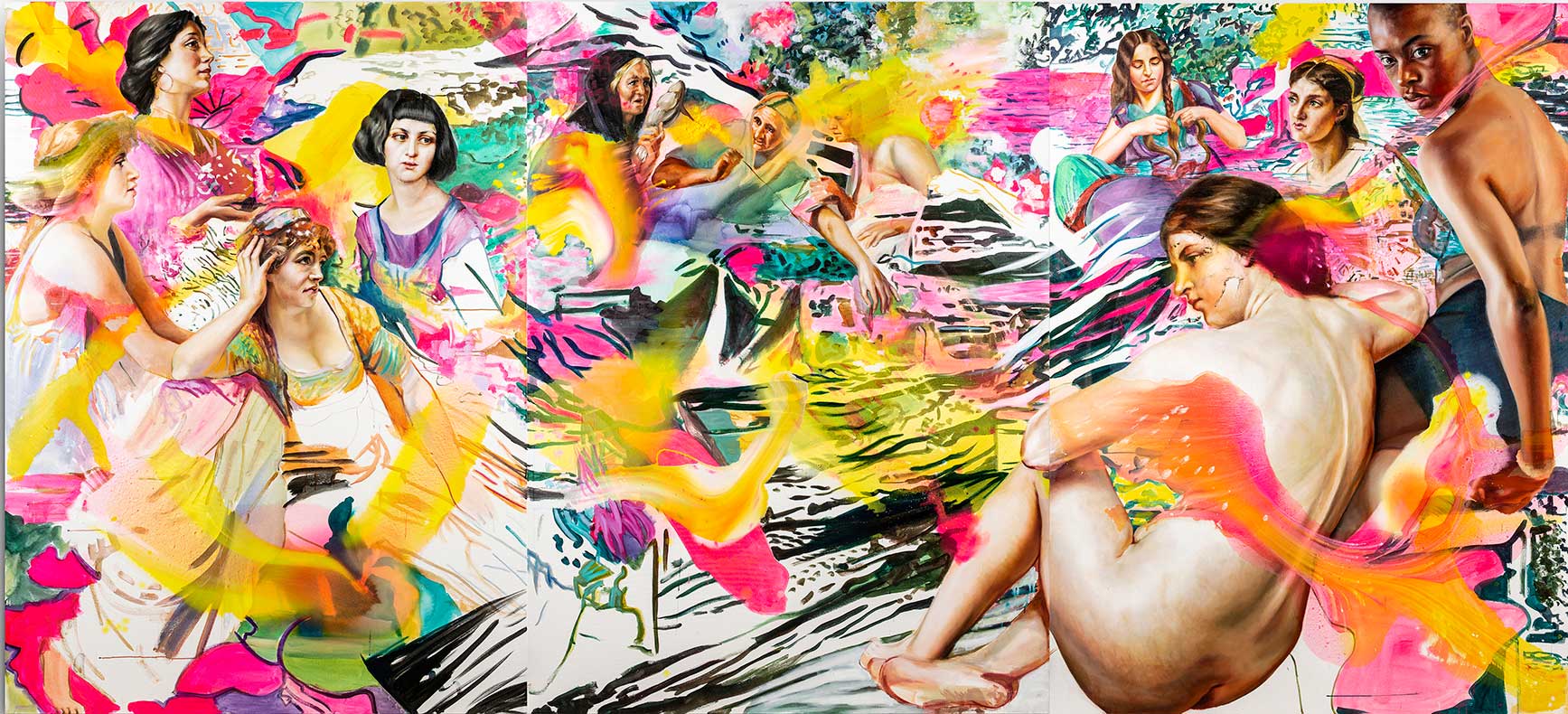 Sound the deep waters, 2019. Angela Fraleigh (born 1976). Oil and acrylic on canvas, 90 × 198 inches. Courtesy of the artist. ©Angela Fraleigh. Photograph by Kenek Photography.
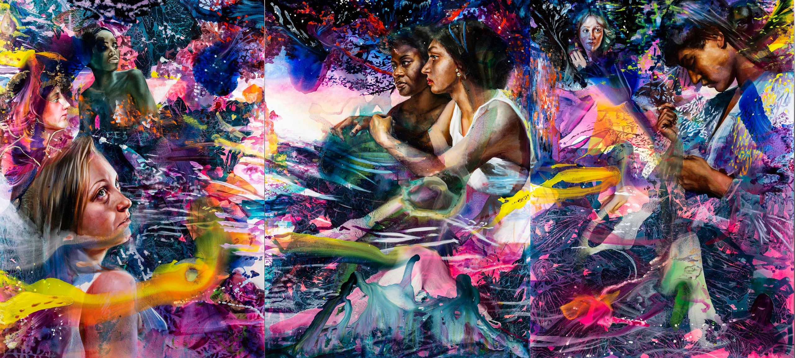 Our world swells like dawn, when the sun licks the water, 2019. Angela Fraleigh (born 1976). Oil and acrylic on canvas, 90 × 198 inches. Courtesy of the artist. ©Angela Fraleigh. Photograph by Kenek Photography.
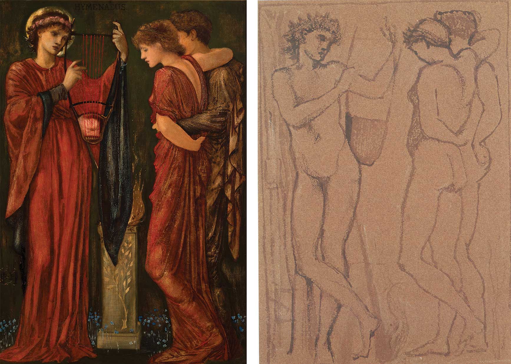 ILL. #2 Hymenaeus, 1869. Edward Burne-Jones (1833–1898). Oil paint over gold leaf on panel, 32 1/4 x 21 1/2 inches, frame: 36 x 49 1/2 inches. Delaware Art Museum, Samuel and Mary R. Bancroft Memorial, 1935. ILL. #3 Study for Hymenaeus, undated. Edward Burne-Jones (1833–1898). Charcoal and wash on brown paper. Private collection.
 Above, left to right: Chronicle of the conquest of Granada by Washington Irving, cover design by Alice C. Morse (New York: Putnam, 1893) M.G. Sawyer Collection of Decorative Bindings, Helen Farr Sloan Library & Archives. | Endpaper possibly designed by Alice C. Morse from The Alhambra by Washington Irving (New York: Putnam, 1892) Helen Farr Sloan Library & Archives.
 Above, left to right: Just like moons and like suns, still I’ll rise (Fanny Eaton to Maya Angelou), 2019. Cold porcelain, wire, oil paint, and pastel in glass vessel. | The ocean could not be swept back with a broom. The truth was out and it illuminated the world. (Margaret Sanger to Madame Restell), 2019. Cold porcelain, wire, oil paint, and pastel in ceramic vessel.
 Above: Daughter of the Sun (Circe’s Garden), 2019. Cold porcelain, wire, oil paint, and pastel in glass vessel.
 Above, left to right: The stars tell all their secrets to the flowers, and, if we only knew how to look around us, we should not need to look above. (Margaret Fuller to Simone de Beauvoir), 2019. Cold porcelain, wire, oil paint, and pastel in ceramic vessel. | Stained with moonlight, nurtured by the stars (Lord Alfred Douglas to Oscar Wilde), 2019. Cold porcelain, wire, oil paint, and pastel in glass vessel.
 Above, left to right: Untitled, 1980s. Mitch Lyons (1938-2018). Clay monoprint, sheet: 33 3/4 × 34 3/4 inches. Delaware Art Museum, Gift of the artist, 2012. © Estate of Mitch Lyons. | Untitled pot, not dated. Mitch Lyons (1938-2018). Ceramic, 10 3/8 x 6 ½ inches. Collection of the Estate of Mitch Lyons. © Estate of Mitch Lyons. Photograph by Carson Zullinger.
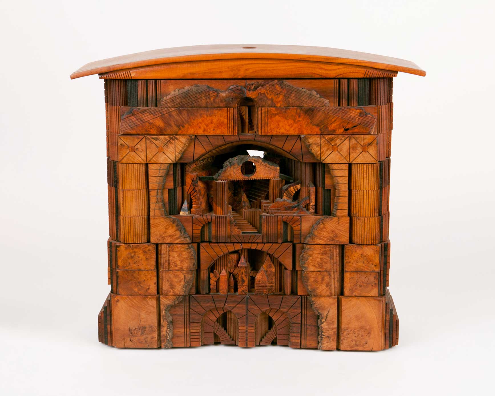 Fig. 2. Landscape Box (closed), c. 1988. Po Shun Leong (born 1941). Cherry burl, wenge, mahogany, and Hawaiian koa woods with built-in lamp, 19 × 21 5/8 × 6 1/2 inches. Delaware Art Museum, Gift of Nancy and Joe Miller, 1998. © Po Shun Leong.
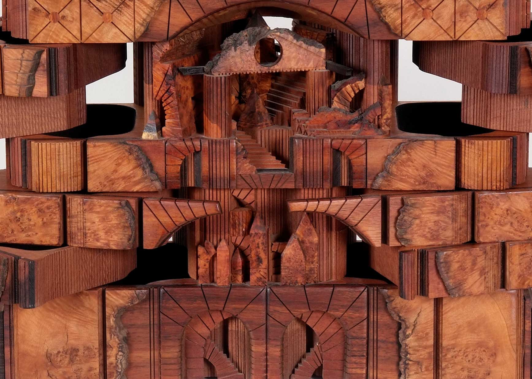 Fig. 3. Landscape Box (open) (detail), c. 1988. Po Shun Leong (born 1941). Cherry burl, wenge, mahogany, and Hawaiian koa woods with built-in lamp, 19 × 21 5/8 × 6 1/2 inches. Delaware Art Museum, Gift of Nancy and Joe Miller, 1998. © Po Shun Leong.
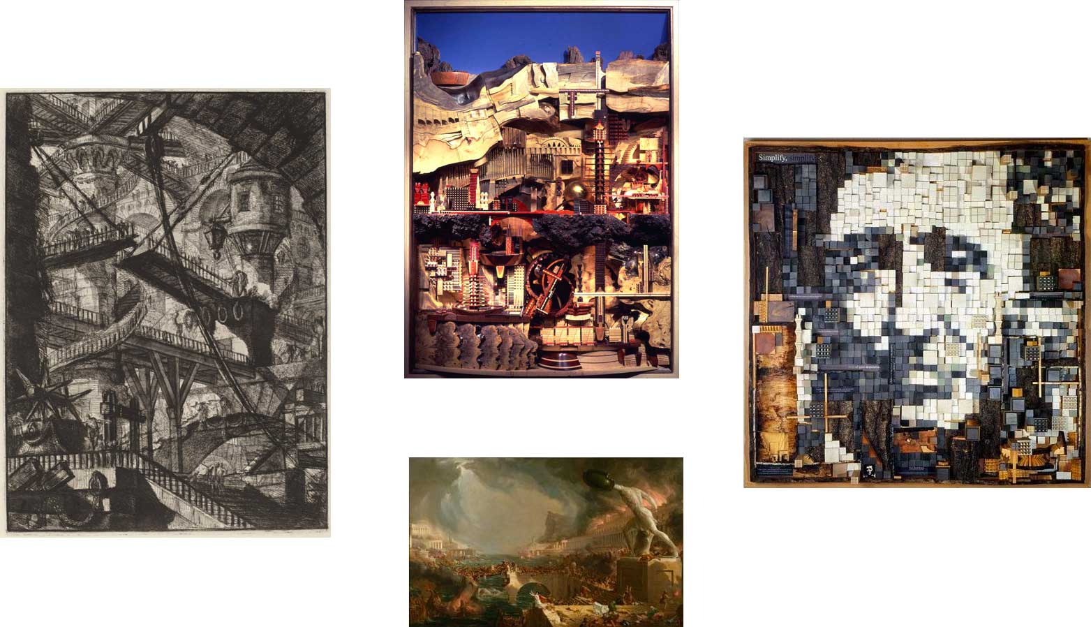 Clockwise, from left: Fig. 4. The Drawbridge, from Carceri, 1780s. Giovanni Battista Piranesi. Etching, engraving, scratching, National Gallery of Art, Rosenwald Collection. Fig. 5. Mesa Verde, 1994. Po Shun Leong. Buckeye burl woods, 55 x 40 x 9 inches. Image from Po Shun Leong. Fig. 7. Portrait collage of Henry David Thoreau, 2001. Po Shun Leong. Wood, 60 inches. Image from Po Shun Leong. Fig. 6. The Course of Empire: Destruction, 1836. Thomas Cole. Oil on canvas, 39 1/4 x 63 1/2 inches. New York Historical Society, Gift of The New York Gallery of the Fine Arts.
.jpg)